
Cybermontage
Get the font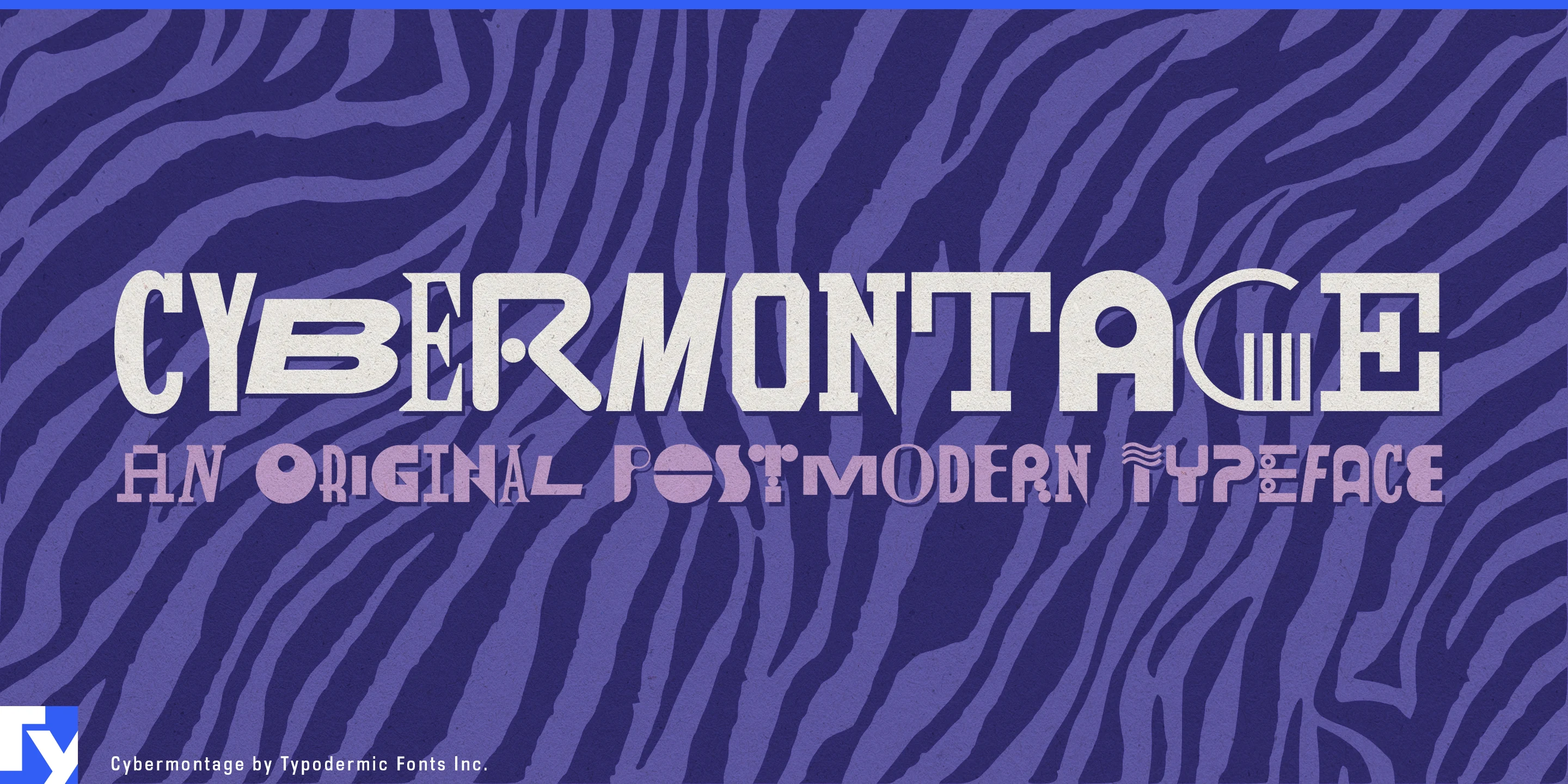
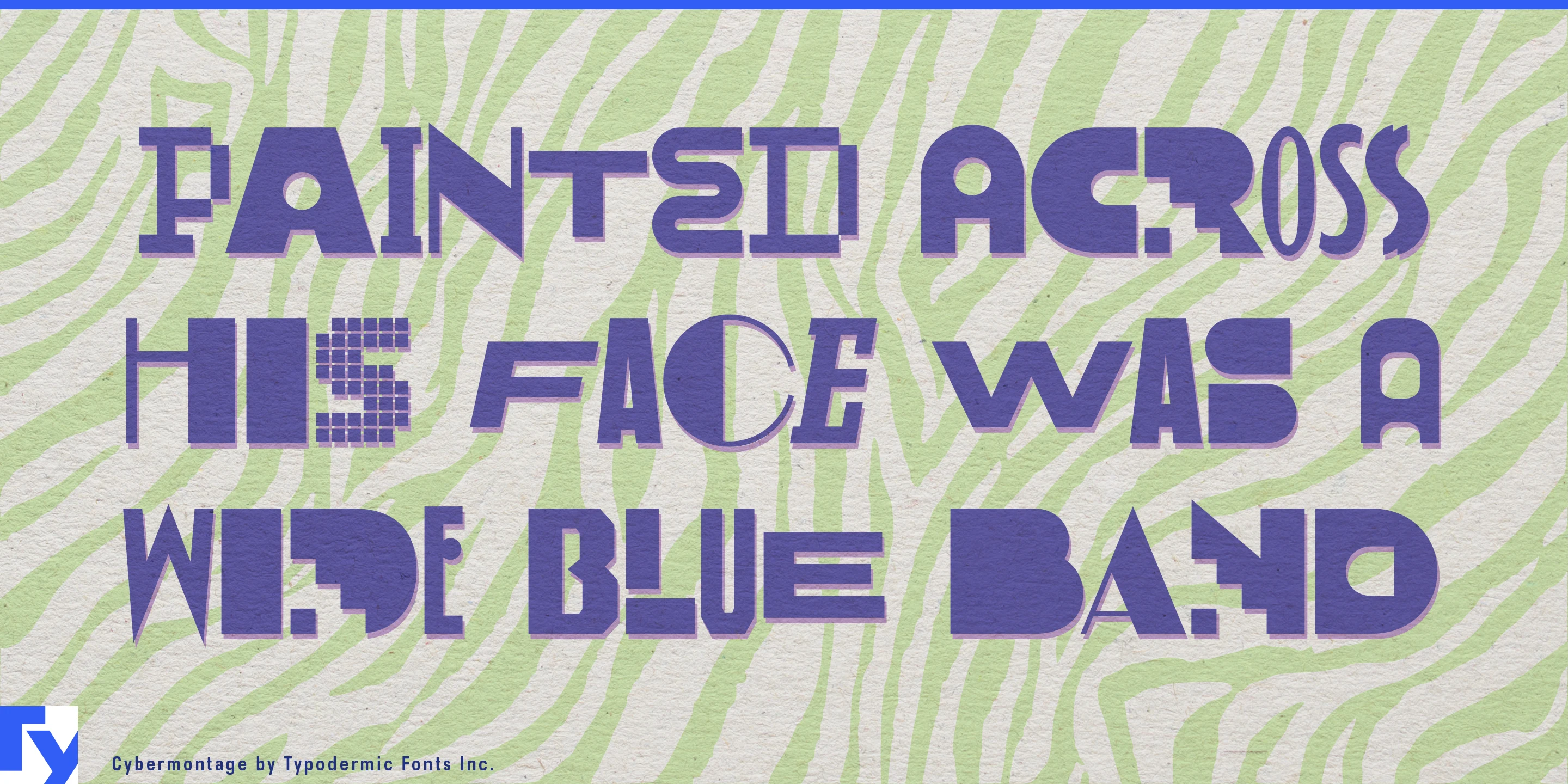
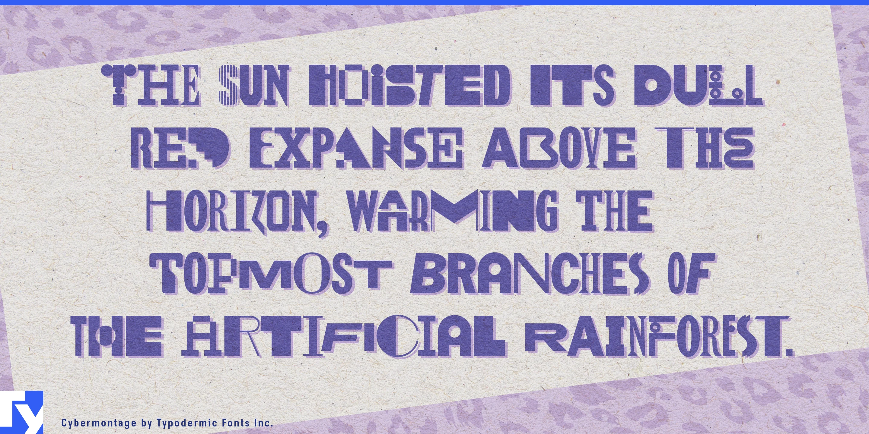
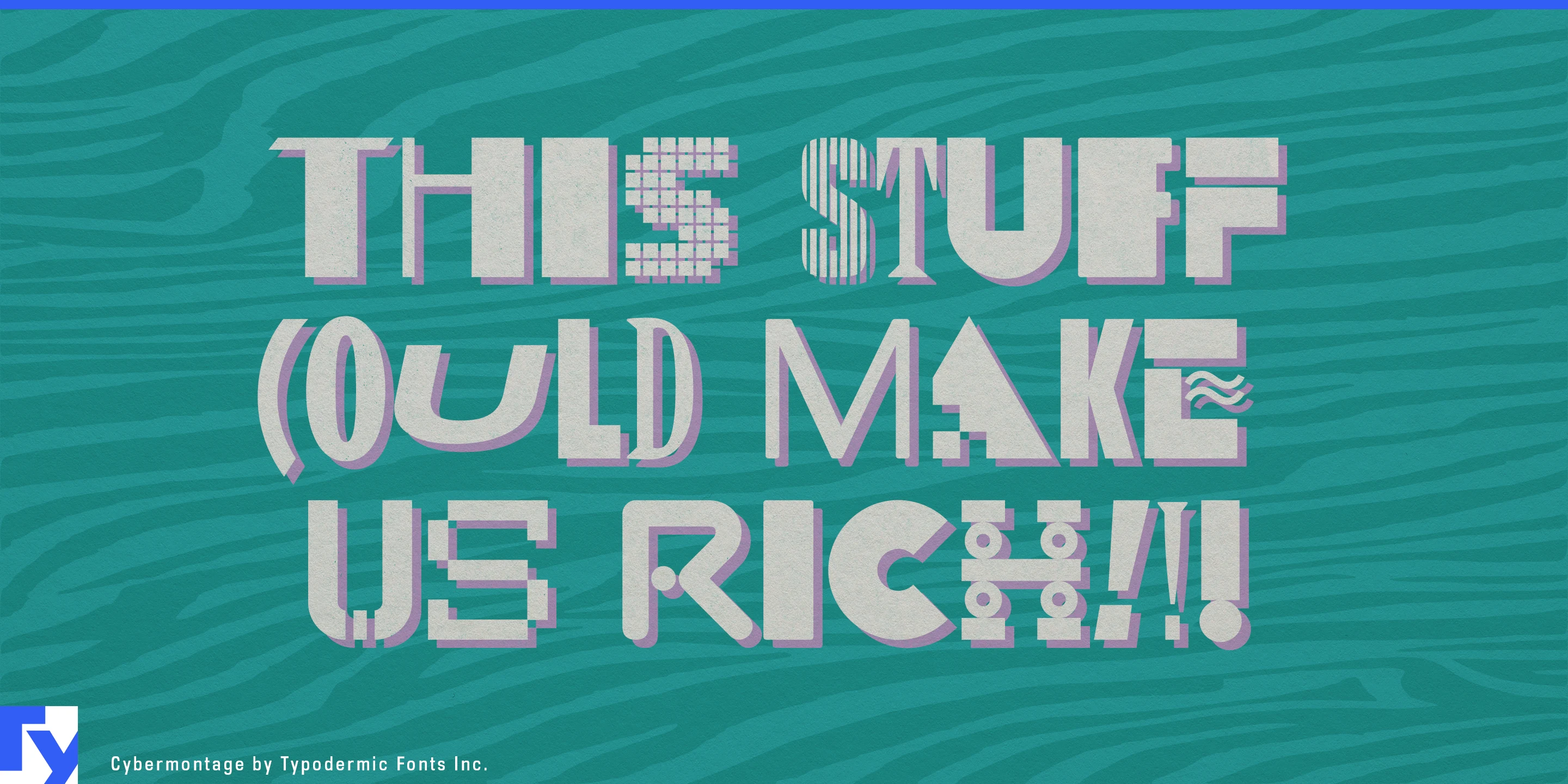
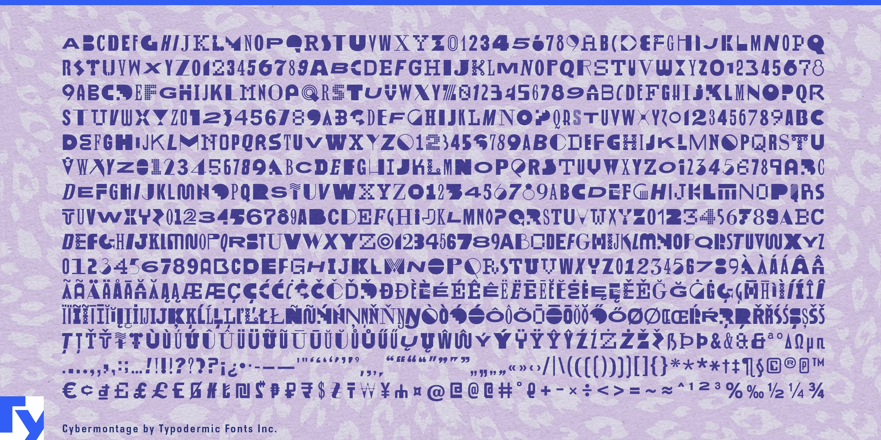
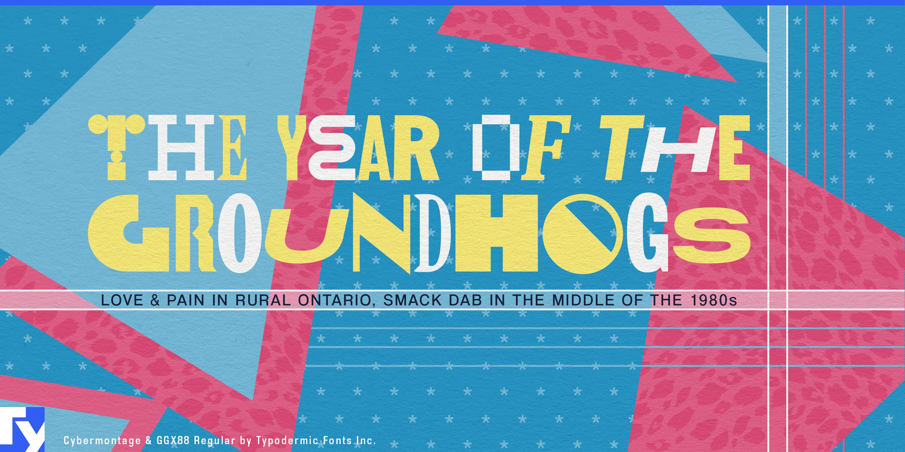
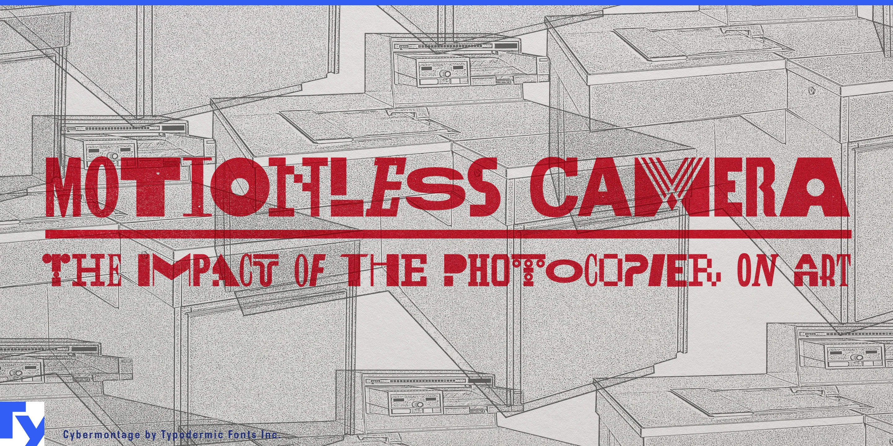
Cybermontage is built for headlines that refuse to settle into a single alphabet. Each letter and numeral has seven alternate forms, ranging across geometric sans shapes, deco fragments, industrial constructions, pixel-like forms, and other stylistic detours. Those variants can shuffle automatically as text is entered, so a headline develops its own mixture of forms without requiring the designer to assemble every character by hand.
That behaviour is particularly useful on the web. Culture magazines, music publications, entertainment sites, fashion editorial, and arts organizations can give each new headline a different internal composition while keeping the overall typographic system recognizable. A homepage with several article titles gains variation from headline to headline; tomorrow’s stories generate another set of combinations without requiring a new display font or manually rebuilt treatment.
Campaign and launch sites can push the idea further. Film releases, music campaigns, fashion collections, product collaborations, festivals, and cultural programmes often need one identity to stretch across landing pages, announcements, social graphics, advertising, merchandise, and event signage. Performer names, dates, products, episode titles, and campaign messages can each arrive with a different mix of letterforms while remaining part of the same system.
That makes Cybermontage especially useful for mutable event identities. A music festival, film programme, design conference, club series, or cultural season may need dozens of related graphics over weeks or months. Different performers, venues, screenings, and announcements can reshuffle the alphabet instead of repeating one fixed headline treatment. A straightforward supporting sans can carry schedules and details while Cybermontage keeps the display layer changing.
Music and entertainment provide another natural setting. Artist websites, album campaigns, tour announcements, streaming graphics, title sequences, projected visuals, and animated promos can use the stylistic collisions as part of the image. One word may move between sharp geometry, decorative fragments, squared constructions, and remnants of other typographic genres without becoming a pile of unrelated fonts.
The design grew from an interest in the eclectic typography around the end of the 1980s and beginning of the 1990s, when designers freely collided historical styles, new digital forms, geometric systems, and bits of visual culture that were never expected to match. Cybermontage was assembled in much the same spirit, drawing on earlier Typodermic designs, old metal-type references, and newly constructed letters. That postmodern logic remains visible, but it no longer needs to define the application.
The seven variants can also be selected deliberately when a particular composition matters. A designer can let the automatic shuffling establish the texture, then adjust individual letters for a logo, title card, poster, or hero graphic. That balance between automation and control makes Cybermontage useful for systems that need a lot of distinctive display typography without turning every headline into a custom lettering project.
Cybermontage is an all-caps display face for web headlines, campaigns, events, music, entertainment, and other environments where repetition quickly becomes visible. One alphabet would be too predictable; seven versions of every letter give the headline somewhere else to go.
Get Cybermontage
Desktop licenses cover print, logos, and static graphics. MyFonts also offers embedding licenses for websites, e-books, and applications. Embedding licenses
Commercial font facts
Family details
- First released
- 2018
- Styles
- 1 style
- Version
- 1.000
- Formats
- OTF
- Class
- Sans serif
- Form
- Geometric
- Case
- All caps
- Scripts
- Latin
- Role
- Display
- Features
- Alternates
Commercial style names (1)
- Regular