
Zanipolo
Get the font
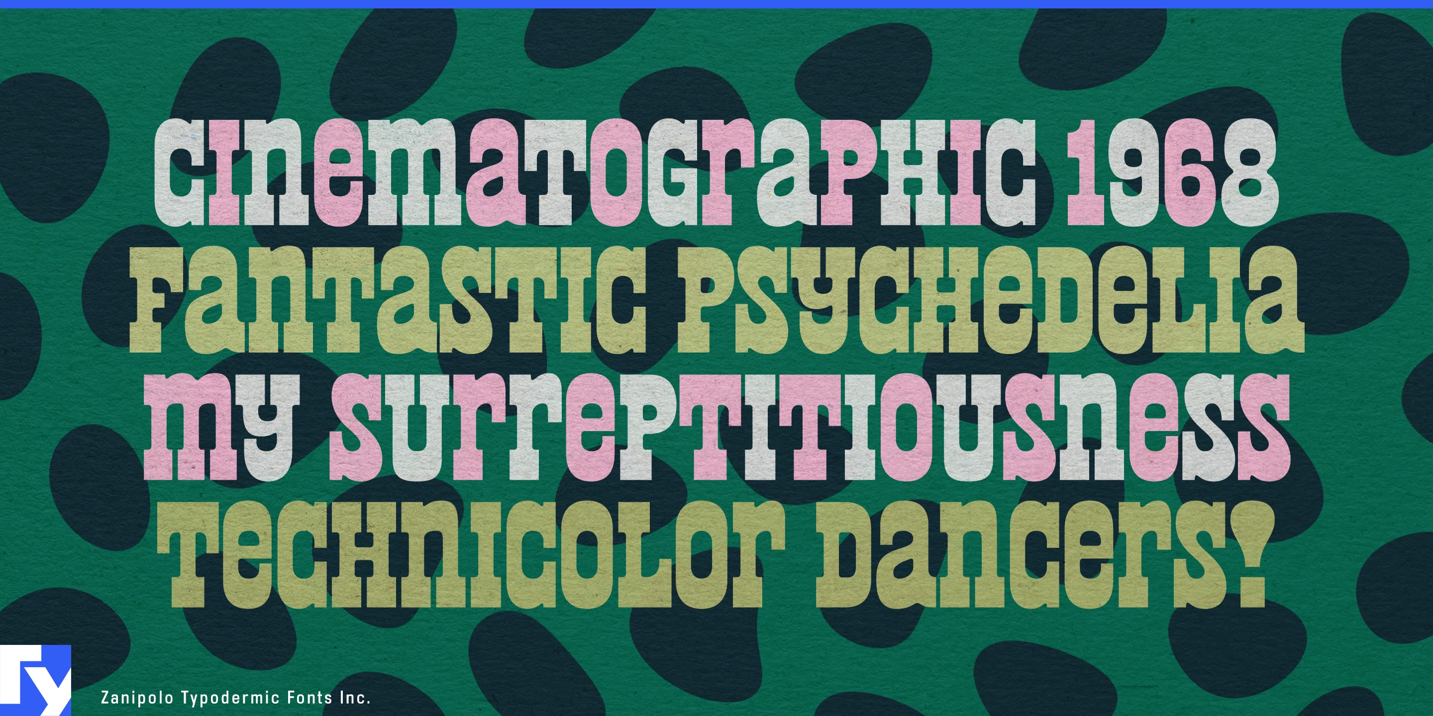

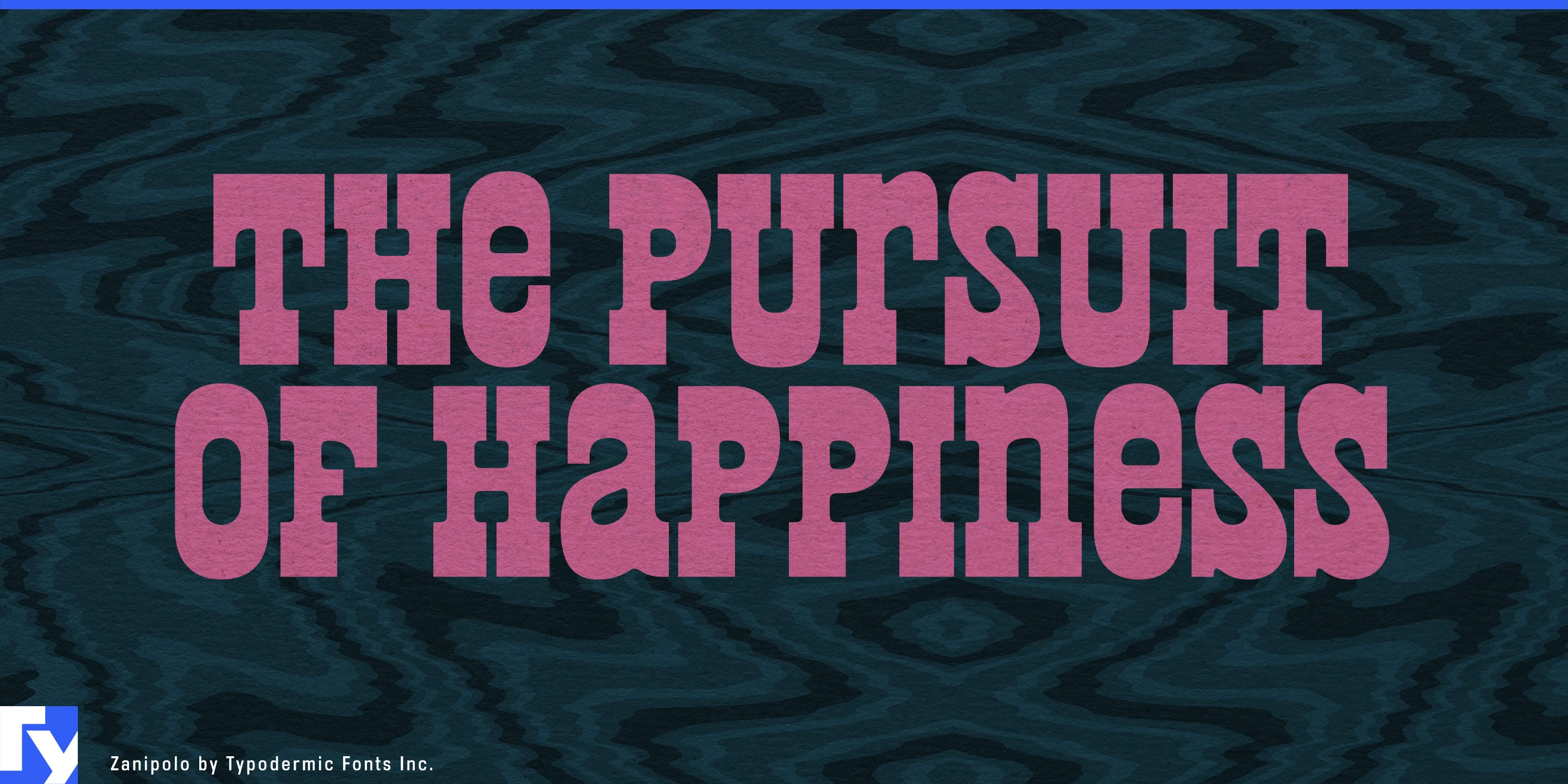
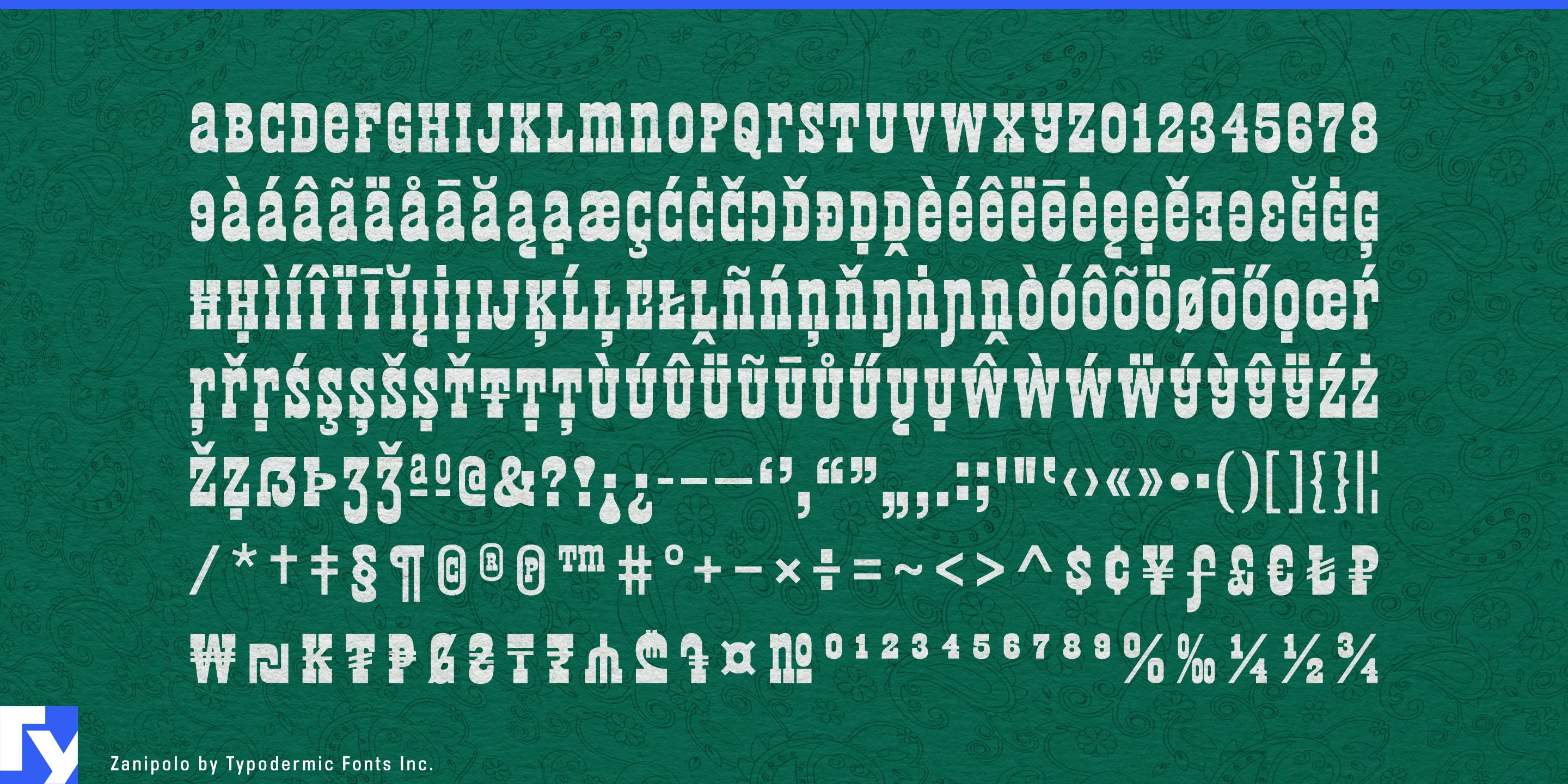
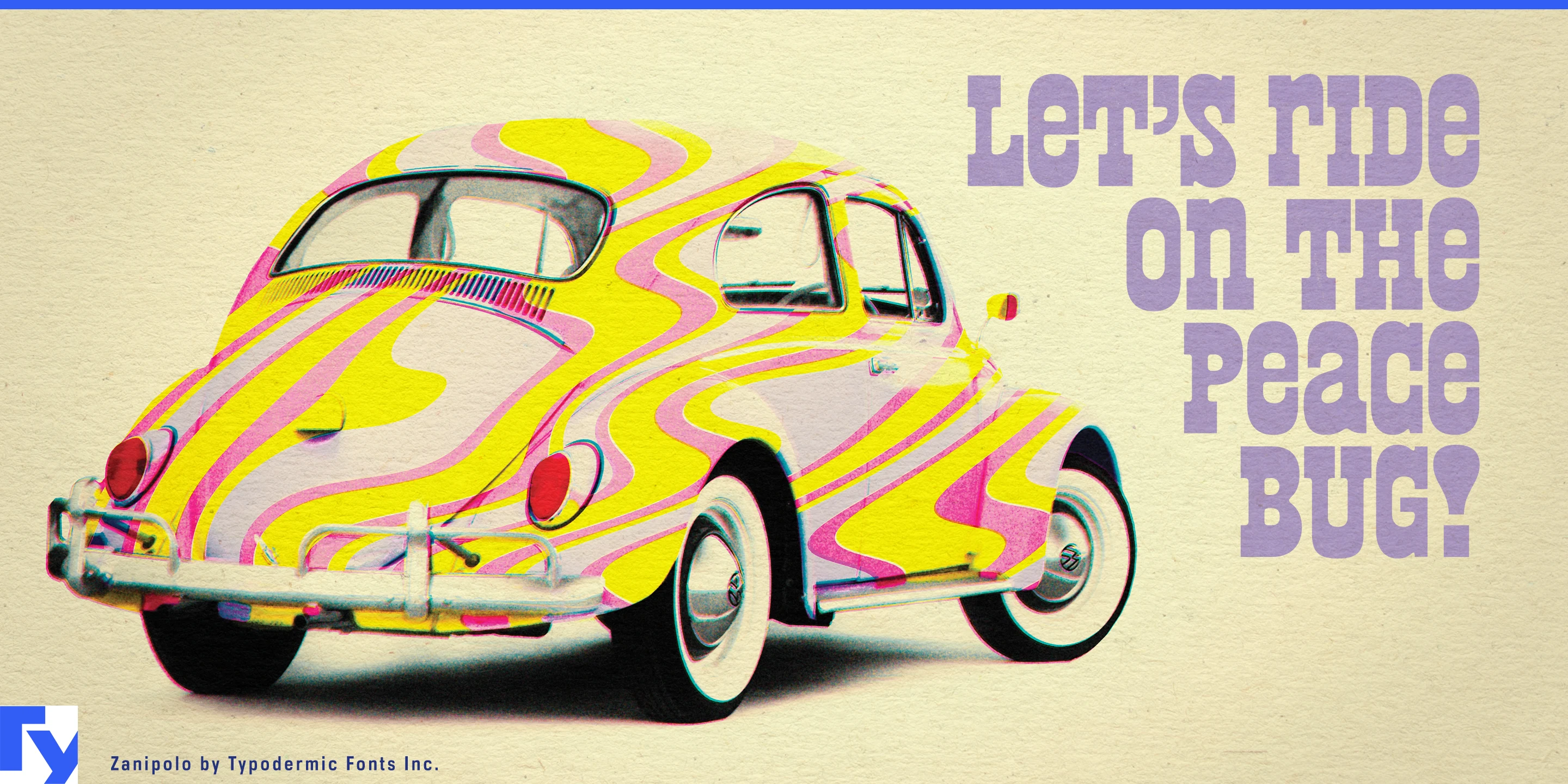

Some packages need the product name to do most of the graphic work. A heavy slab serif can lay down plenty of ink, but it often brings Western, industrial, or heritage associations along with it. Zanipolo delivers similar visual mass with softer corners, tight spacing, and playful unicase forms, producing dense words that feel friendly rather than rugged.
Its unconventional A and lowercase-derived shapes reduce some of the gaps that interrupt ordinary all-cap words. Short names can become remarkably solid blocks, especially at large sizes and in strong color combinations. The reverse-contrast construction adds another layer of strangeness without breaking that compact rhythm.
That behavior makes Zanipolo particularly effective for contemporary food packaging. Pasta boxes, tomato tins, pesto jars, polenta cartons, olive containers, and prepared sauces can let the product name occupy the package instead of floating inside it. Its European slab-serif roots provide a useful connection to grocery typography without turning the result into nostalgic pastiche.
Small packages benefit even more. Sardine tins, anchovy cartons, preserved seafood, pickled vegetables, and other conservas leave little room for a large name, illustration, variety, and supporting information. Zanipolo can compress an assertive product name into that space while a quieter companion face handles the details. Across a range, changing foreground and background colors can distinguish flavors or varieties while the typography keeps the family recognizable.
Pizza shops, delis, gelato stores, food halls, and contemporary casual restaurants can extend the same approach across menu boards, boxes, sandwich wraps, delivery bags, counter graphics, and window signs. Large category words such as PIZZA, DOLCI, LUNCH, or DRINKS become substantial visual anchors without feeling stern.
Color-coded snack and private-label grocery ranges offer another natural role. Crackers, popcorn, cookies, preserves, bakery products, and seasonal foods can use Zanipolo for oversized product or flavor names while a neutral text face carries ingredients, nutrition, and other information.
Outside food, the same density works whenever a short title needs to occupy serious visual acreage without becoming severe. Report covers, presentation openers, exhibition titles, and campaign graphics can turn a few words into a compact field of color. Zanipolo’s unusual mixture of narrow European slab-serif ideas and psychedelic exaggeration is memorable, but its real strength is practical: it lays down a lot of ink in very little space while keeping the result soft, colorful, and fun.
Get Zanipolo
Desktop licenses cover print, logos, and static graphics. MyFonts also offers embedding licenses for websites, e-books, and applications. Embedding licenses
Commercial font facts
Family details
- First released
- 2024
- Styles
- 1 style
- Version
- 1.000
- Formats
- OTF
- Class
- Slab serif
- Form
- Geometric
- Case
- Unicase
- Scripts
- Latin
- Role
- Display
Commercial style names (1)
- Regular