
Montebaldo
Get the font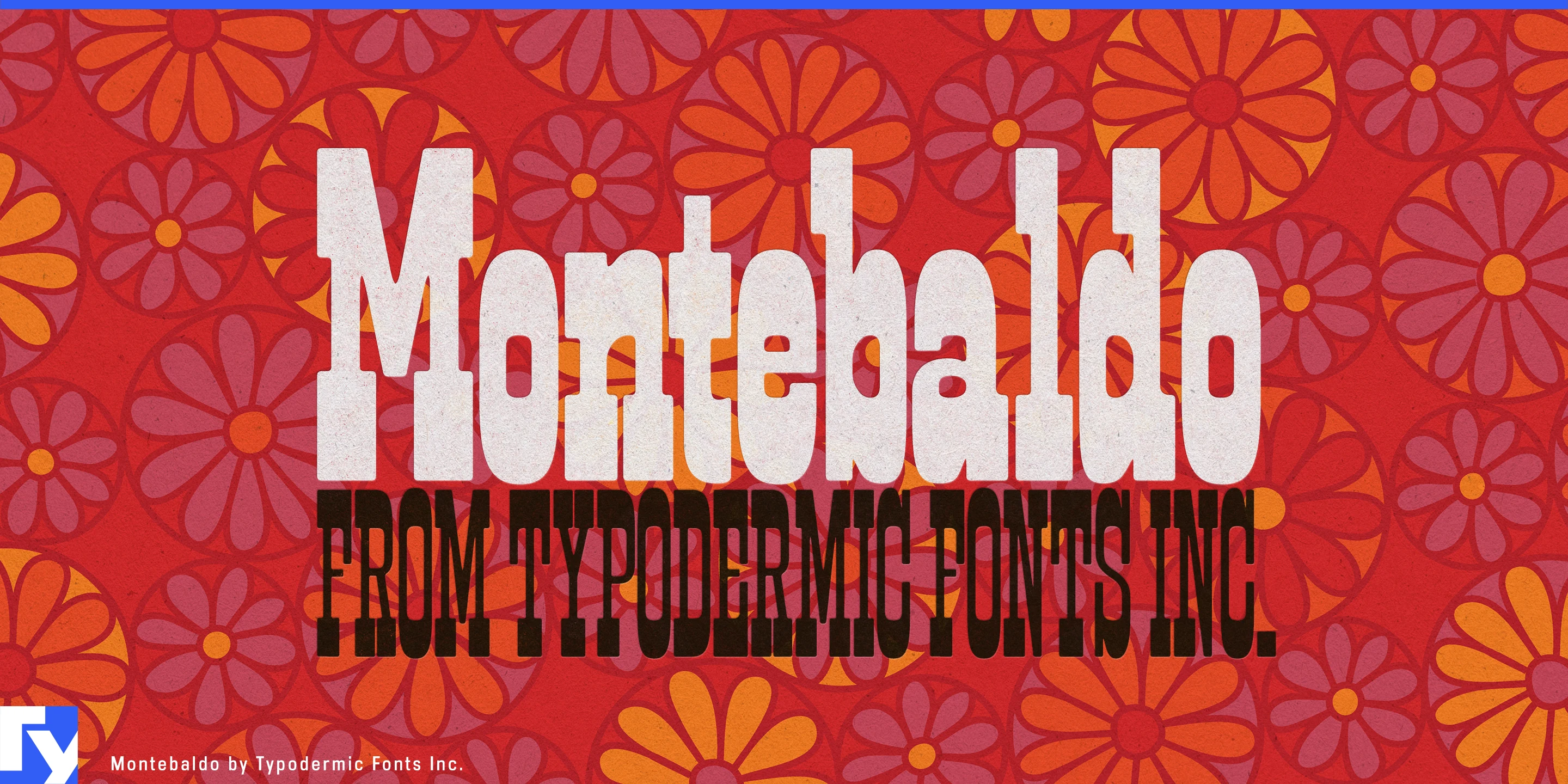
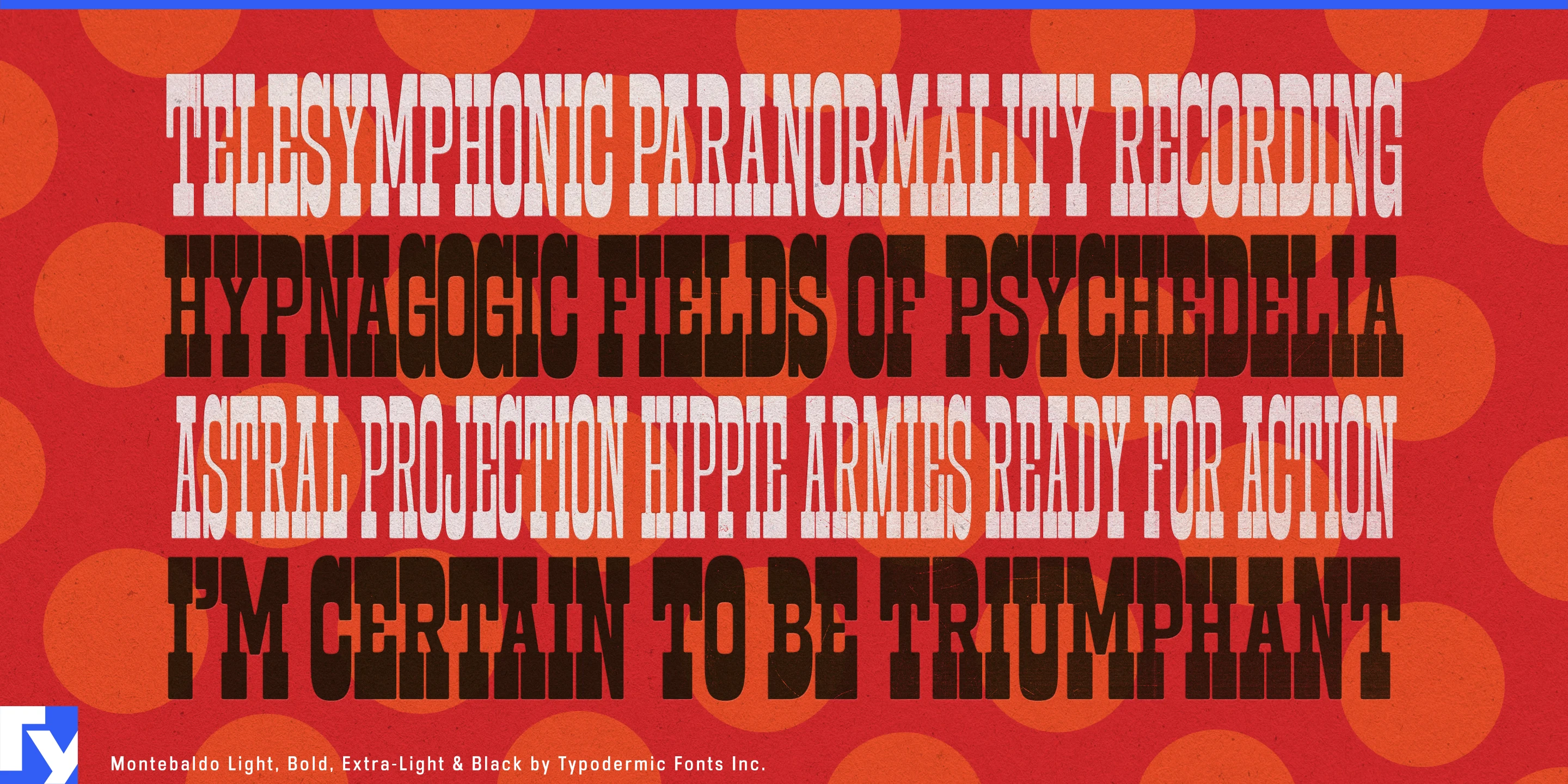

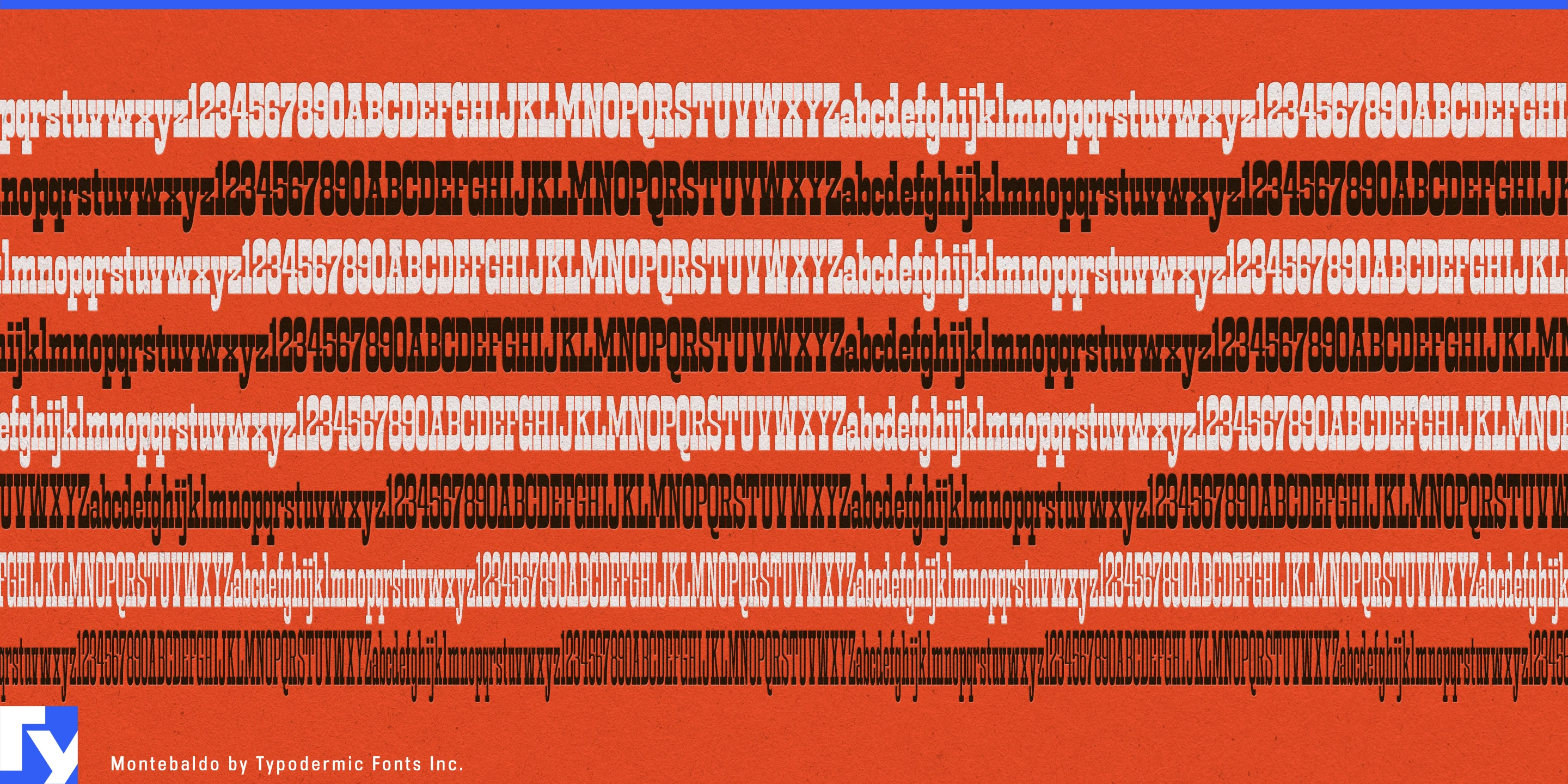
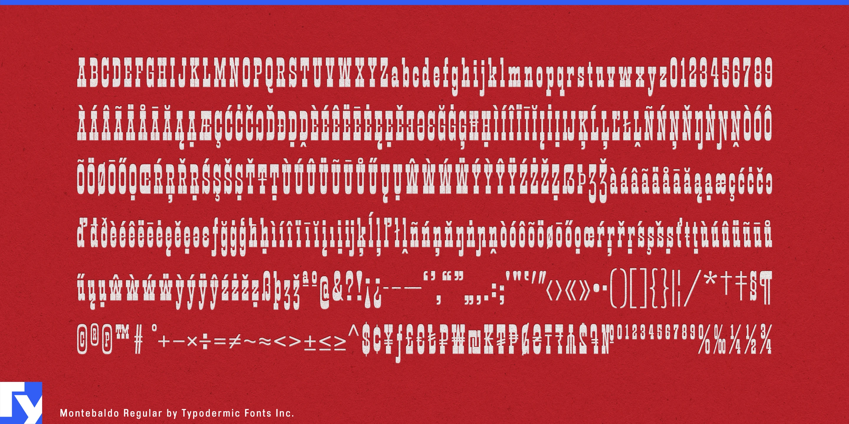

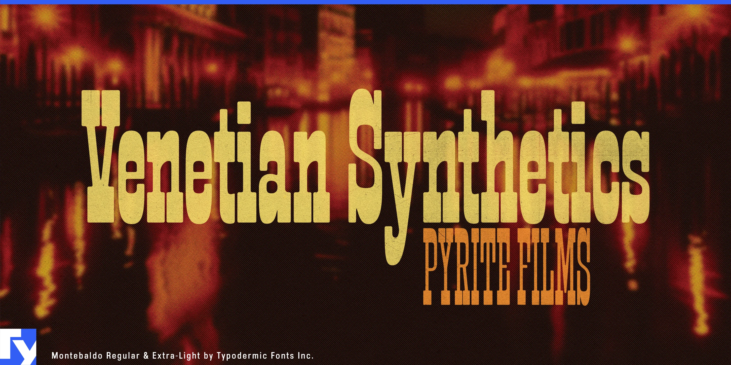
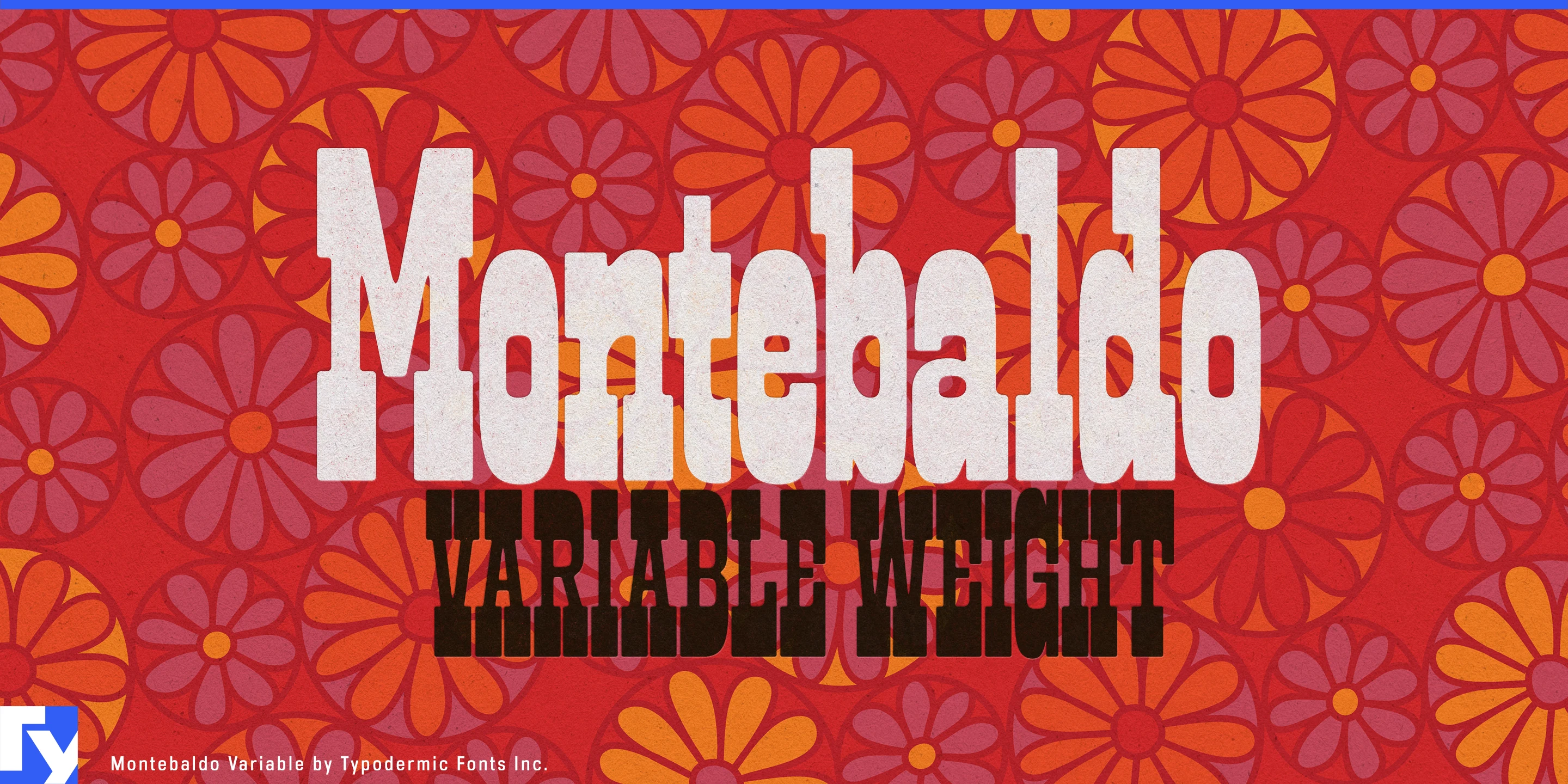
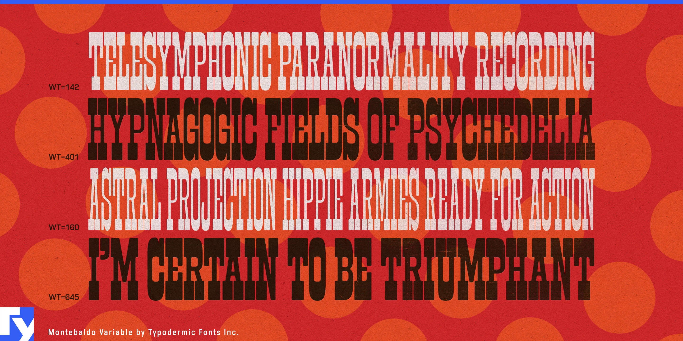
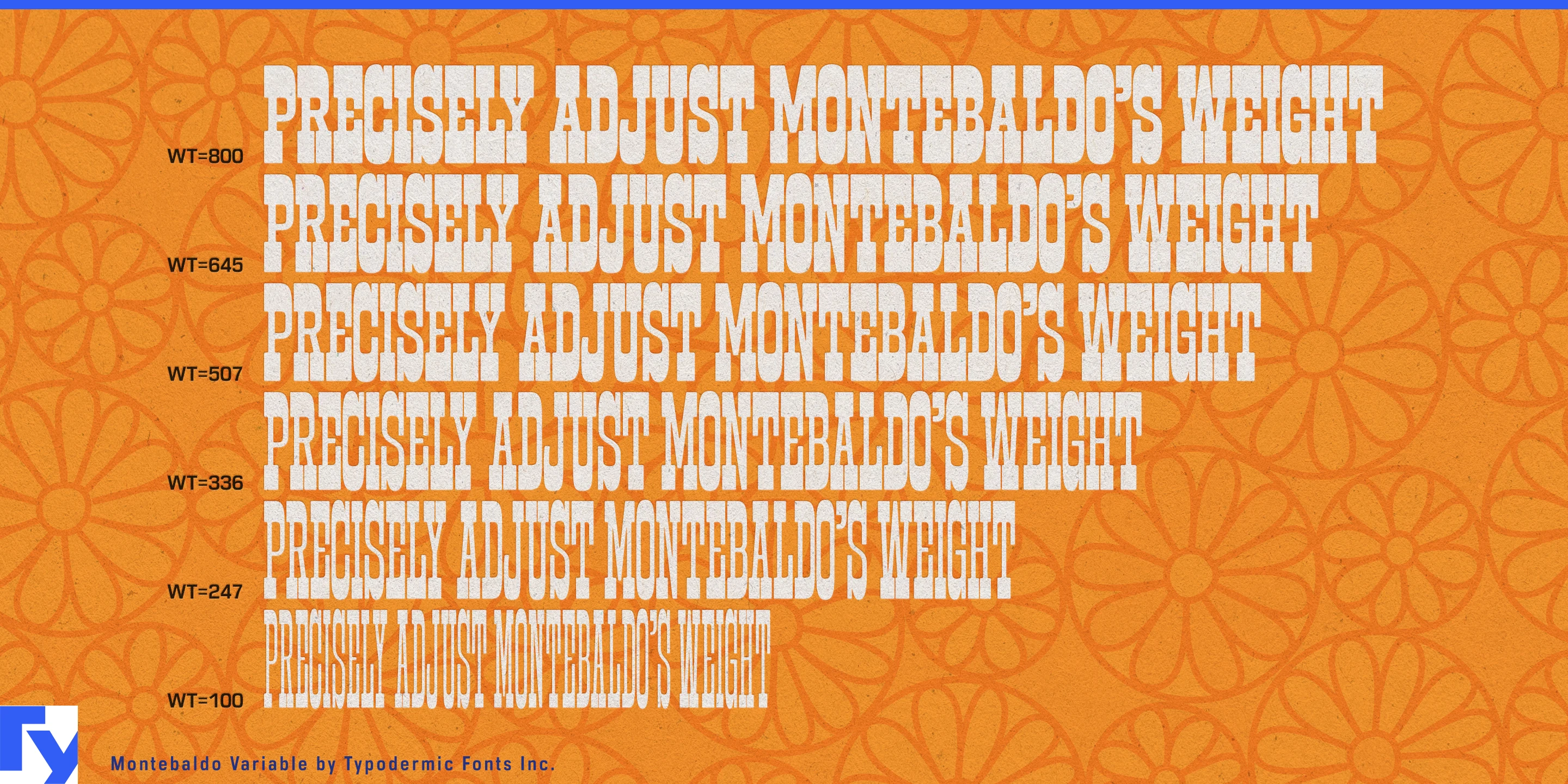
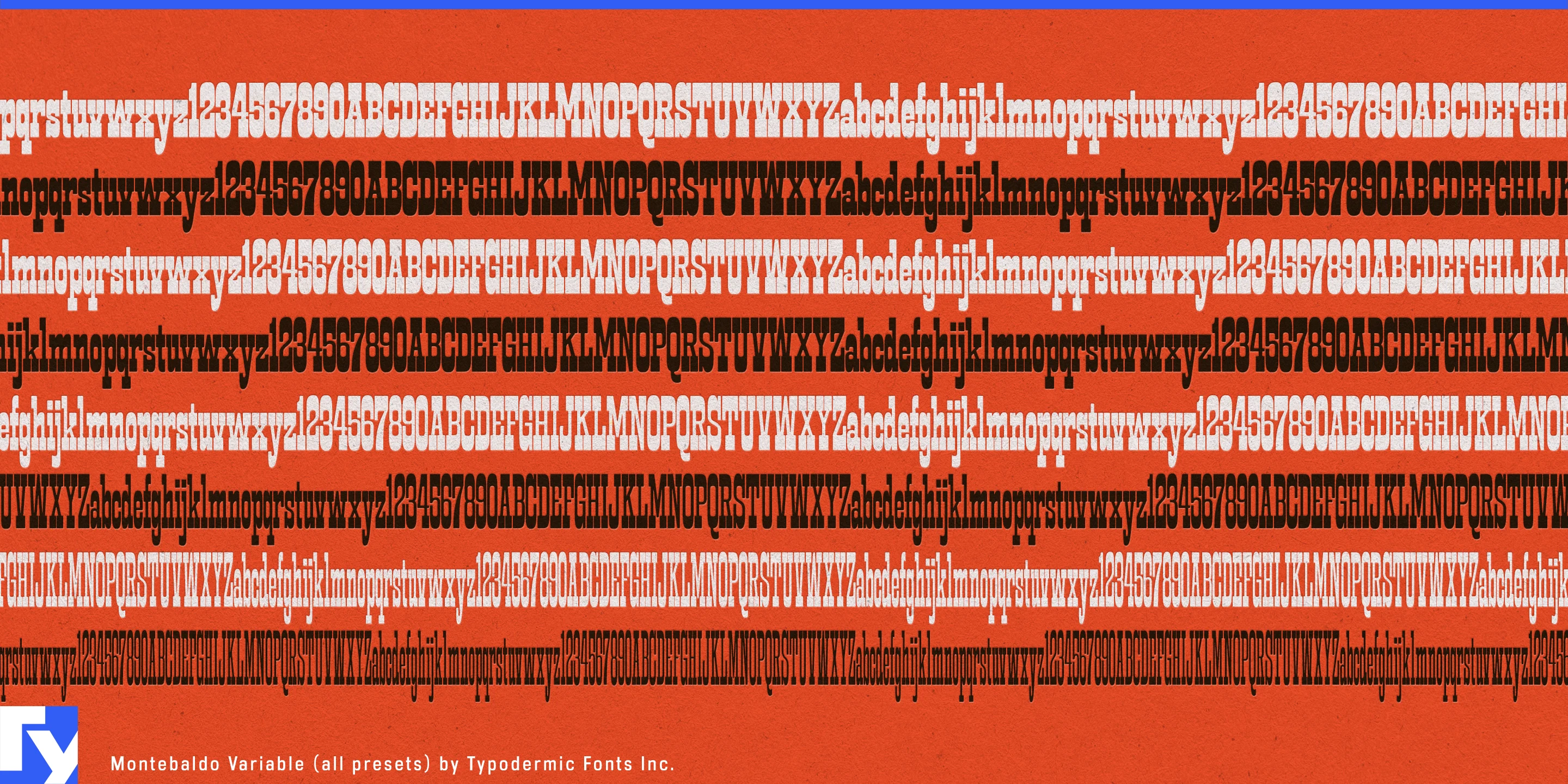
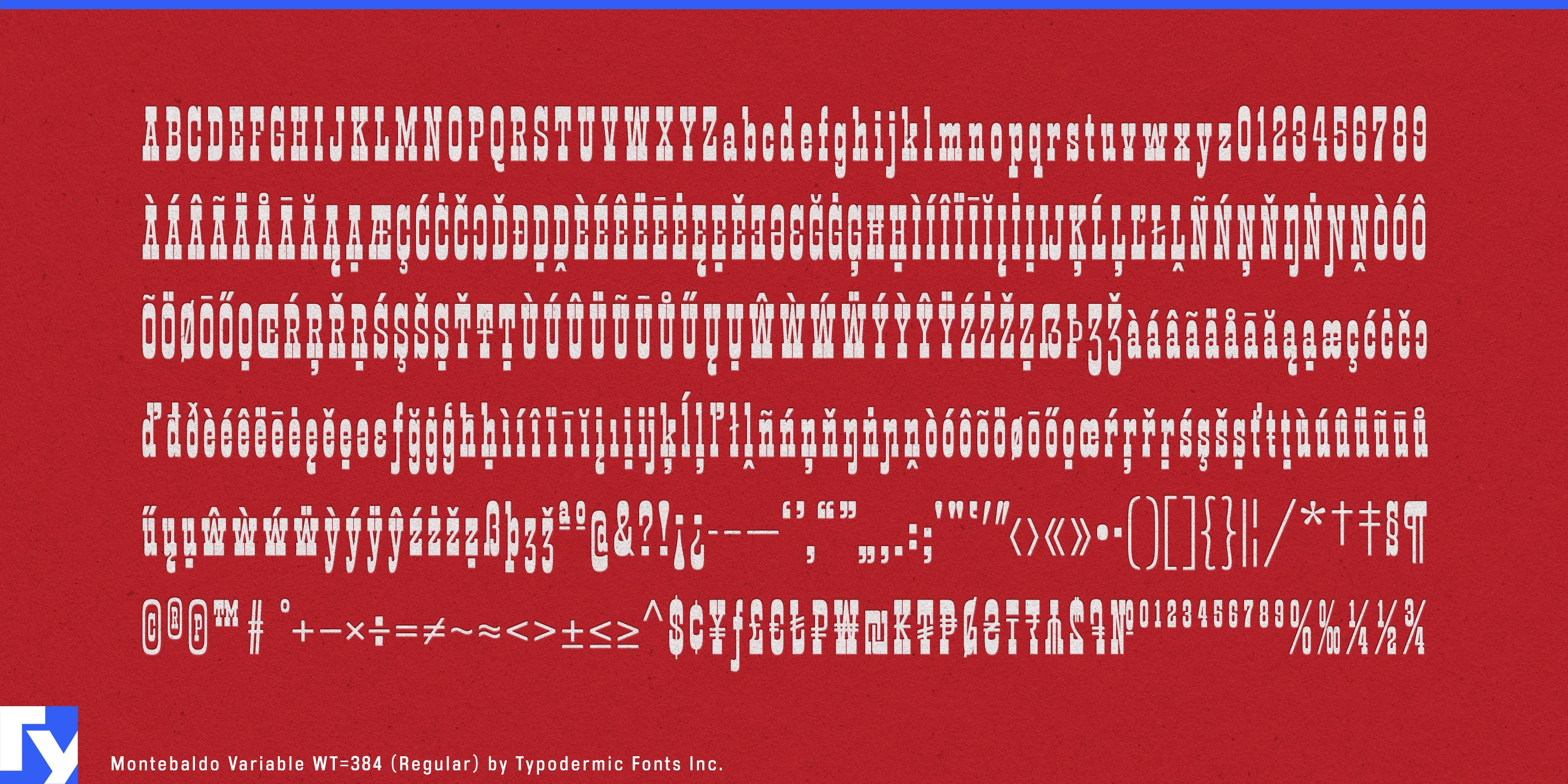

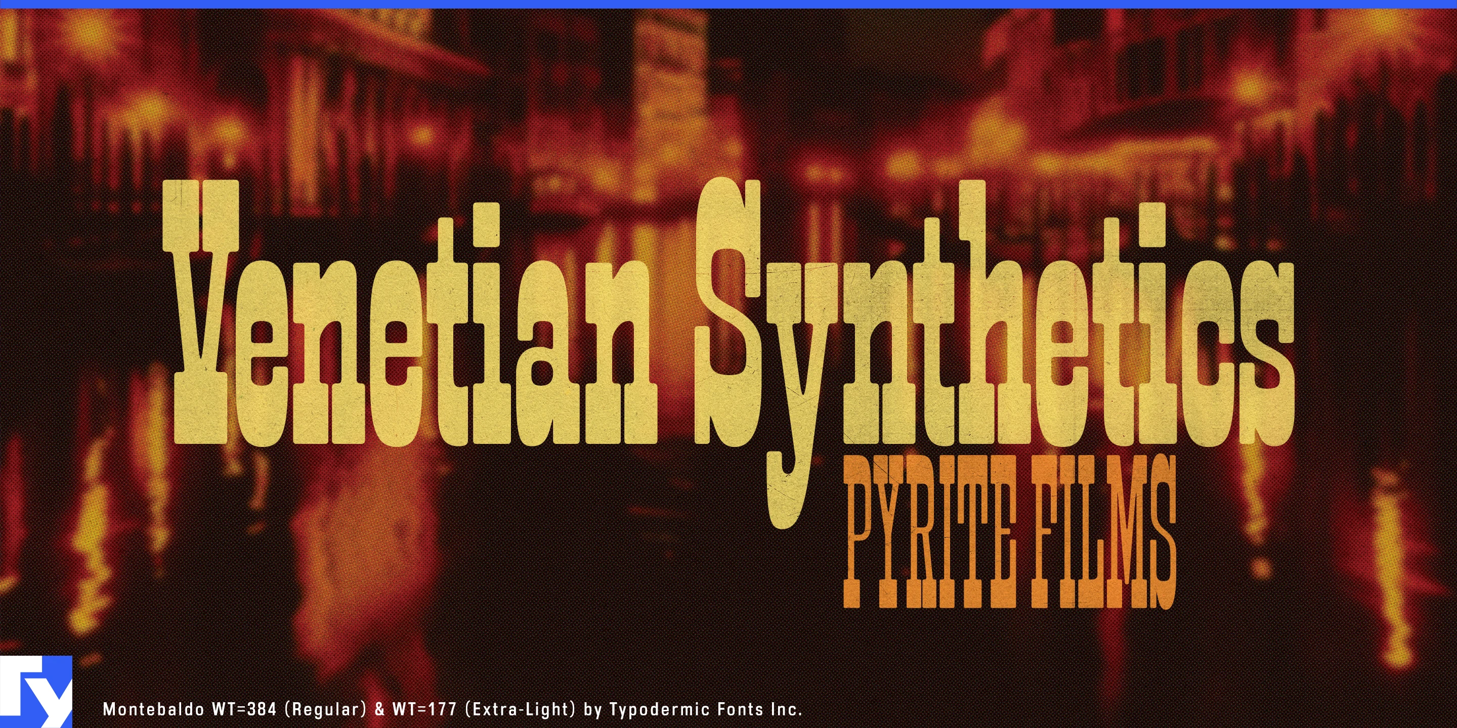
Some headline systems struggle when the words refuse to cooperate. A short title leaves too much empty space; a long one suddenly has to shrink. Montebaldo approaches that problem through a coordinated relationship between weight and width: lighter styles are narrower, while heavier styles spread out. That lets designers use emphasis to help different all-caps lines approach a common measure instead of treating every title as an isolated fitting problem.
A short word can become broad and heavy; a long phrase can move toward a lighter, more compressed treatment. Stacked together, those contrasts create solid headline blocks while preserving hierarchy. Montebaldo is strongest in uppercase, where its unusual proportions and inverse-slab construction turn words into architectural shapes rather than ordinary lines of text.
Exhibitions and cultural identities are especially good territory. An architecture biennale, design museum, photography festival, or contemporary-art programme may need dozens of titles with radically different lengths, yet entrance walls, banners, catalogue covers, tickets, directional panels, and social graphics still have to belong to one system. Montebaldo gives designers a repeatable way to make those titles occupy comparable visual territory without simply reducing everything to the size of the longest phrase.
Fashion and beauty campaigns present a similar challenge. Collection names, fragrance lines, treatment ranges, and seasonal phrases move between storefront windows, cartons, shopping bags, counter displays, transit advertising, and vertical mobile formats. Short names can become expansive and dense; longer ones can narrow and lighten while retaining the same underlying construction.
Architecture monographs, museum catalogues, photography books, design annuals, and film retrospectives can use the same logic across a series, while fragrance collections, architectural materials, designer lighting, and furniture ranges can apply it to product names across packaging, sample books, showroom walls, and trade-fair displays.
Montebaldo is most useful when headline length and emphasis need to work together. It turns uneven all-caps titles into deliberate blocks, making short words heavier and broader, long phrases lighter and narrower, and the differences between them part of the composition.
Get Montebaldo
Desktop licenses cover print, logos, and static graphics. MyFonts also offers embedding licenses for websites, e-books, and applications. Embedding licenses
Commercial font facts
Family details
- First released
- 2024
- Styles
- 8 styles
- Version
- 1.001
- Formats
- OTF
- Class
- Slab serif
- Form
- Rounded
- Width
- Condensed
- Scripts
- Latin
- Role
- Display
Commercial style names (8)
- Thin
- Extra-Light
- Light
- Regular
- Semi-Bold
- Bold
- Extra-Bold
- Black