
Soap
Get the font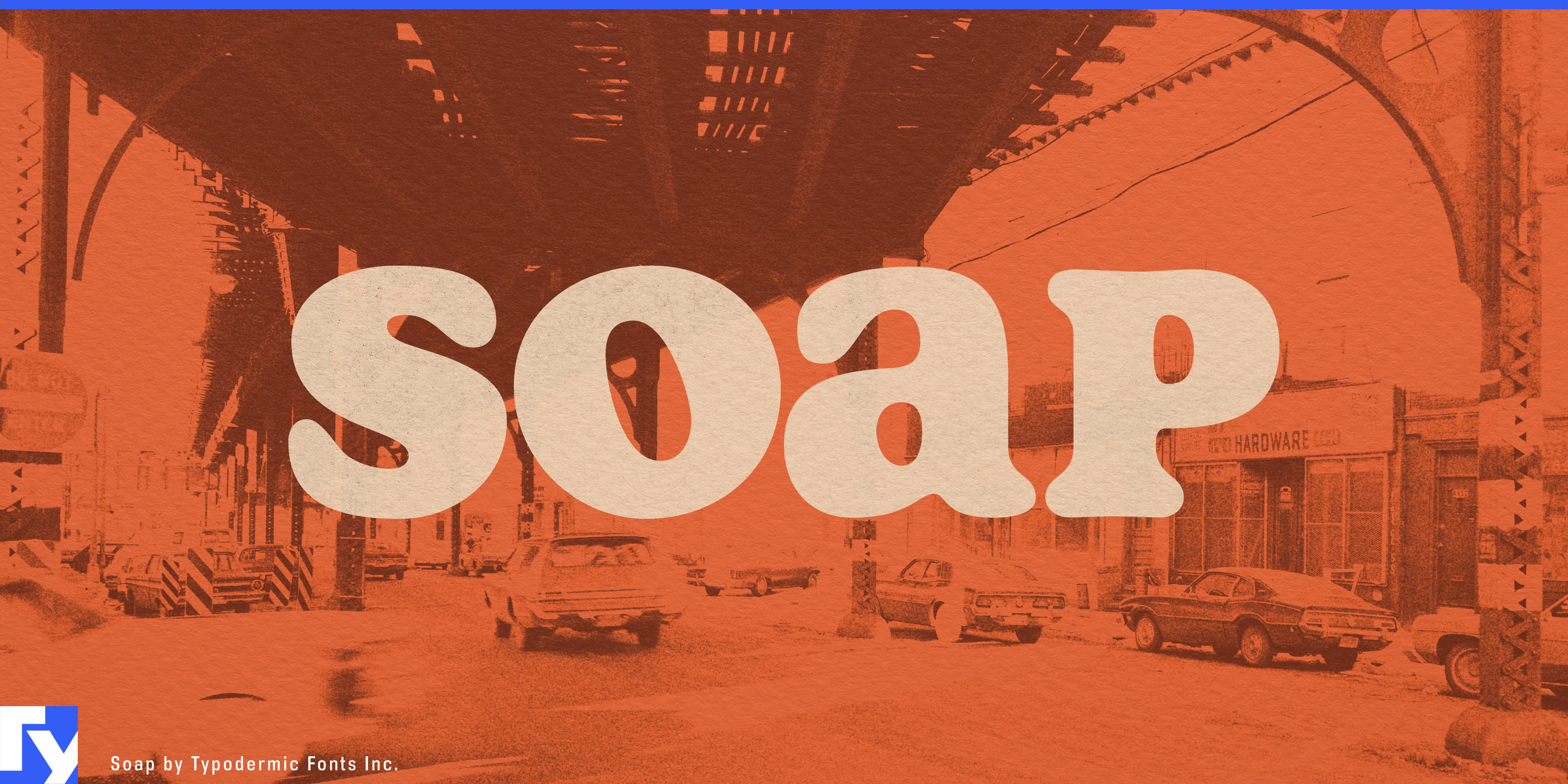
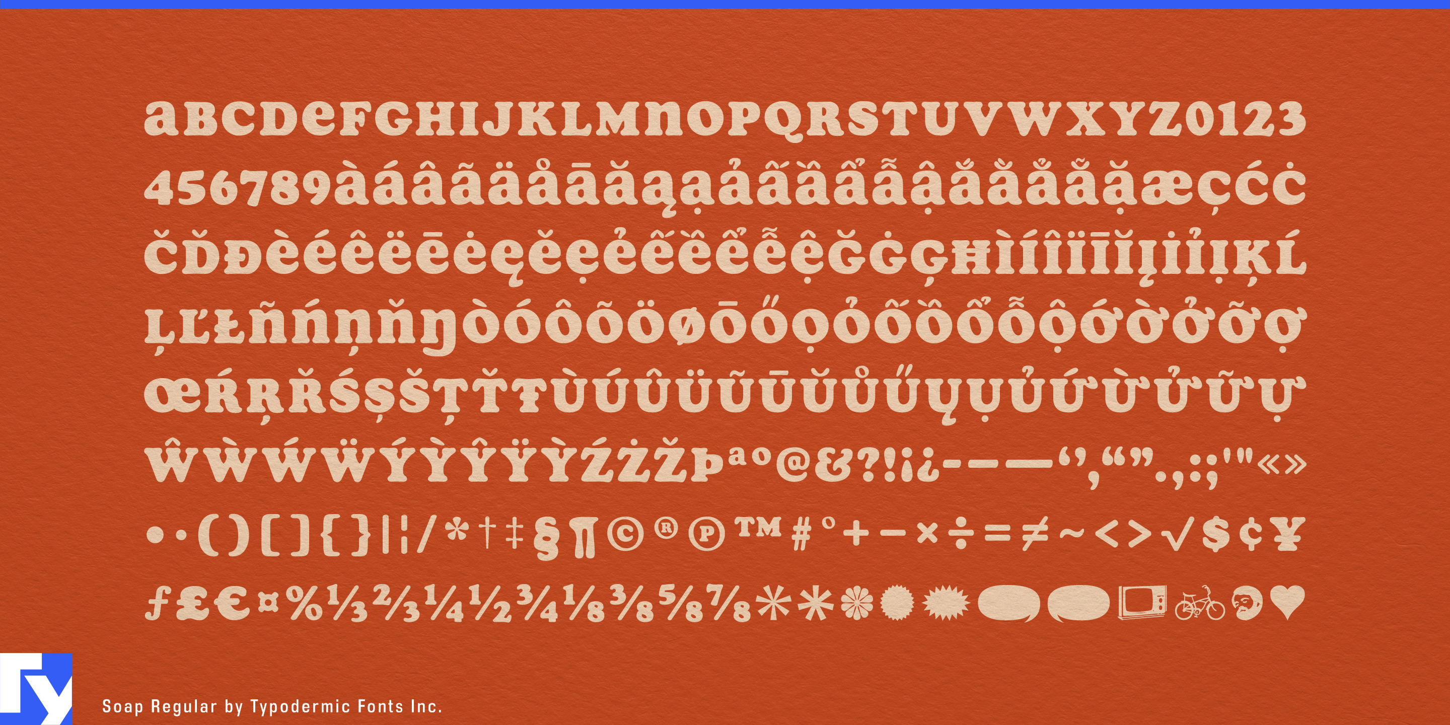
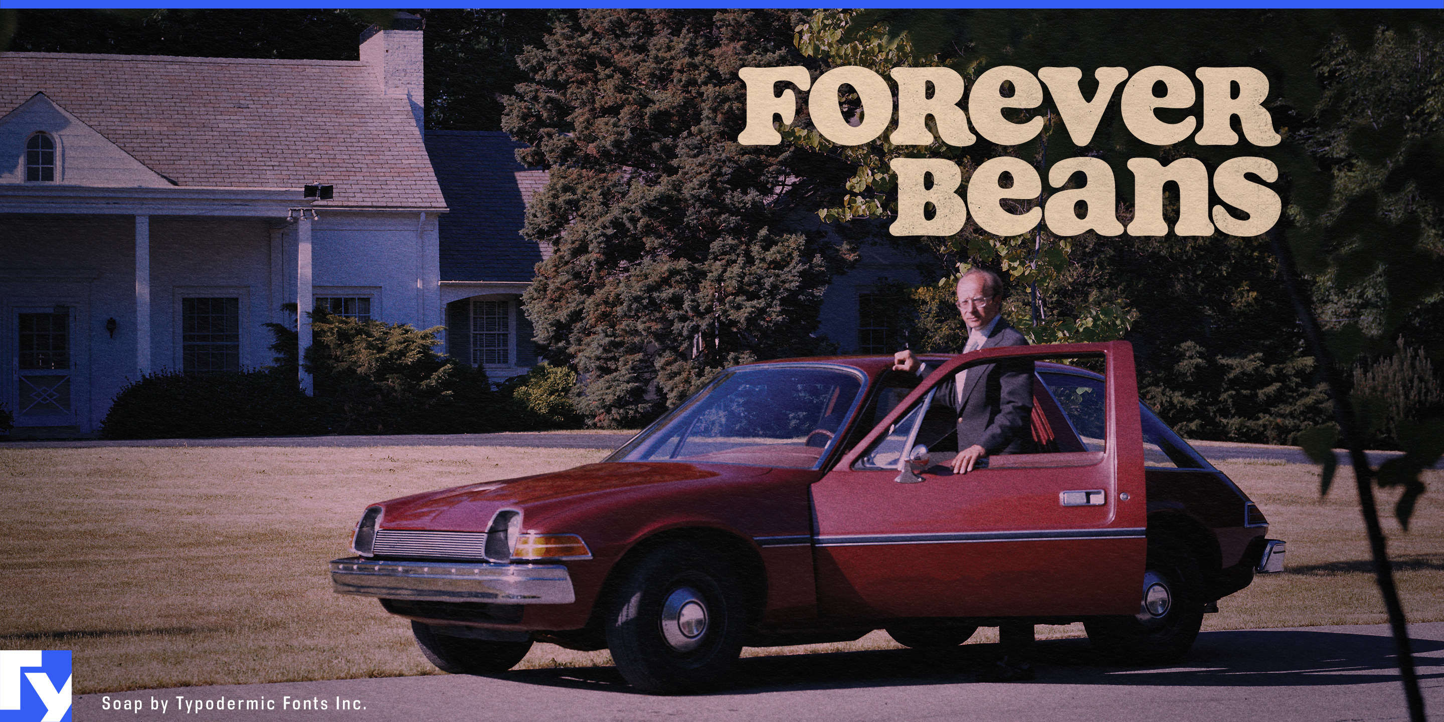
Soap starts with a simple question: how much smoother could Cooper Black get? The familiar heavy curves are softened, swollen, and relaxed until the letters seem almost melted together. Soap takes the already mellow side of Cooper Black and exaggerates it, pushing its 1970s associations further into soft shapes, flowing joins, and an easygoing unicase rhythm.
That makes Soap especially convincing around food with some physical softness or indulgence of its own. Ice cream, chocolate, pudding, cookies, doughnuts, cereal, peanut butter, milkshakes, and snack foods can use its heavy curves to make product names and flavours feel almost edible. It suits contemporary packaging that borrows from colourful 1970s supermarket graphics without reproducing a particular old label. Soap brings the period flavour through the letterforms themselves, so the surrounding design does not need to pile on retro effects.
There is another seventies food world on the healthier side of the aisle. Granola, whole-grain bread, herbal tea, natural snacks, botanical drinks, and co-op groceries can draw on the era when health-food shops, counterculture graphics, and commercial packaging shared a surprisingly similar typographic vocabulary. Soap can feel homespun and mellow without imitating hand lettering or relying on fake woodcut textures.
Music is another natural home, particularly the softer end of 1970s culture. Soul, funk, soft rock, singer-songwriter releases, mellow psychedelia, reissues, record-store graphics, and vintage music events can use Soap for album titles, artist names, posters, and merchandise. Its forms carry plenty of period atmosphere before a designer adds a rainbow, sunburst, lava lamp, or any of the usual props.
The same quality works for businesses that deliberately inhabit an older, less polished consumer world: record shops, vintage clothing stores, second-hand furniture, ceramics, plant shops, retro motels, casual cafés, herbal products, and relaxed lifestyle brands. Soap is familiar enough to feel immediately readable, but its exaggerated smoothness keeps it from simply looking like Cooper Black pulled straight from the type menu.
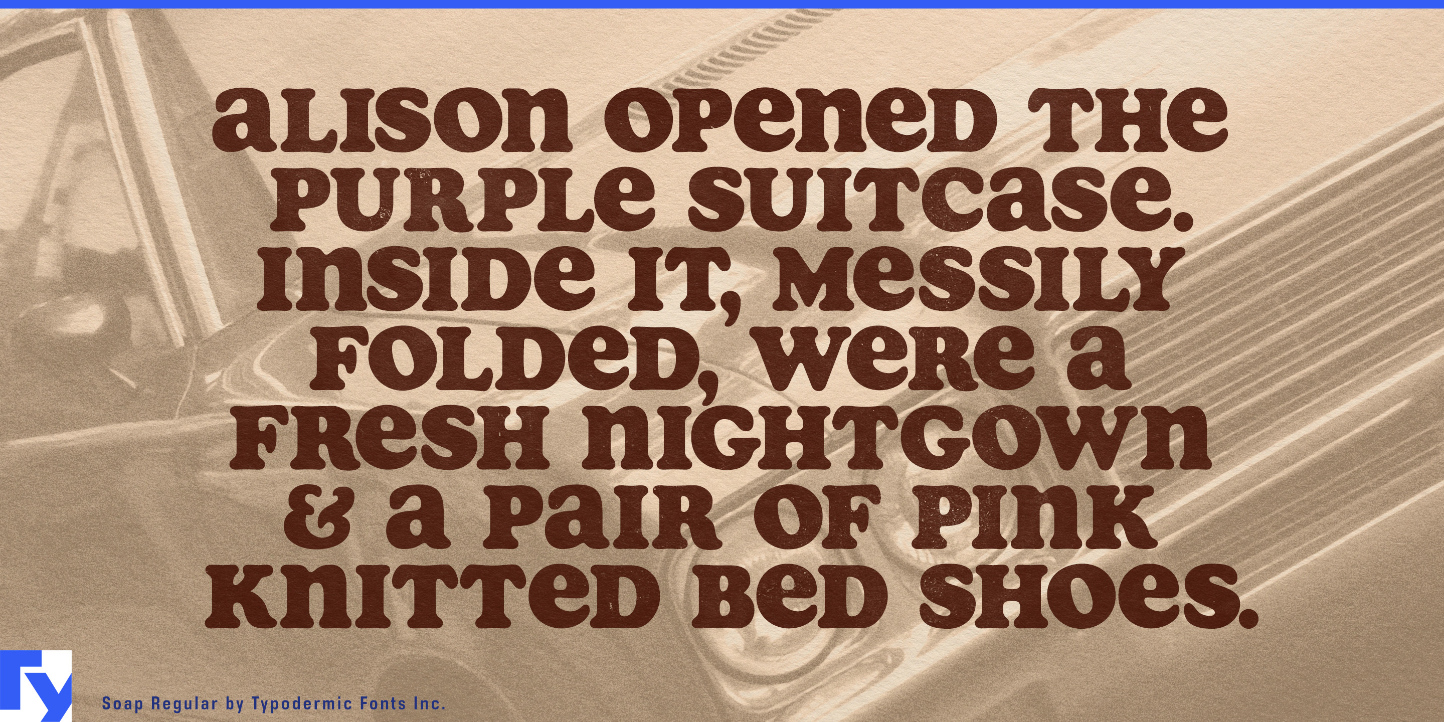
The unicase construction adds to that looseness. Capitals and lowercase forms mingle at a similar scale, creating chunky display copy with a rhythm less formal than conventional mixed case. Flavour names, shop signs, record titles, package headings, short slogans, and several lines of large copy can all make use of its rolling texture.
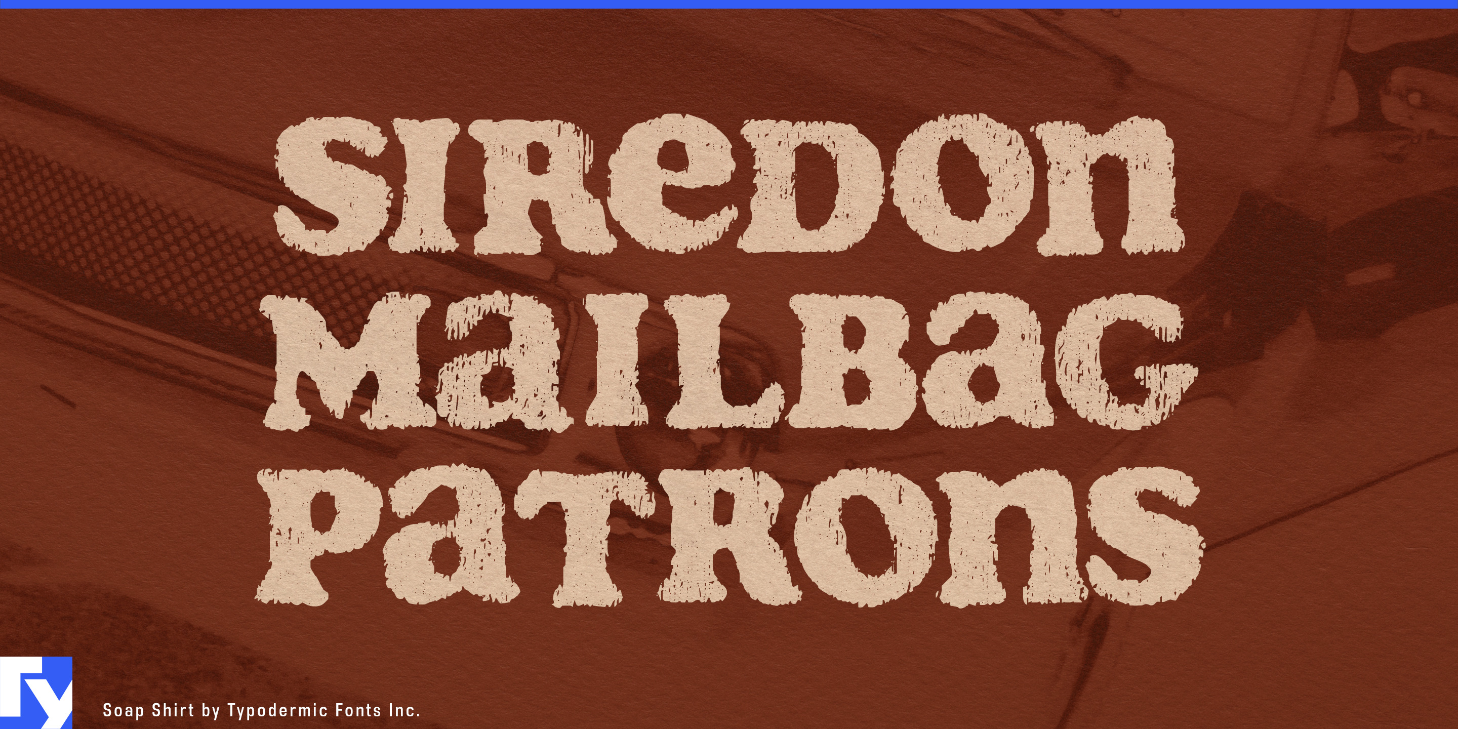
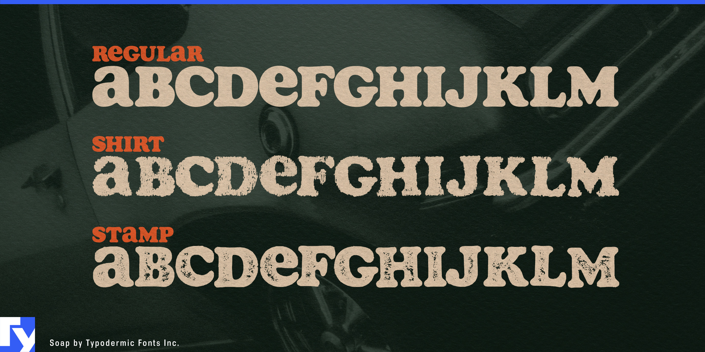
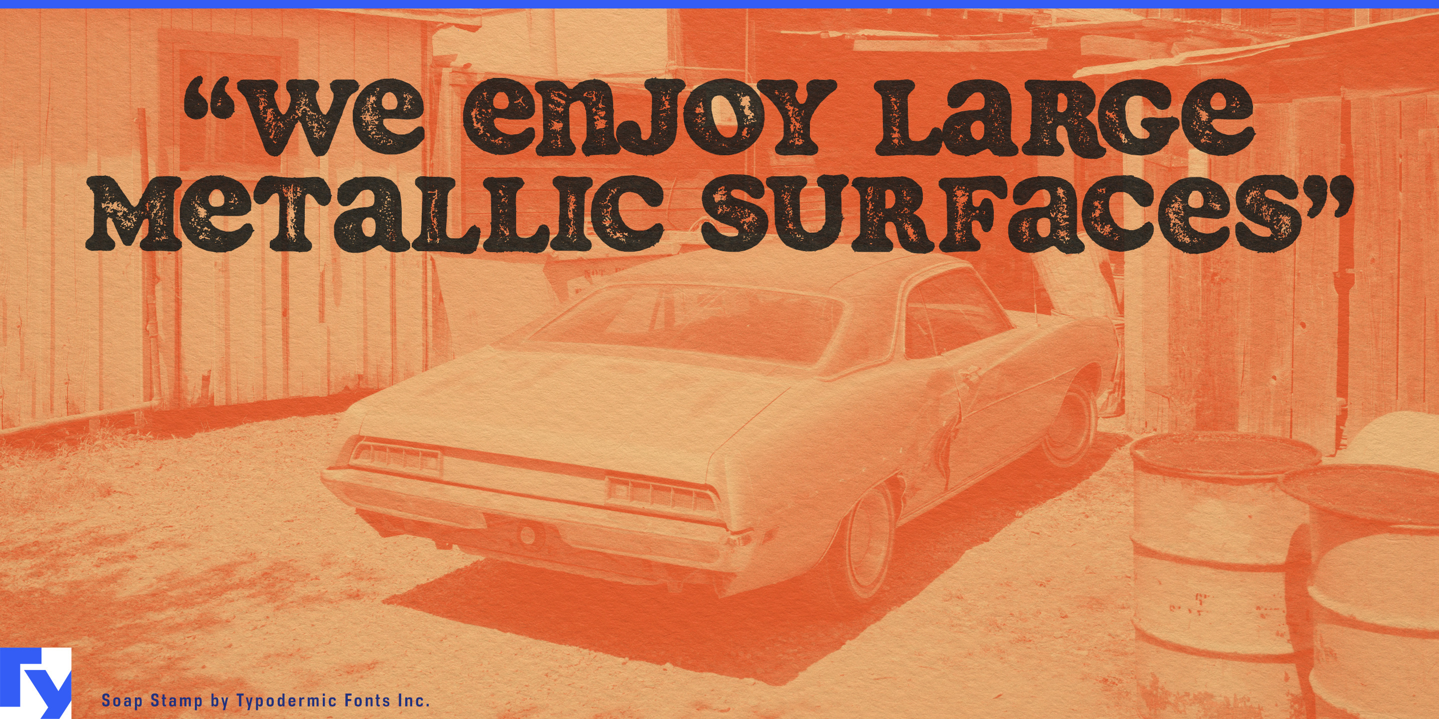
Distressed versions push the same design into more physical territory, suggesting an old T-shirt, faded gig poster, stamped package, thrift-store graphic, or weathered piece of printed ephemera. The clean version keeps the seventies softness without the wear, for nostalgia that needs to feel freshly printed rather than rediscovered in a basement.
Cooper Black made heavy serif lettering famously friendly. Soap takes that softness further, rounds off whatever resistance remains, and lets the seventies linger a little longer.
Get Soap
Desktop licenses cover print, logos, and static graphics. MyFonts also offers embedding licenses for websites, e-books, and applications.
Commercial font facts
Family details
- First released
- 2005
- Styles
- 3 styles
- Version
- 2.401
- Formats
- OTF
- Class
- Serif
- Form
- Rounded, Low contrast
- Case
- Unicase
- Scripts
- Latin
- Role
- Display
- Features
- Distressed, Alternates
Commercial style names (3)
- Regular
- Shirt
- Stamp