
Shlop
Get the font
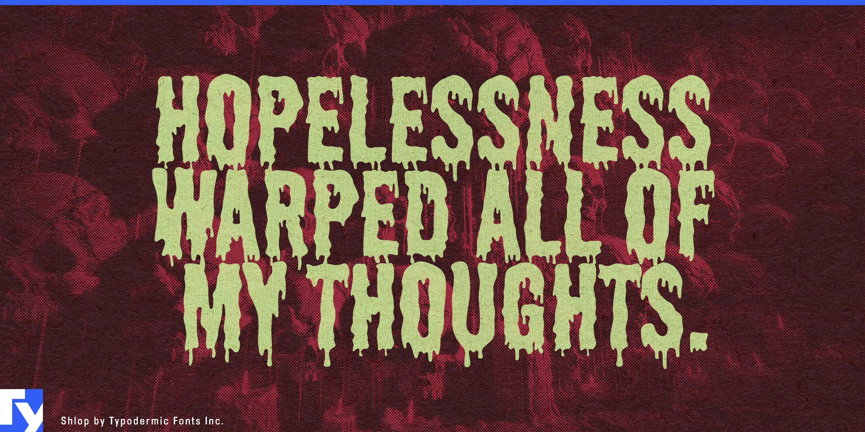
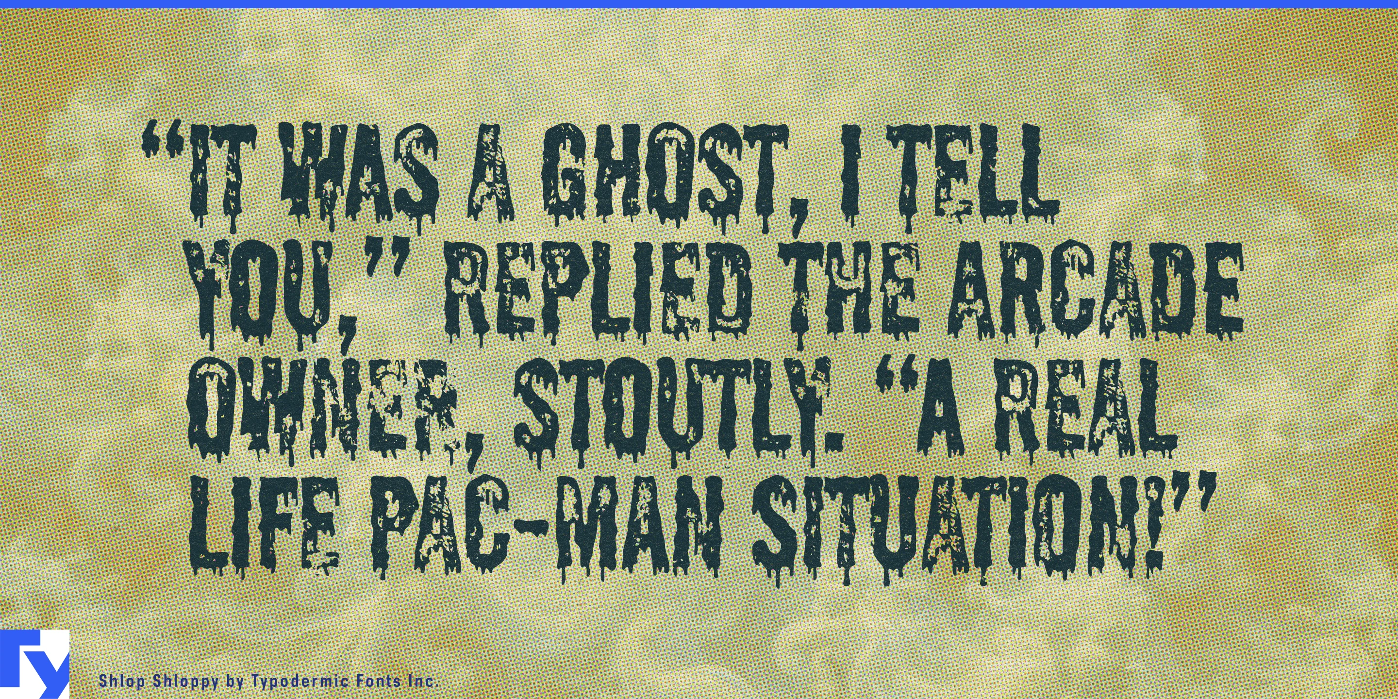


Shlop already has the drips. Shlop Shloppy adds the artifact.
The familiar horror silhouette remains, but the solid areas break apart into irregular, under-inked texture. Instead of looking like clean vector lettering placed over distressed artwork, Shloppy appears to have gone through the same rough printing process as everything around it. Ink coverage falters, edges deteriorate and adjoining letters can congeal into messier, more physical word shapes.
That makes Shlop Shloppy especially useful for licensed horror apparel. Vintage-style monster shirts, anniversary merchandise, attraction souvenirs, cult-film collections and horror-franchise capsules often need new lettering to sit beside screen-printed illustrations, faded photography and deliberately cheap-looking graphics. Shloppy gives chest prints, back graphics and supporting slogans the same imperfect surface as the rest of the garment.
Haunted attractions and seasonal horror events offer another strong setting. Horror mazes, scare parks and immersive attractions need individual house names, fictional institutions, warning signs, queue graphics, staff shirts and souvenir merchandise alongside the polished identity of the overall event. Shloppy can make a laboratory, cult, carnival or dubious local business look as though its graphics were printed inside the fictional world.
Retro horror media benefits from the same effect. VHS-inspired collector editions, grindhouse reissues, soundtrack packages and exploitation-film merchandise depend on the physical language of inexpensive printing and degraded reproduction. Edition titles, distributor names, warning bursts and promotional lettering can look convincingly battered without introducing suspiciously perfect edges.
Monster figures, masks, model kits, trading cards and other horror collectibles can use Shloppy when their packaging should resemble a forgotten monster product or flea-market discovery. In games, it is especially effective on objects within the fictional world: cassette labels, cult pamphlets, contaminated files, arcade graphics and battered video sleeves.
Shlop Regular is the stronger choice when the dripping silhouette alone needs to be clear and direct. Shlop Shloppy earns its place when the lettering needs a production history: under-inked, cheaply screen-printed, photocopied, weathered or dragged out of some dubious old piece of horror merchandise.
Get Shlop
Desktop licenses cover print, logos, and static graphics. MyFonts also offers embedding licenses for websites, e-books, and applications. Embedding licenses
Commercial font facts
Family details
- First released
- 1997
- Styles
- 2 styles
- Version
- 4.002
- Formats
- OTF
- Class
- Sans serif
- Form
- Grotesque
- Scripts
- Latin
- Role
- Display
- Features
- Ligatures
Commercial style names (2)
- Regular
- Shloppy