
Mixolydian
Get the font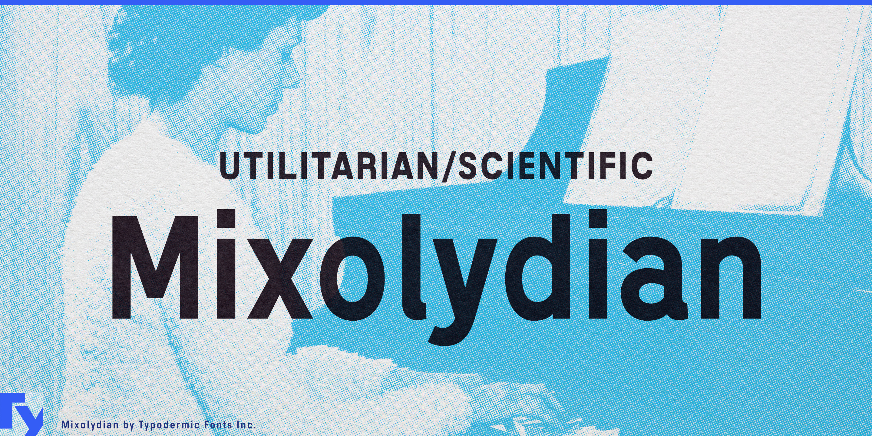
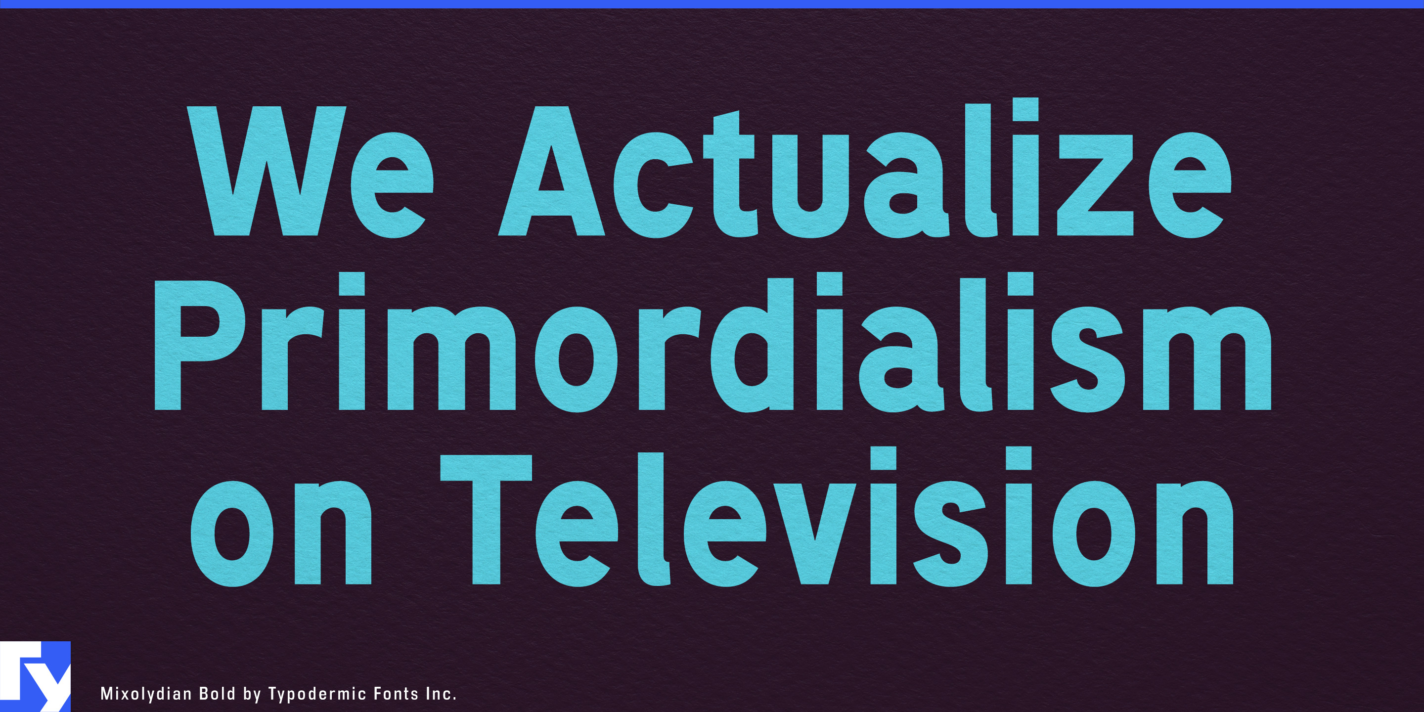
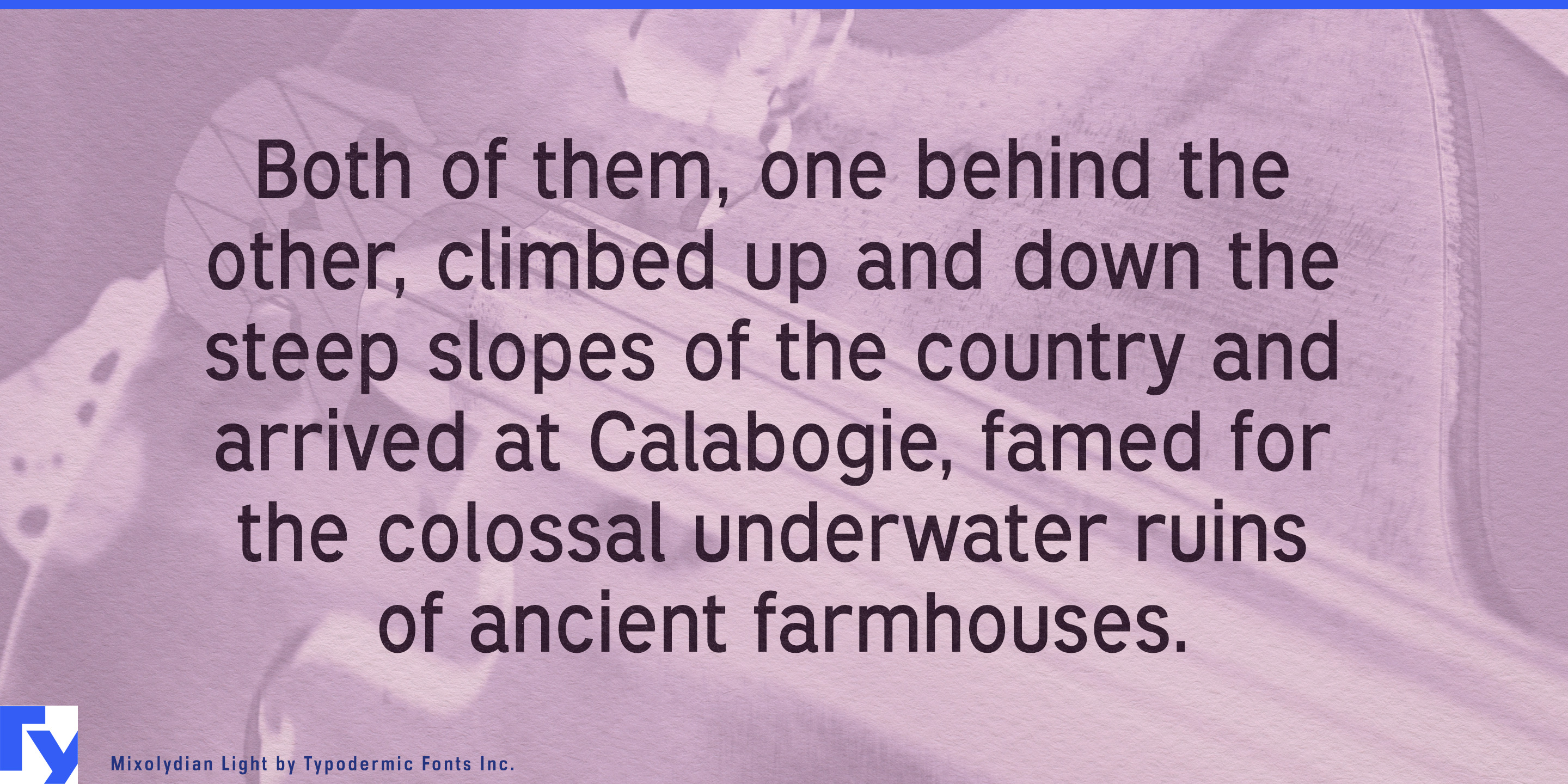
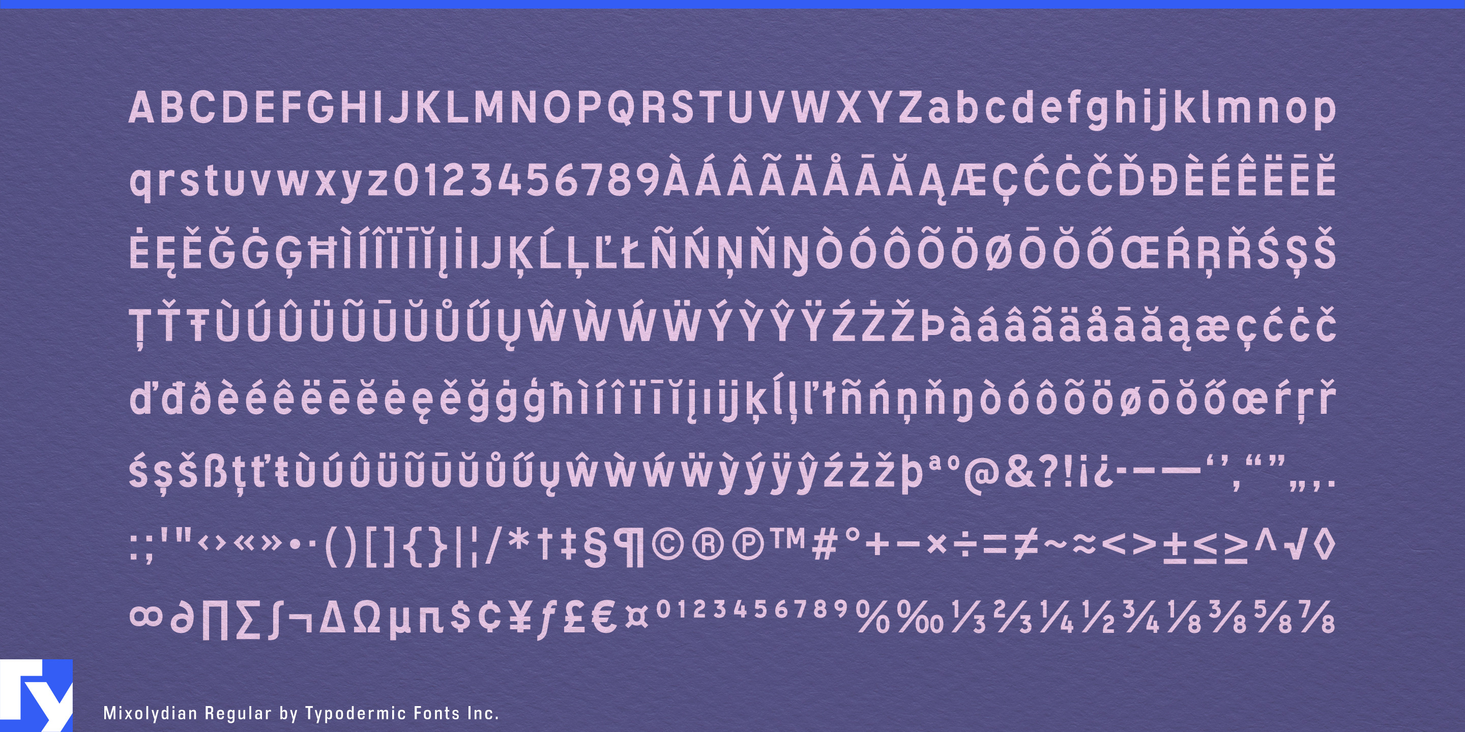

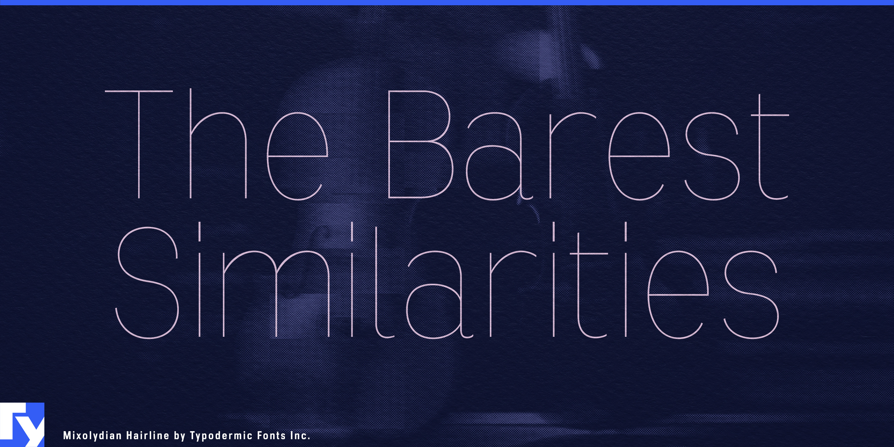
Mixolydian is the typographic equivalent of a grey work jumpsuit or a white lab coat. Its forms draw on American road-sign lettering and drafting templates, sources designed to communicate information rather than advertise themselves. The result is a utilitarian sans-serif with blunt geometry, slightly uneven proportions, and the matter-of-fact rhythm of something issued by a department, specified by an engineer, or labeled for inspection.
That character suits organizations that need to look procedural, competent, and standardized. Industrial measurement equipment, factory automation, machine vision, semiconductor production, building controls, environmental monitoring, and municipal infrastructure all generate typography that moves between physical equipment and information systems. Mixolydian can carry model numbers on enclosures, operating instructions beside control panels, headings in service manuals, labels in diagrams, and status information on monitoring dashboards without changing visual language between the machine and its documentation.
The same quality works particularly well for science-forward supplements and nutraceuticals. Longevity products, mineral complexes, sports-recovery formulas, microbiome products, electrolyte systems, and clinical nutrition often have to organize concentrations, variants, ingredients, dosage information, and technical claims while establishing scientific credibility. Mixolydian suits bottles and cartons, sachet systems, formulation charts, ingredient matrices, comparison tables, practitioner literature, and technical product pages. It pushes a product line toward laboratories, formulations, and controlled processes rather than cosmetics or lifestyle wellness.
Ingredient suppliers, analytical laboratories, contract manufacturers, pharmaceutical production companies, and formulation specialists can use the same visual language for specification sheets, testing reports, sample kits, technical presentations, equipment interfaces, and trade-show graphics. Mixolydian is especially useful when one organization spans the factory floor, laboratory, control room, field installation, and corporate office.
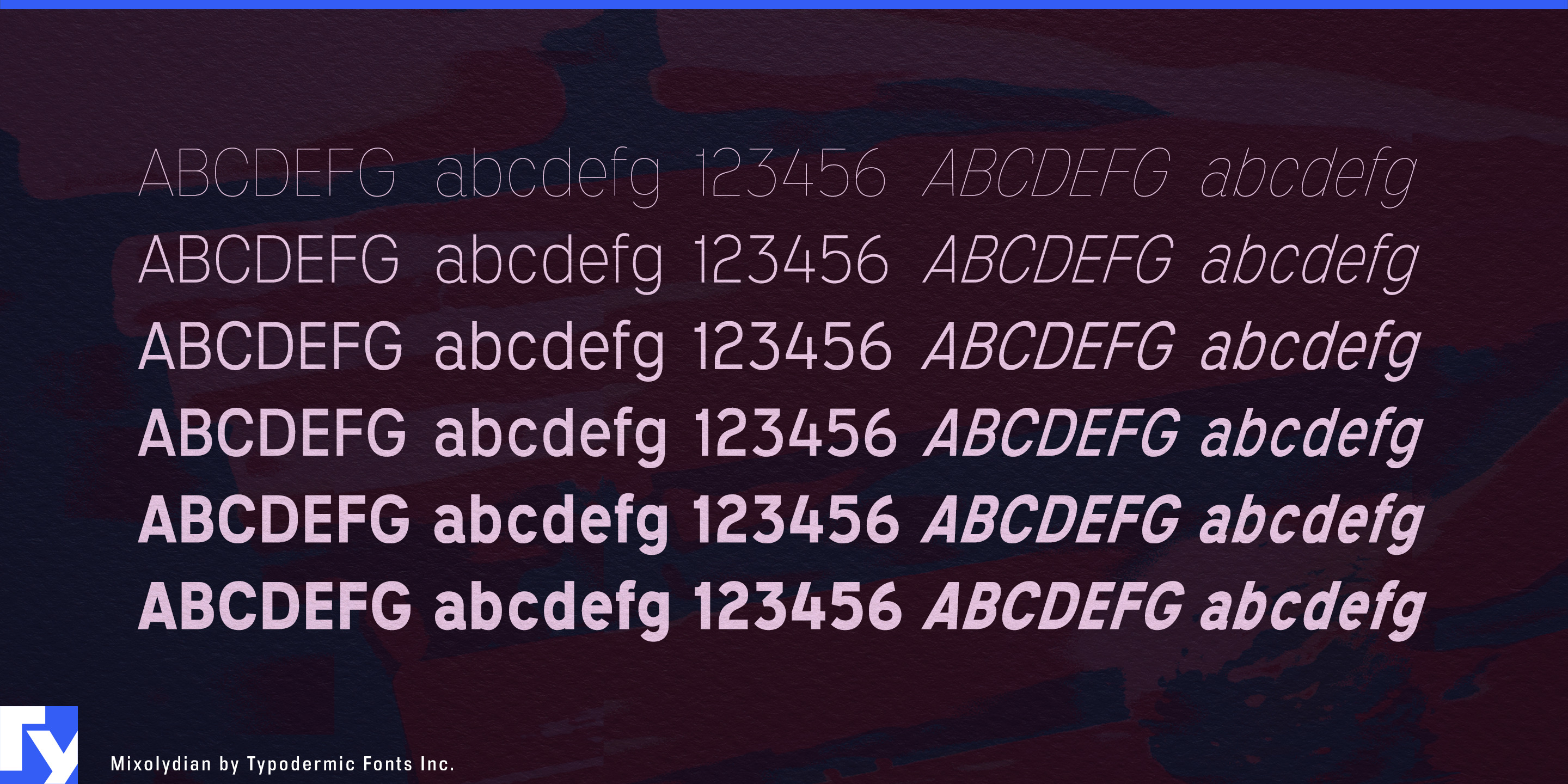
The lighter weights can take on the restrained quality of technical drawing annotations, analytical interfaces, and research graphics, while the heavier styles provide the sturdiness needed for equipment identifiers, section headings, facility graphics, and product names. Across the family, Mixolydian retains enough of its highway-and-drafting ancestry to feel built for a purpose, while its lowercase and range of weights let it function far beyond imitation signage.
Get Mixolydian
Desktop licenses cover print, logos, and static graphics. MyFonts also offers embedding licenses for websites, e-books, and applications.
Commercial font facts
Family details
- First released
- 2012
- Styles
- 12 styles
- Version
- 1.100–1.200 (source evidence varies)
- Formats
- OTF
- Class
- Sans serif
- Form
- Geometric
- Case
- Mixed case
- Scripts
- Latin
- Role
- Dual purpose
Commercial style names (12)
- Hairline
- Hairline Italic
- Thin
- Thin Italic
- Extra-Light
- Extra-Light Italic
- Light
- Light Italic
- Regular
- Italic
- Bold
- Bold Italic