
Tussilago
Get the font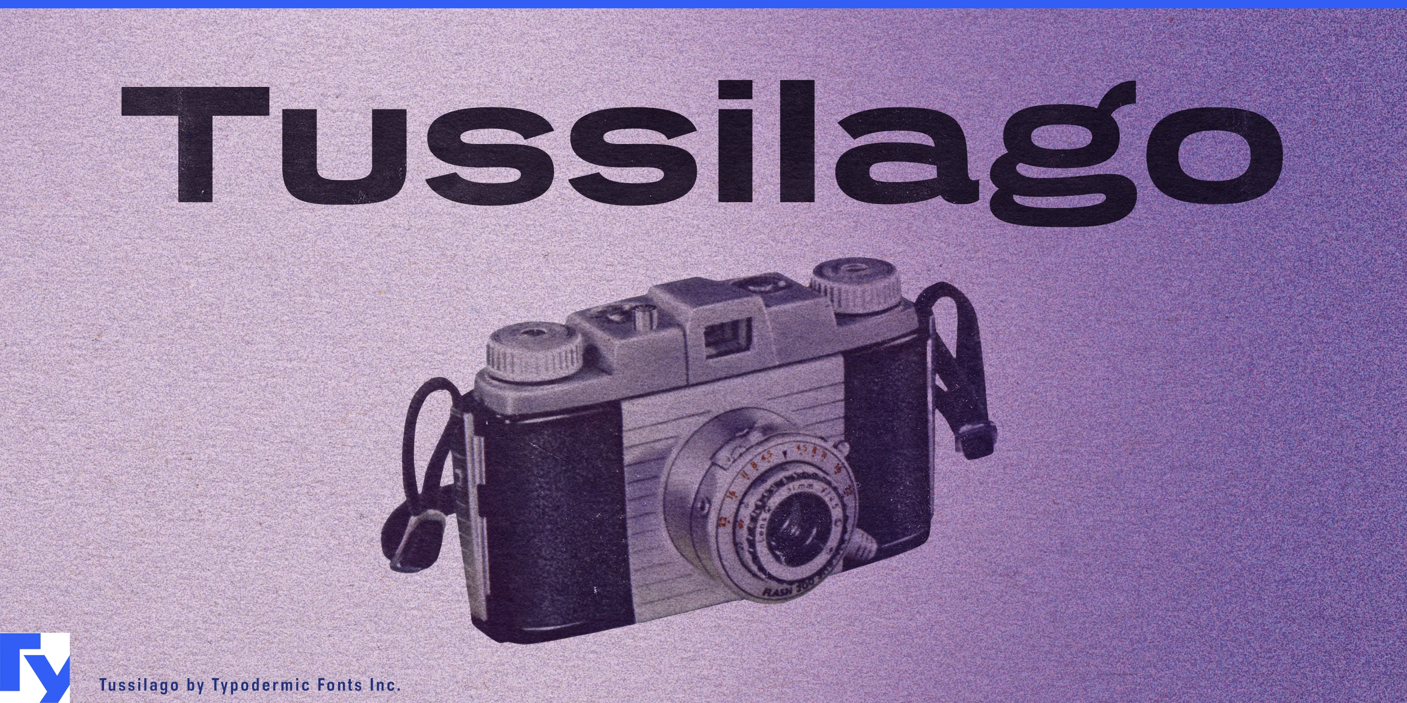
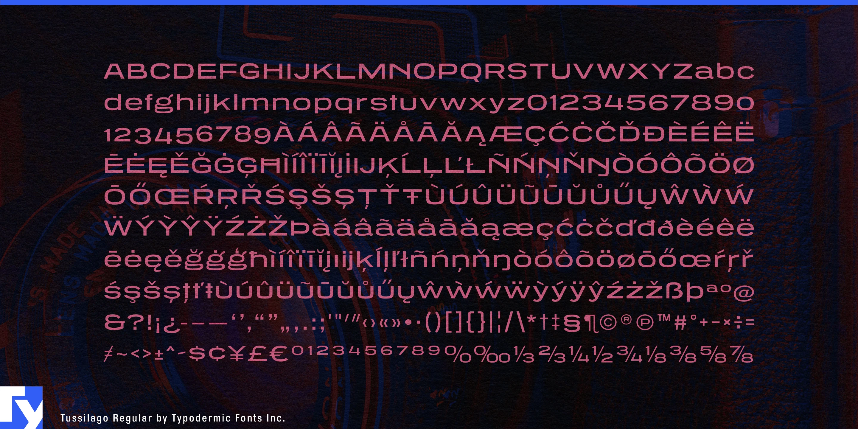
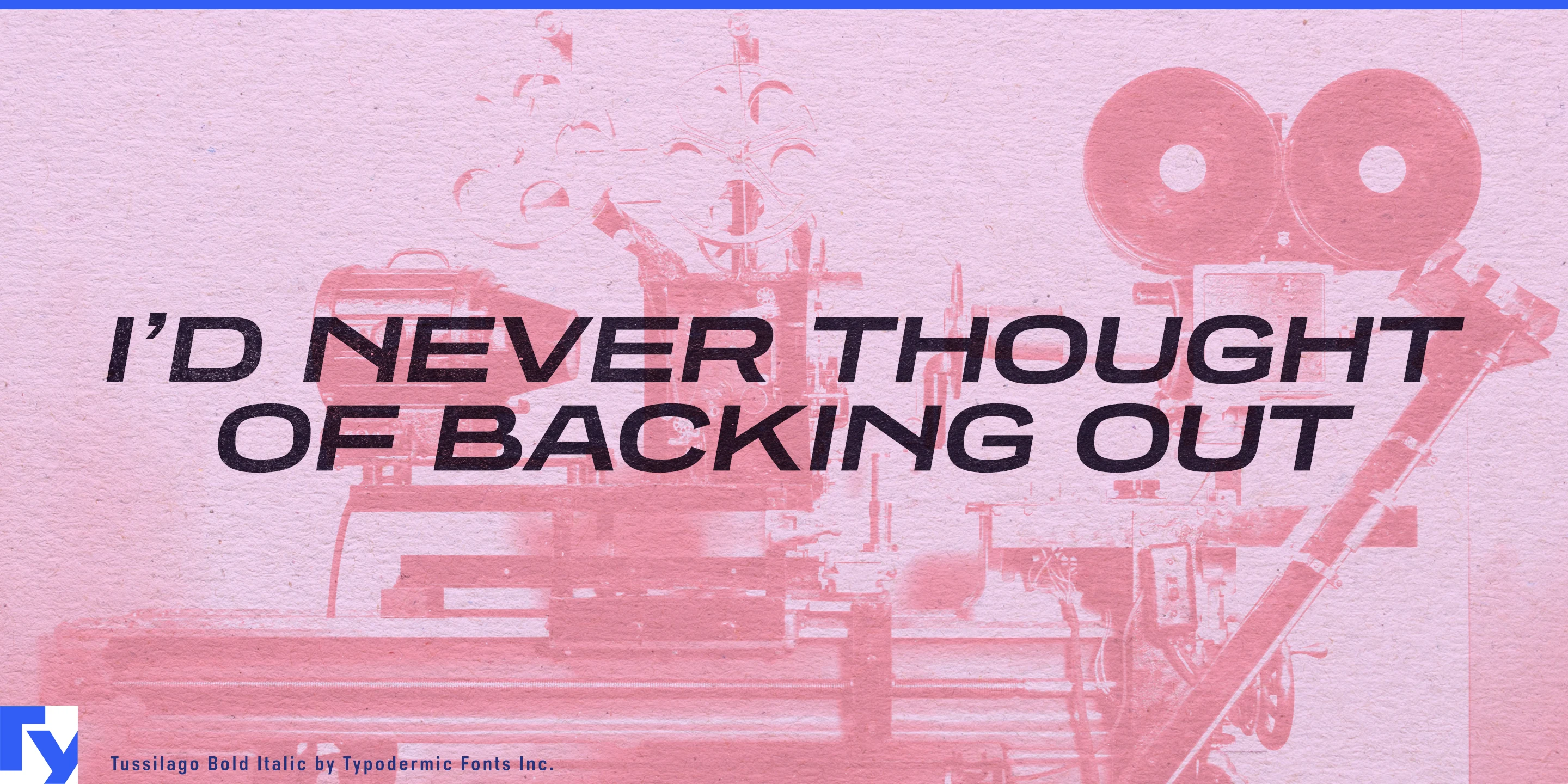

Some products have horizontal space to spend. A bicycle down tube, linear pendant, amplifier fascia, range hood or entrance canopy can leave a normal-width wordmark looking undersized, while added tracking fills the space without adding much substance. Tussilago builds that width into the letterforms.
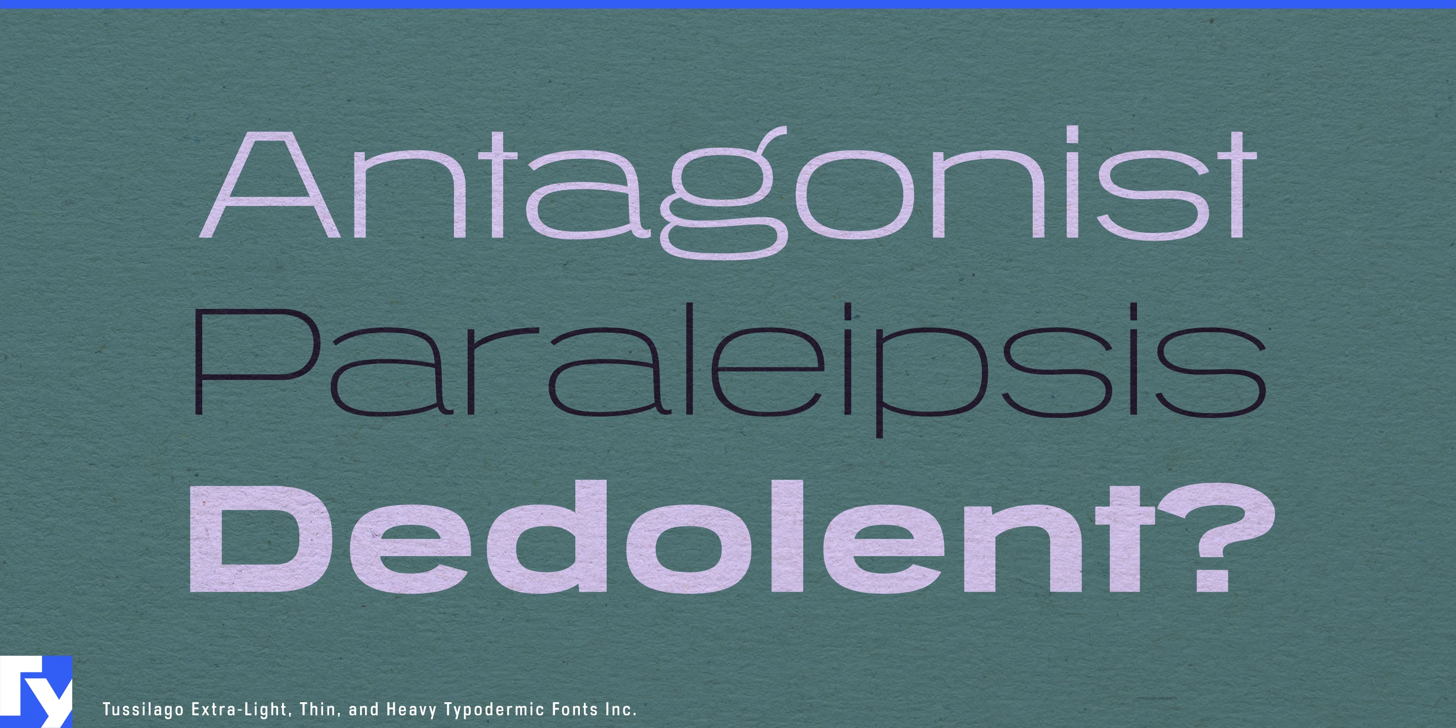
Tussilago is a wide sans-serif with geometric construction, low contrast and sturdy, open forms. Its proportions carry an echo of mid-twentieth-century display typography, but the design is less rigid than a strict geometric and avoids the look of a period reproduction. It suits contemporary products that need to appear engineered and deliberately designed without drifting into generic tech minimalism or science-fiction styling.
Bicycle and e-bike frames are a natural fit. Down tubes, top tubes, integrated battery housings and cargo-bike bodies provide long, shallow surfaces where a marque or model name can become part of the object’s proportions. Similar opportunities appear in linear architectural lighting, range hoods, built-in appliance fascias, heat-pump cabinets, ventilation equipment and other horizontally proportioned building systems.
Audio and electronic equipment offer another kind of long frontage. Soundbars, amplifiers, synthesizers, keyboards, rack-mounted hardware and mixing equipment give product-family names and model designations room to spread laterally. Tussilago’s geometry feels engineered without resembling interface typography, making it especially useful for equipment intended to look durable rather than momentarily futuristic.
At architectural scale, Tussilago works for entrance canopies, showroom fascias, concourse identifiers, broad directory headings and building names with enough wall space to exploit its width. Its modernist undertone also suits exhibitions concerned with industrial design, architecture, transportation and domestic technology, where contemporary typography may need to coexist with mid-century objects without imitating their original lettering.
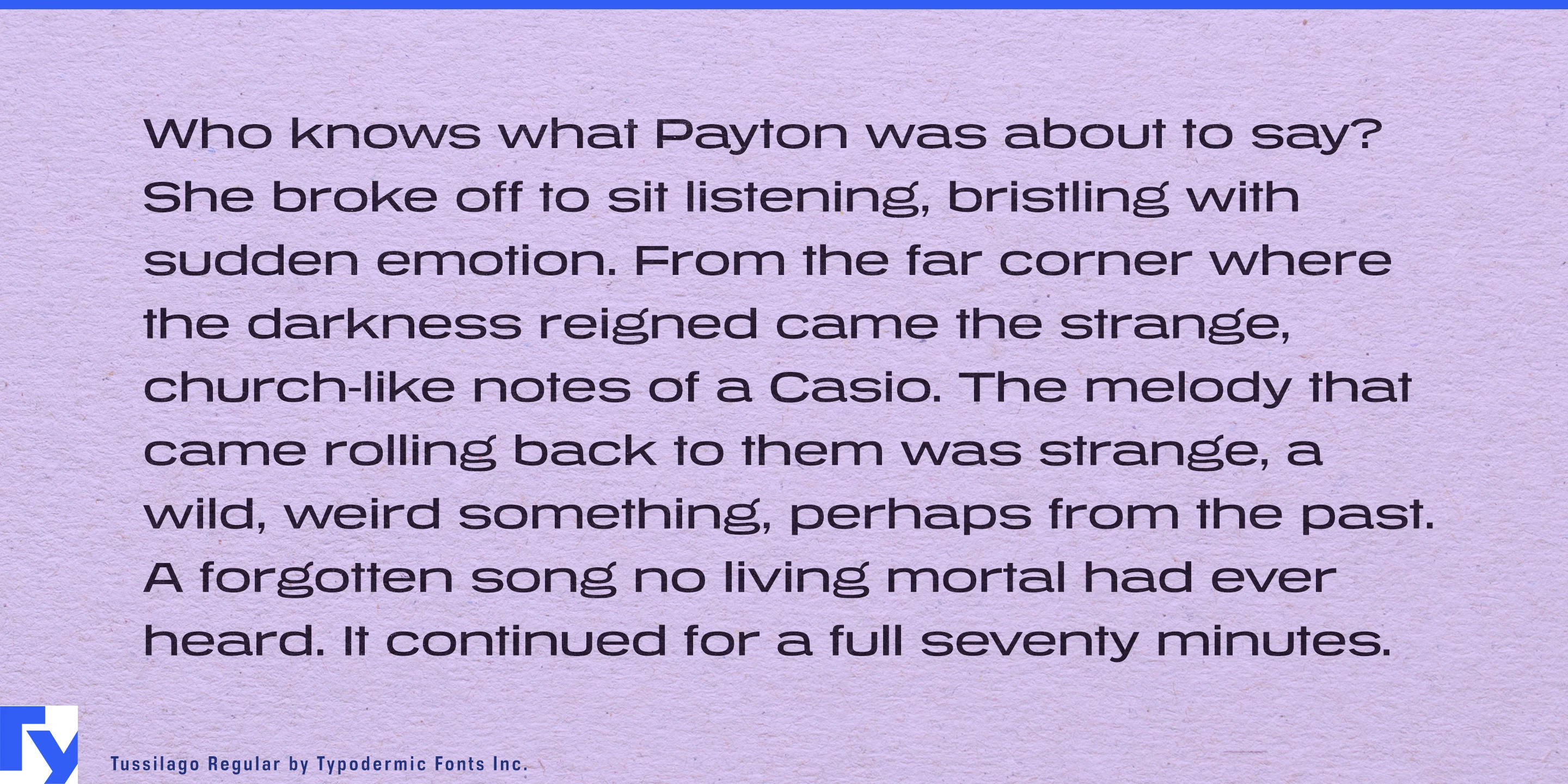
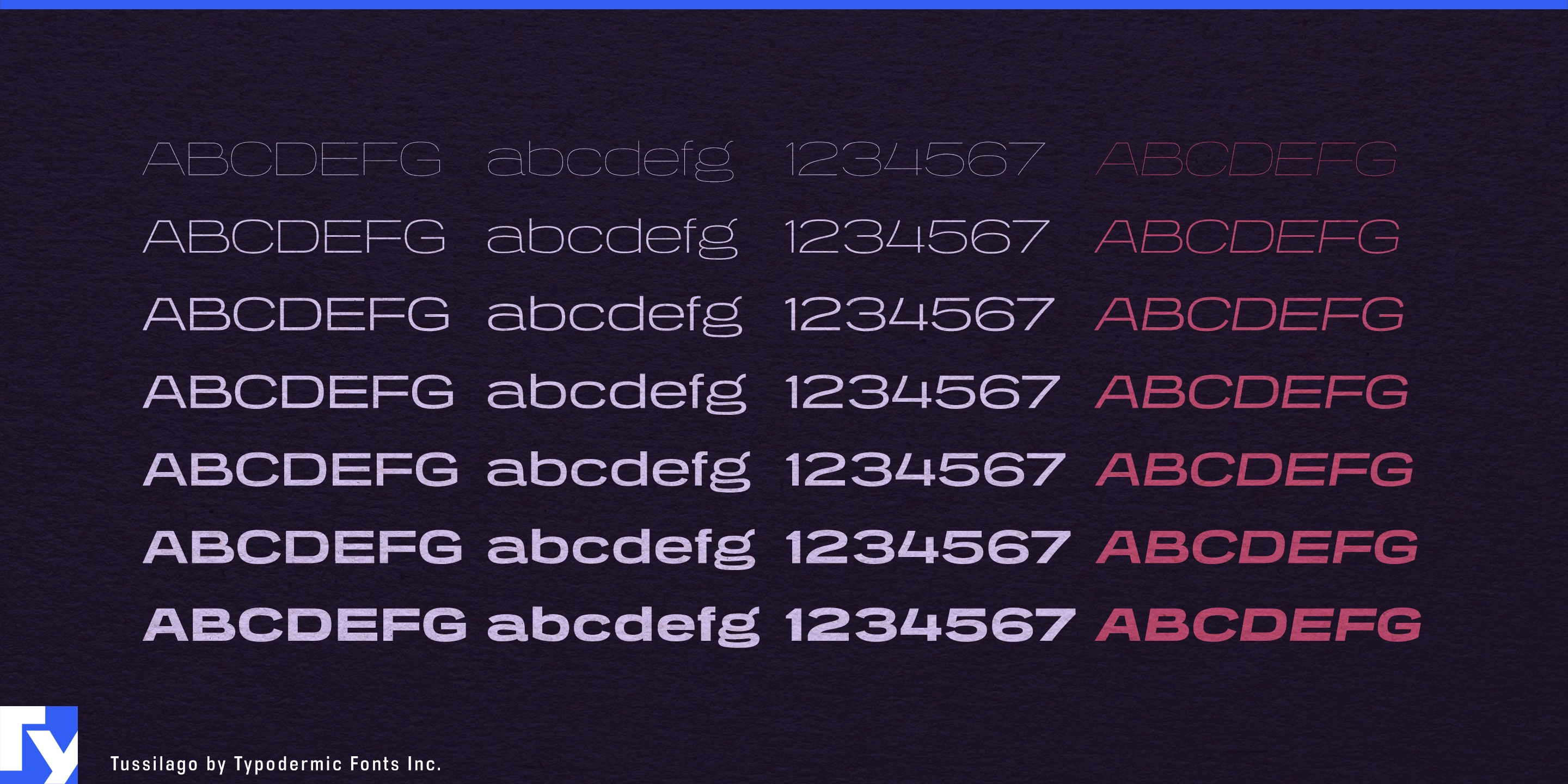
The family ranges from light, expansive display styles to heavier weights suited to equipment names and frame lettering, with matching italics and both old-style and lining numerals. Tussilago can handle short supporting copy, but its width is most useful when space is treated as an asset: long products, broad fascias, generous signs and wide pages where extended proportions can do practical work.
Get Tussilago
Desktop licenses cover print, logos, and static graphics. MyFonts also offers embedding licenses for websites, e-books, and applications. Embedding licenses
Commercial font facts
Family details
- First released
- 2008
- Styles
- 14 styles
- Version
- 1.200
- Formats
- OTF
- Class
- Sans serif
- Form
- Geometric, Low contrast
- Scripts
- Latin
- Role
- Dual purpose
Commercial style names (14)
- Hairline
- Hairline Italic
- Thin
- Thin Italic
- Extra-Light
- Extra-Light Italic
- Light
- Light Italic
- Regular
- Italic
- Bold
- Bold Italic
- Heavy
- Heavy Italic