
Strenuous
Get the font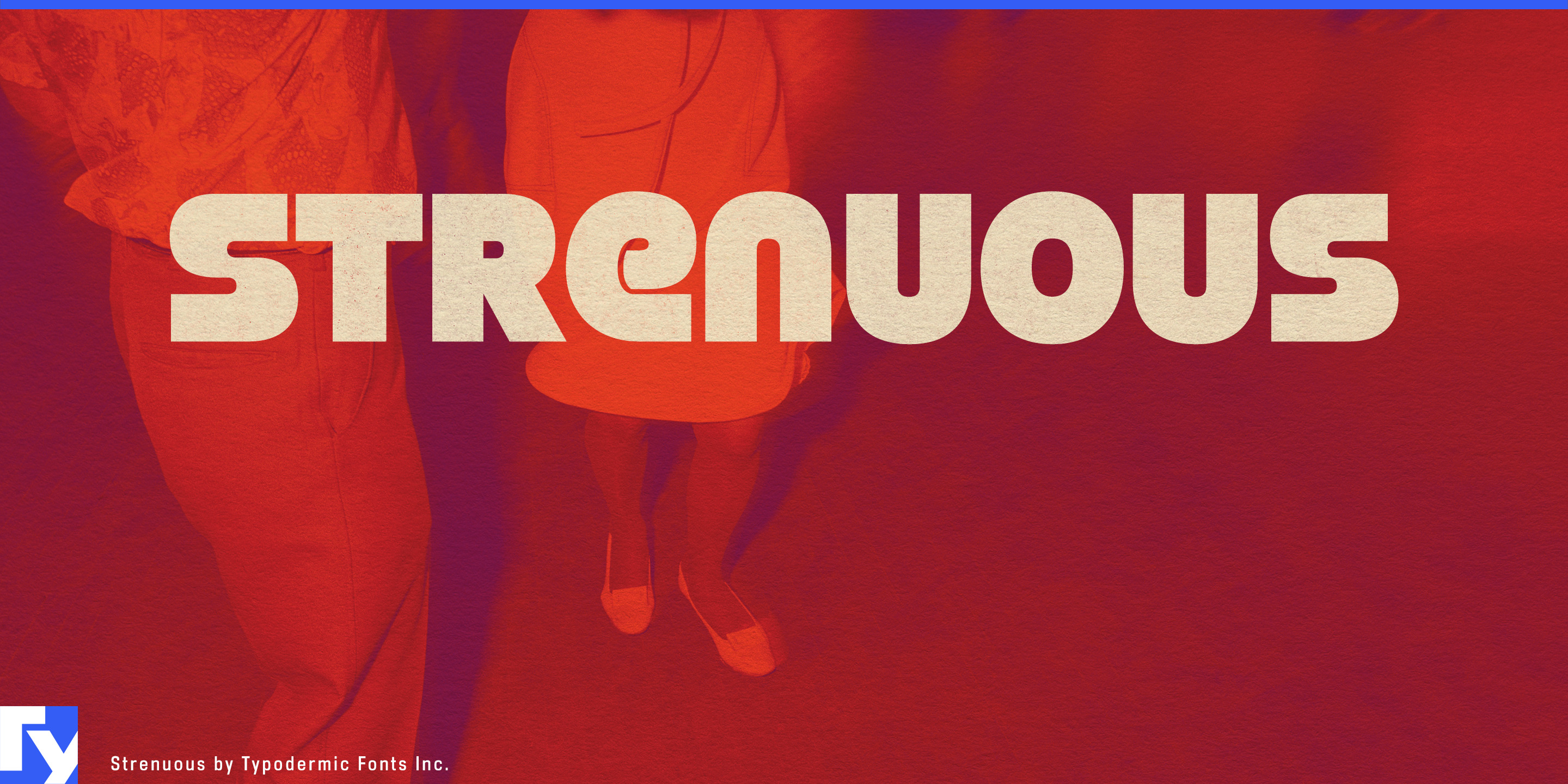
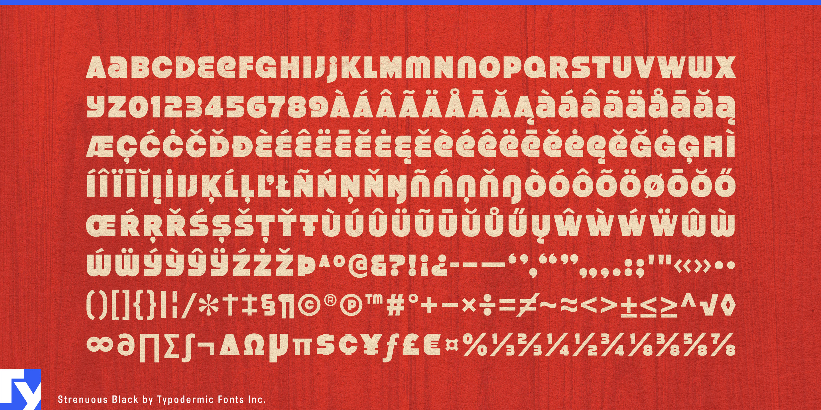
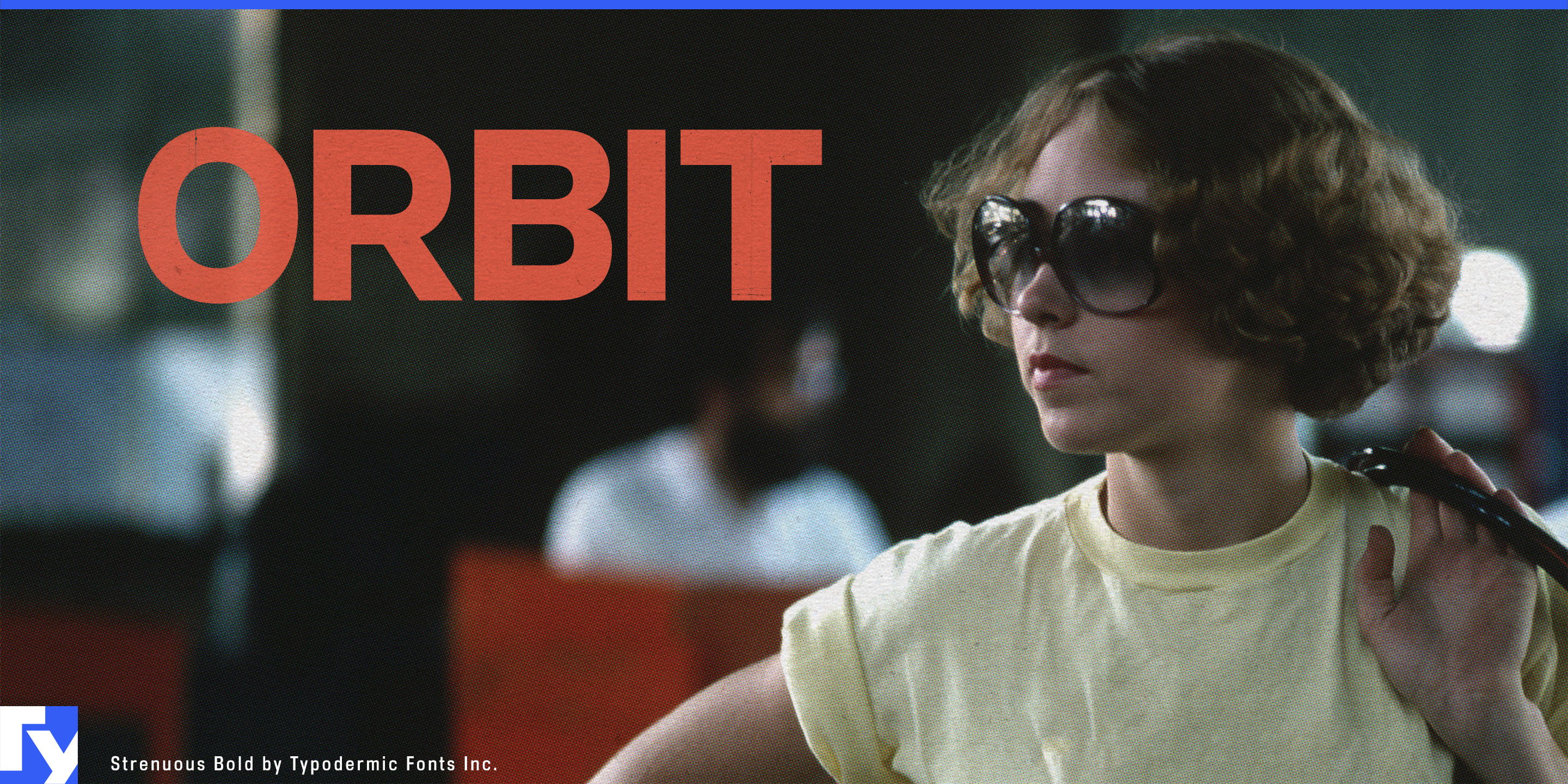
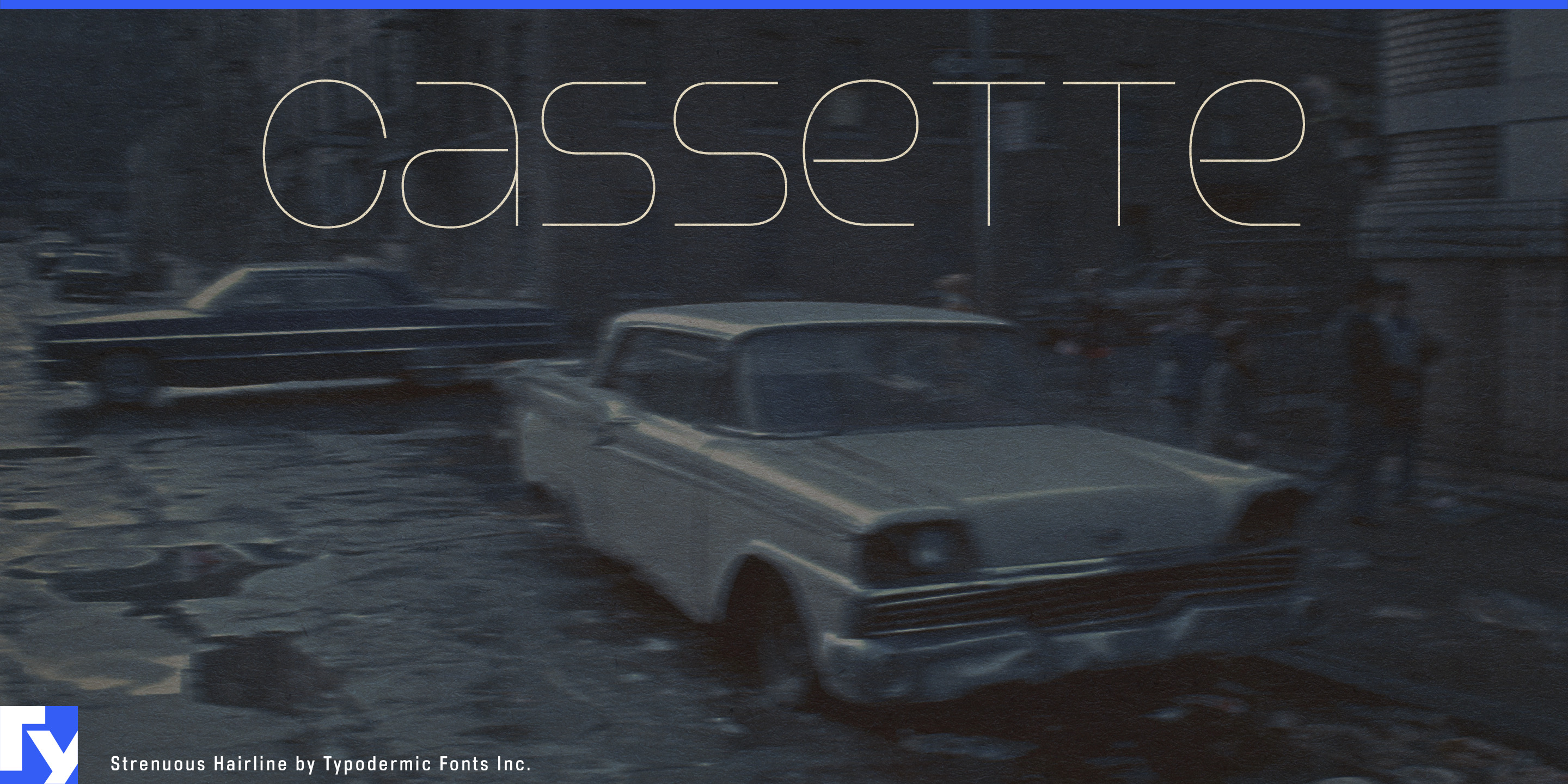
A 1970s display face can make one spectacular title. The harder problem is keeping that same period language alive when the project expands into episode cards, product names, venue graphics, campaign headlines and secondary information. Strenuous turns a highly specific retro voice into a full display system.
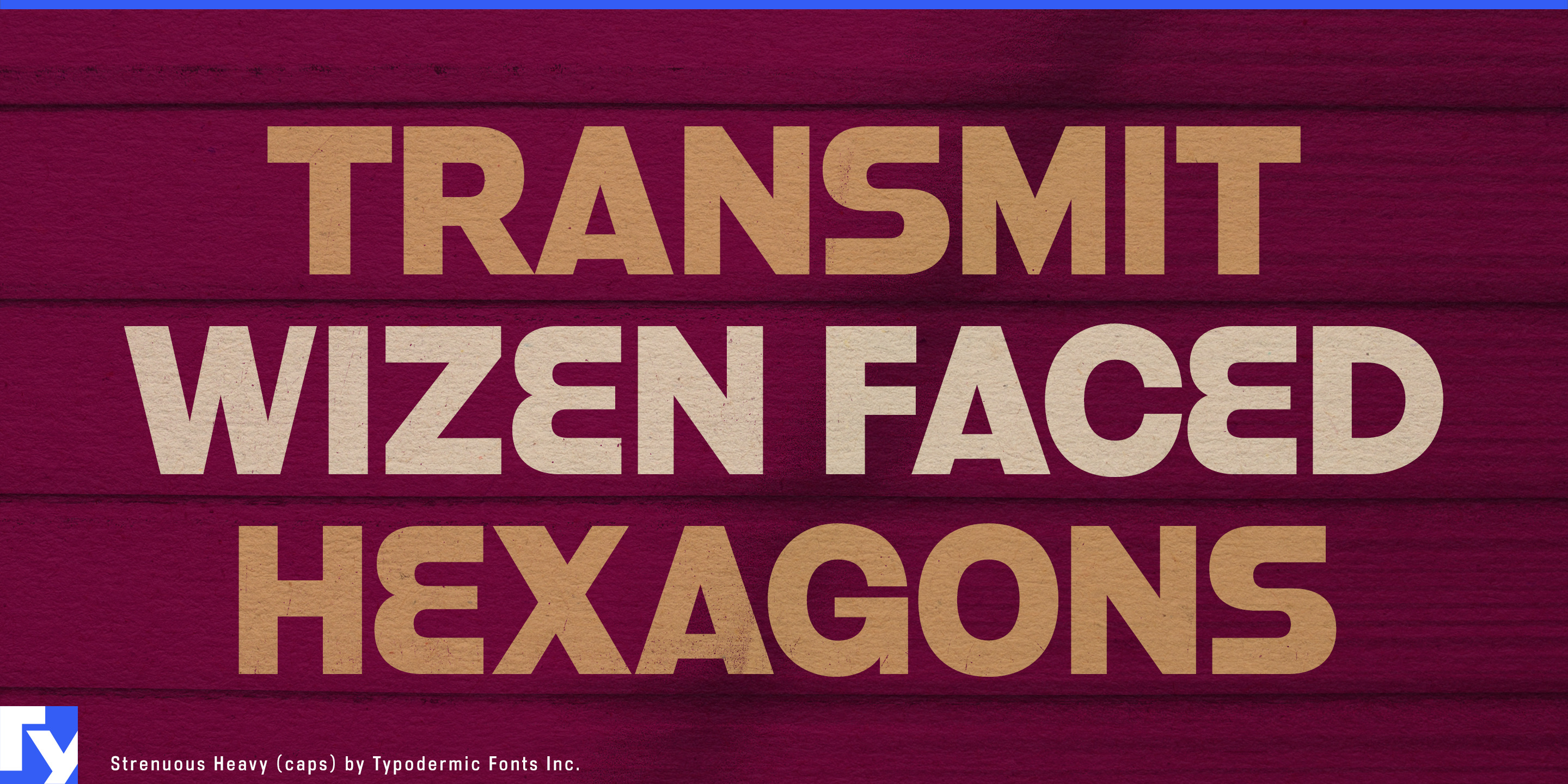
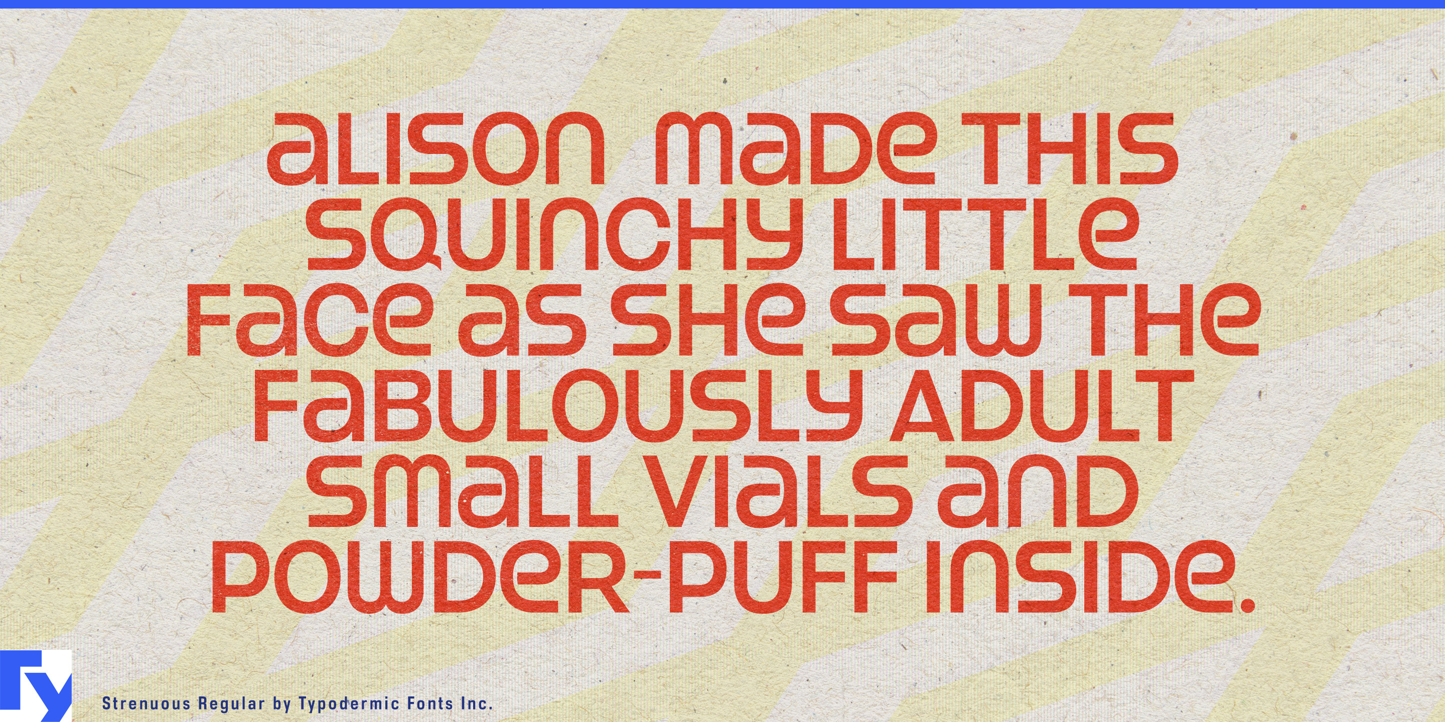
The design began with lettering from the 1974 film Black Eye and developed into a unicase structure built from uppercase- and lowercase-derived forms sharing a common height. Alternate forms let prominent words be tuned for shape while preserving the compact unicase rhythm.
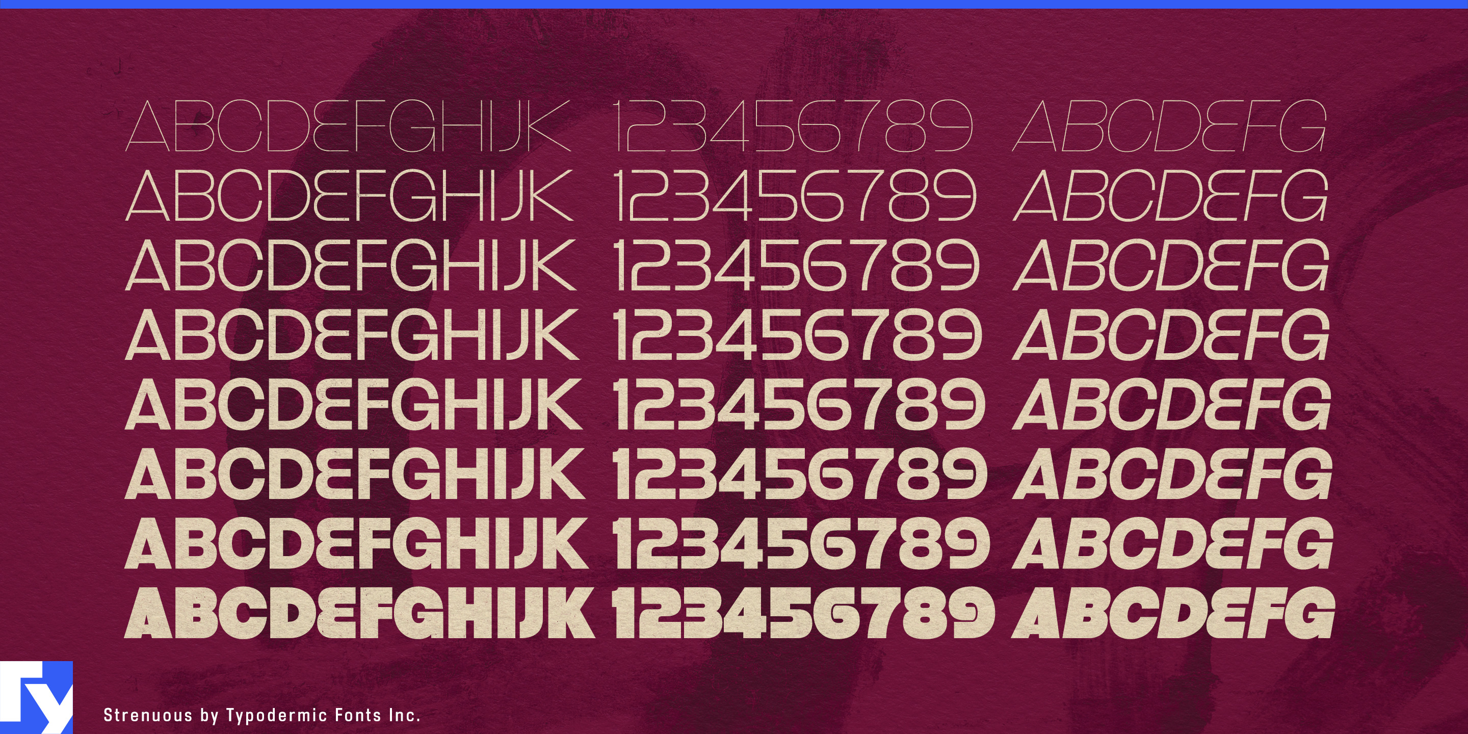
Eight weights from Hairline through Black, each with an italic, give Strenuous far more range than a typical one-style retro face. Hairline, Thin and Extra-Light can create sleek display typography; middle weights handle secondary copy; Heavy and Black restore the dense cinematic force of the original idea. Separate 3D and Cast styles provide more specialized headline treatments.
Period entertainment is a natural fit. Streaming series, films and games set around 1970s crime, neo-noir, urban action or nightlife need more than one opening title. Strenuous can continue into episode cards, character names, dates, locations, chapter graphics and promotional material while preserving a coherent period vocabulary.
Fashion and eyewear campaigns reveal another side of the family. Archive-inspired collections, oversized eyewear, footwear capsules and resort fashion can use the lighter weights for collection names, lookbook divisions and retail-window typography, then shift into heavier styles for campaign titles and product drops.
Boutique hotels, listening bars and cocktail lounges built around 1970s interiors face a similar system problem. Venue names, room or bar names, event graphics and menu headings can share one period atmosphere without relying on the same chunky treatment everywhere.
Funk, soul, jazz-rock and disco reissues, anniversary box sets, label retrospectives and music documentaries can use Strenuous for changing artist names, release titles and years. Turntables, speakers, headphones and amplifiers that reference 1970s industrial design can carry the same visual language into model names, special editions and launch graphics.
Strenuous is strongest when the project needs more than a retro moment. Its weight range, italics and unicase alternates let a distinctive 1970s voice continue through an entire campaign rather than disappearing after the hero title.
Get Strenuous
Desktop licenses cover print, logos, and static graphics. MyFonts also offers embedding licenses for websites, e-books, and applications.
Commercial font facts
Family details
- First released
- 2001
- Styles
- 18 styles
- Version
- 4.100
- Formats
- OTF
- Class
- Sans serif
- Form
- Geometric
- Width
- Condensed
- Case
- Mixed case
- Scripts
- Latin
- Role
- Display
- Features
- Alternates
Commercial style names (18)
- Hairline
- Hairline Italic
- Thin
- Thin Italic
- Extra-Light
- Extra-Light Italic
- Light
- Light Italic
- Regular
- Italic
- Bold
- Bold Italic
- Heavy
- Heavy Italic
- Black
- Black Italic
- 3D
- Cast