
Rinse
Get the font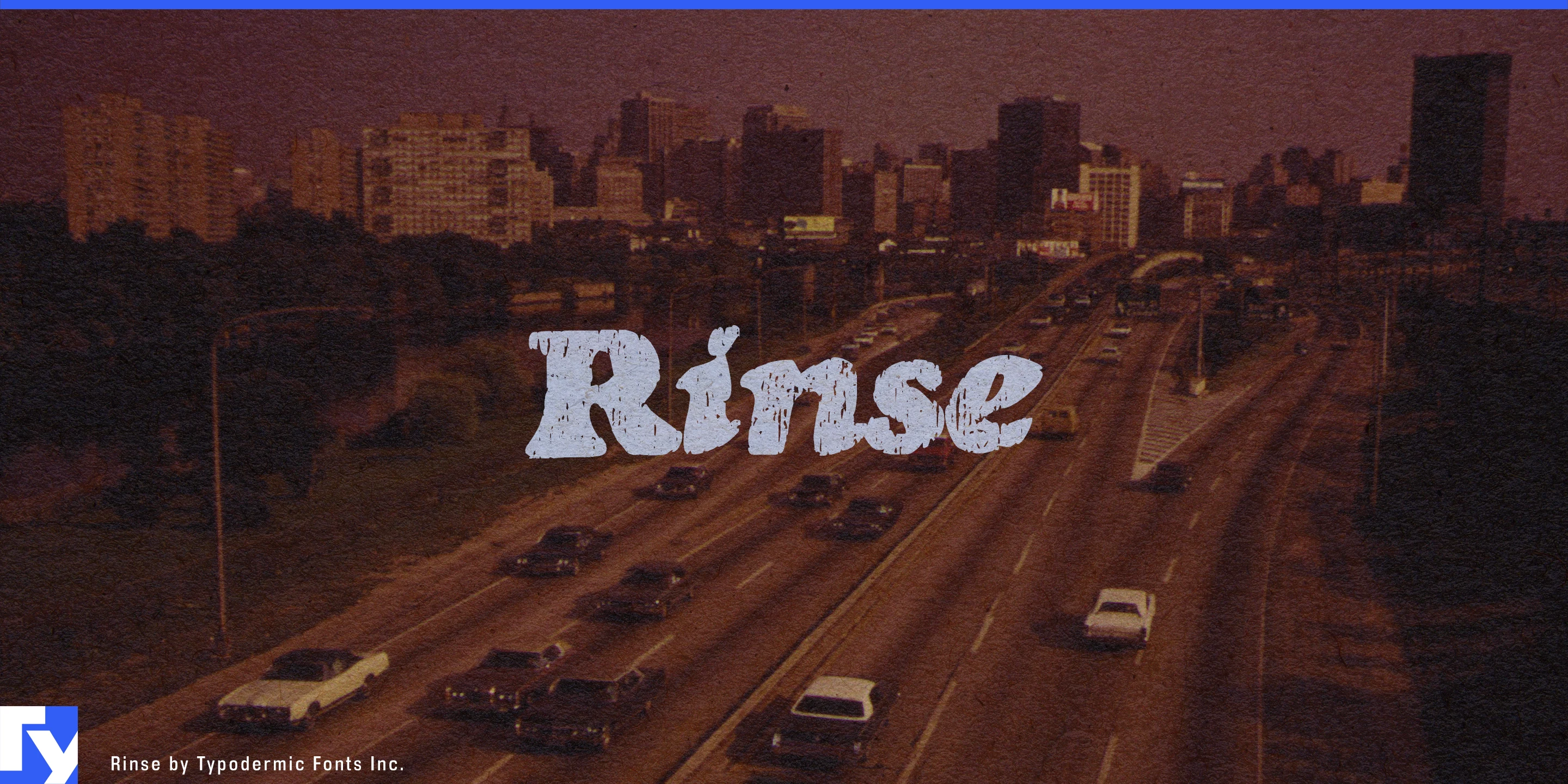
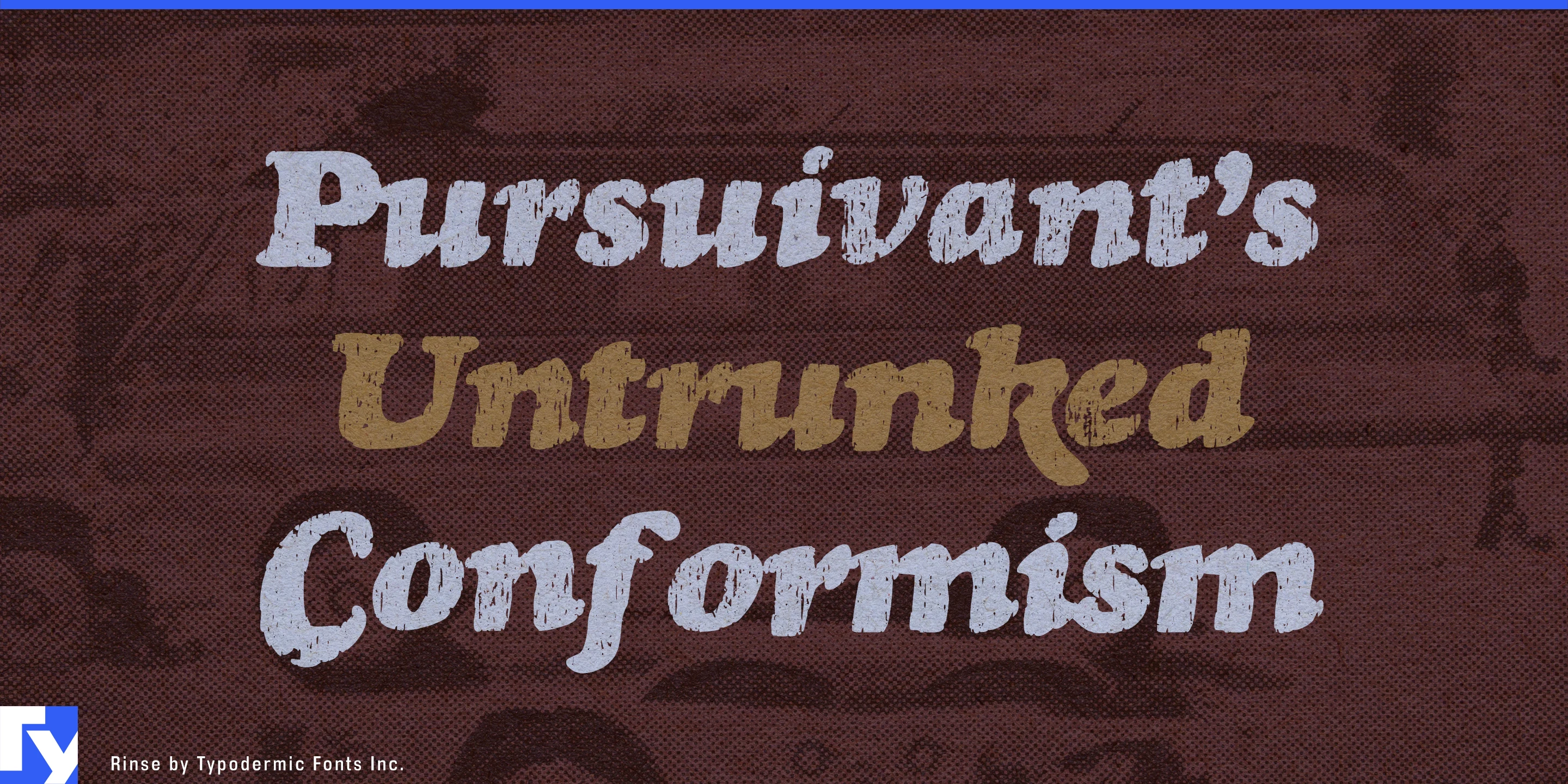


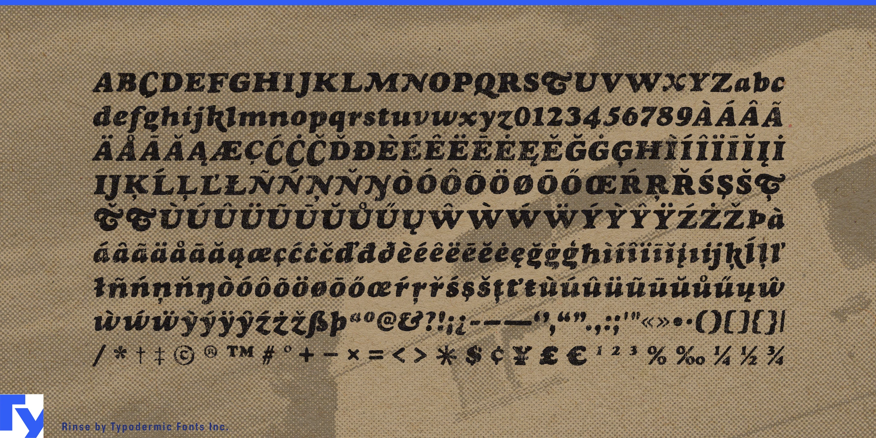


Rinse began with scans from an old metal-type catalogue, reconstructed as a working version of Goudy Heavyface Italic. Its worn surface was developed separately: ink rolled across fabric, scanned, and incorporated through bitmap layering. After autotracing and manual cleanup, the textured outlines were registered over the working font to preserve its original scale and alignment. The irregularity is physical; the typography underneath remains controlled.
Heavy oldstyle forms and an emphatic italic lean give Rinse the flavour of 1970s display lettering. The fabric treatment makes those forms resemble garment graphics softened by years of wear and washing. Ink gathers, thins, and breaks according to the material beneath it, avoiding the repetition of a digitally scattered distress pattern. The name comes from that same world of T-shirts and laundry.
Vintage garment graphics are its natural territory: band shirts, bowling-league uniforms, summer-camp souvenirs, motorcycle-rally apparel, local-team merchandise, and promotional tees for vanished regional businesses. A trucking company, repair garage, record store, or roadside attraction can look as though it survives only on something discovered in a thrift shop. The broad, slanted letters are built for names, slogans, and stacked lines that occupy the garment rather than sitting politely upon it.
Rinse carries that material history into roadside food and drink. Smokehouse signs, barbecue-sauce labels, dry-rub tins, burger wrappers, root-beer packaging, taproom shirts, and bowling-alley menus benefit from lettering that already seems to have passed through kitchens, delivery trucks, and sun-faded windows. Its oldstyle foundation keeps the result connected to familiar commercial lettering without turning it into a spotless retro reproduction.
The texture also works naturally with old photographs. In documentary titles, local-history exhibitions, found-photo books, and reissue packaging, newly added lettering can appear to share the image’s paper grain, fading, and imperfect reproduction. Rinse works best in short display copy such as names, slogans, product varieties, compact headlines, and titles. Letter-pair ligatures introduce controlled variations into recurring combinations, reducing the mechanical repetition that can reveal a digital source.
Get Rinse
Desktop licenses cover print, logos, and static graphics. MyFonts also offers embedding licenses for websites, e-books, and applications. Embedding licenses
Commercial font facts
Family details
- First released
- 2007
- Styles
- 1 style
- Version
- 1.004
- Formats
- OTF
- Class
- Serif
- Case
- Mixed case
- Scripts
- Latin
- Role
- Display
- Features
- Distressed, Ligatures
Commercial style names (1)
- Regular