
Polarband

Get the font
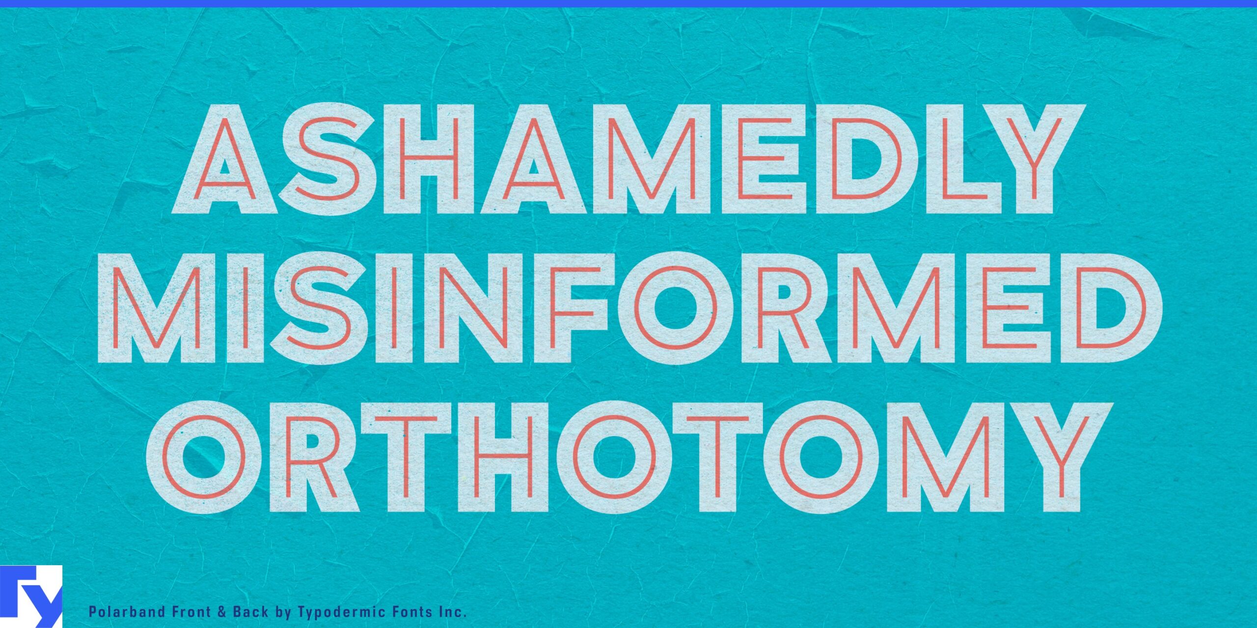
Polarband specimen 1
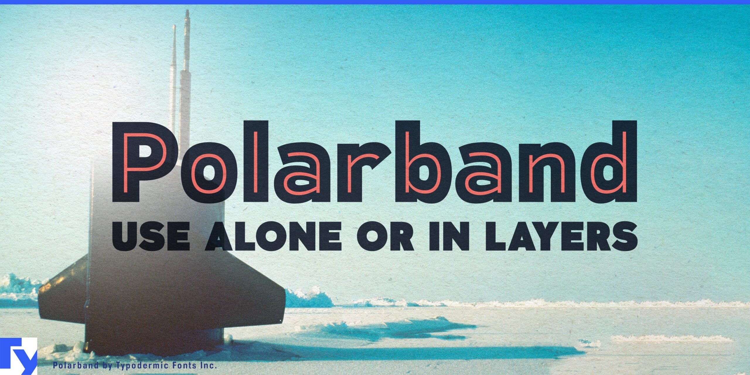
Polarband specimen 2
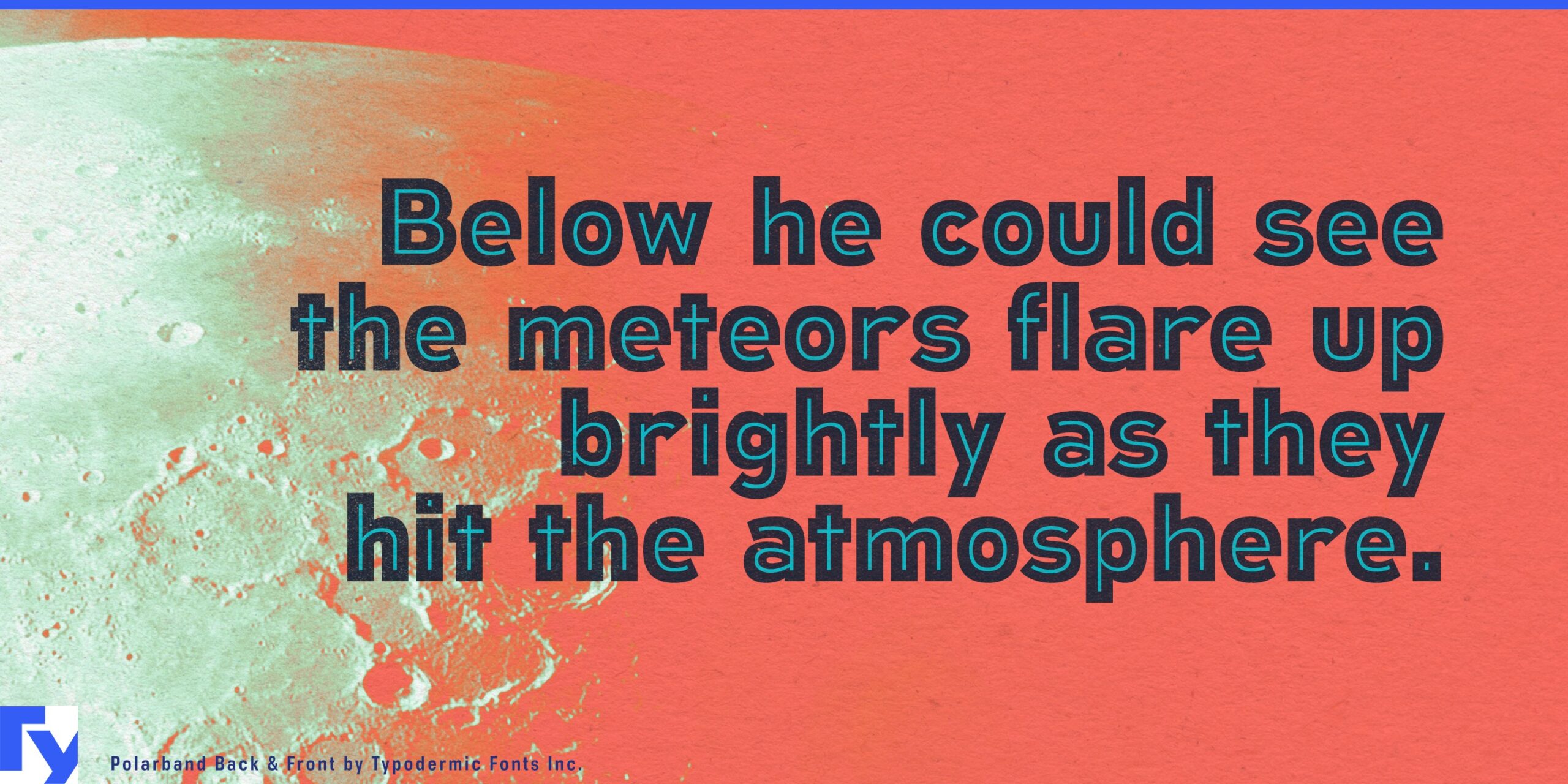
Polarband specimen 3
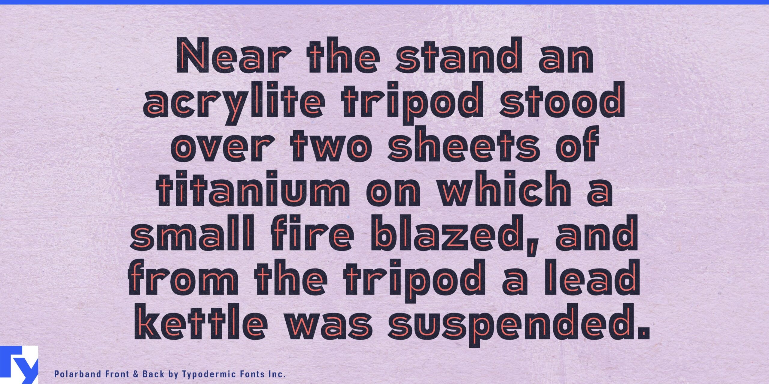
Polarband specimen 4
Polarband specimen 5
Polarband specimen 6
Polarband specimen 7

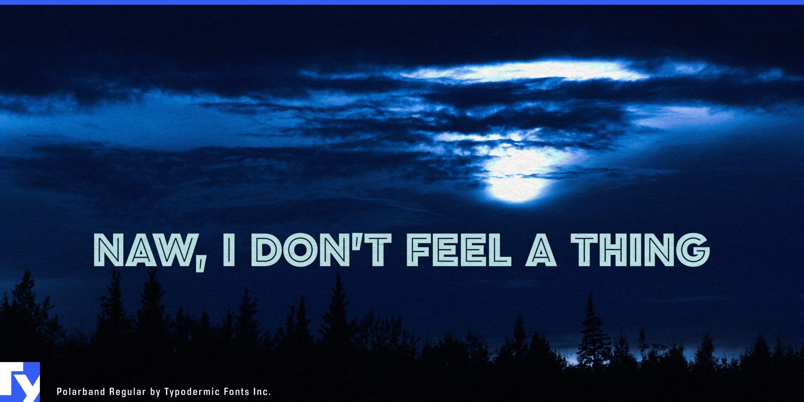
A vintage display face can make a great logo. Trouble starts when that logo has to become a brand. The same lettering suddenly needs flavor names, seasonal editions, campaign headlines and changing color schemes; a decorative alphabet that worked beautifully for five capitals may have nowhere else to go. Polarband turns an early twentieth-century inline idea into a practical mixed-case identity system.

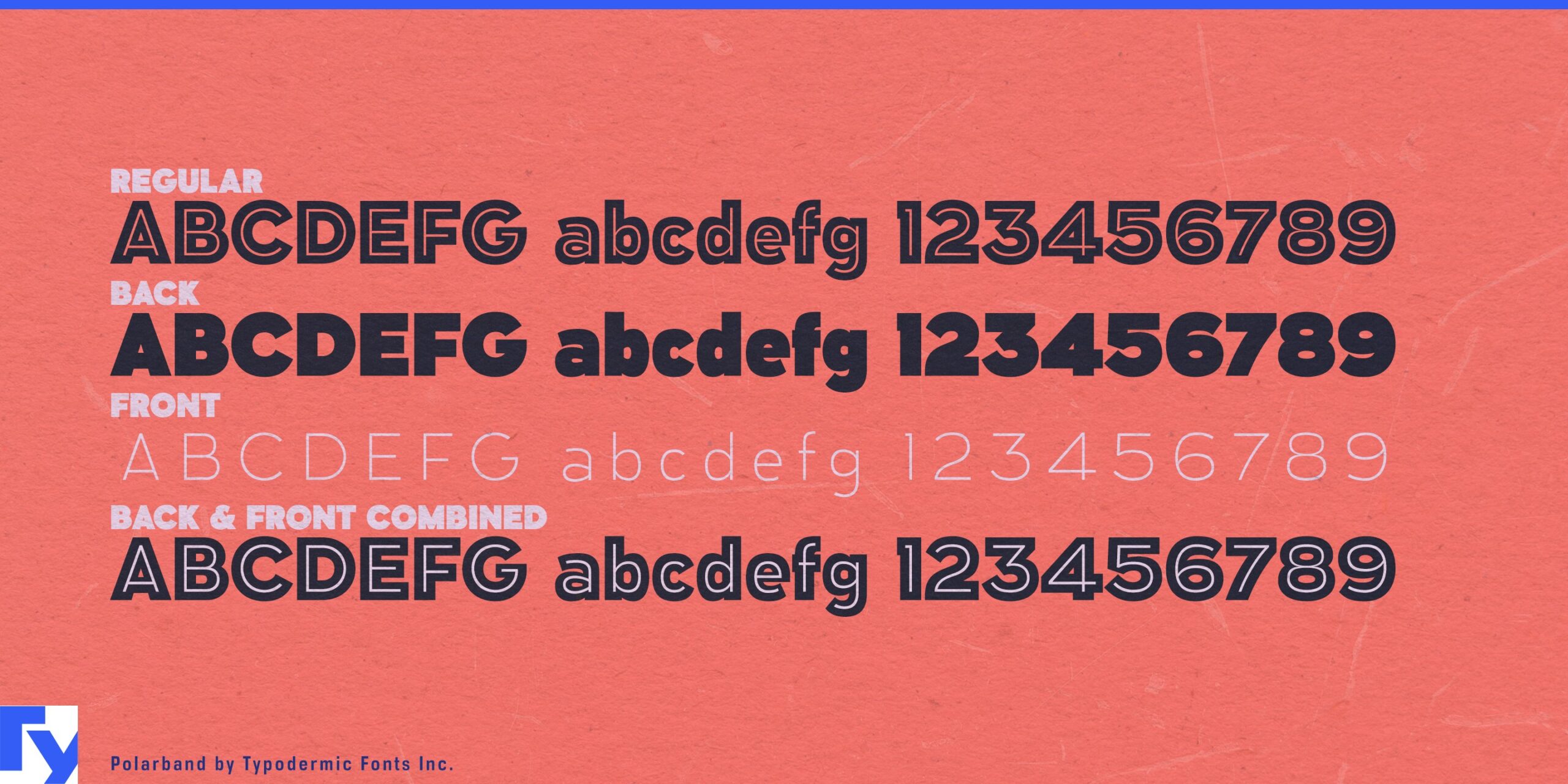
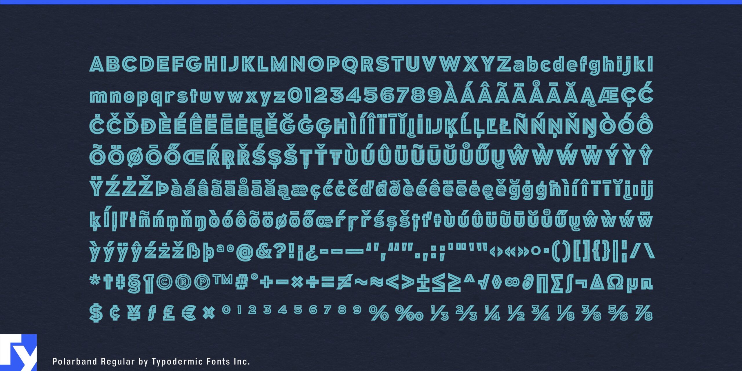
Its broad geometric forms combine substantial letter bodies with fine interior lines. Polarband consists of Regular, Back and Front; the separated components let the main body and inline treatment be colored and combined independently. A full lowercase extends the same visual language into product names, short descriptors and promotional copy rather than confining it to badges and all-cap titles.

That flexibility is especially useful for product ranges built around changing varieties. Premium soft drinks, confectionery, ice cream, coffee products and snack lines often need one recognizable identity across flavors, seasonal releases and limited editions. Polarband lets color change from one SKU to the next while the underlying letterforms remain constant. A quiet companion family can handle ingredients and longer copy; Polarband carries the expressive layer across the range.

Heritage brands face a similar problem. Referencing older commercial lettering can easily slip into fake aging and predictable nostalgia. Polarband’s historical character comes from its proportions and inline construction rather than simulated wear, allowing it to take crisp, saturated and contemporary color combinations. Revived consumer brands, anniversary programs and heritage merchandise collections can acknowledge the past without pretending the new work was printed decades ago.

Restored cinemas, food halls, resorts and entertainment venues can use Polarband in the same way, carrying a decorative identity through event titles, merchandise and seasonal campaigns. The separate Front and Back components also translate naturally into motion graphics, where the layers can be revealed, recolored or animated independently for venue screens, digital advertising and product launches.

Polarband is most useful when historical display character has to survive beyond the hero wordmark. Its mixed-case alphabet gives the identity more language to work with; its layered construction lets color and treatment change without losing the structure that made the name recognizable.

Get Polarband

Desktop licenses cover print, logos, and static graphics. MyFonts also offers embedding licenses for websites, e-books, and applications.

Commercial font facts

Family details

First released
2010
Styles
3 styles
Version
1.103
Formats
OTF
Class
Sans serif
Form
Geometric, Modular
Case
Mixed case
Scripts
Latin
Role
Display
Features
Layered, Inline, Outline
Commercial style names (3)
  • Regular
  • Back
  • Front