
Kimberley
Get the font
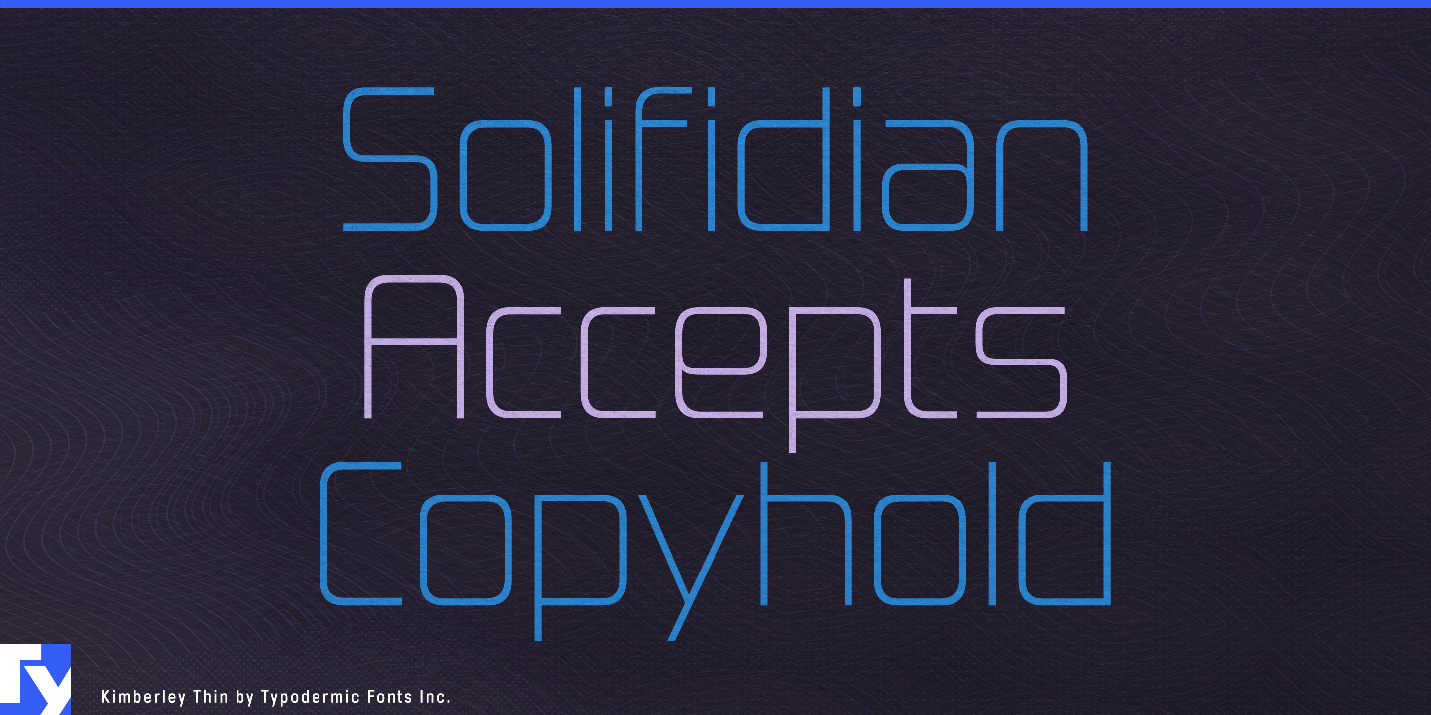
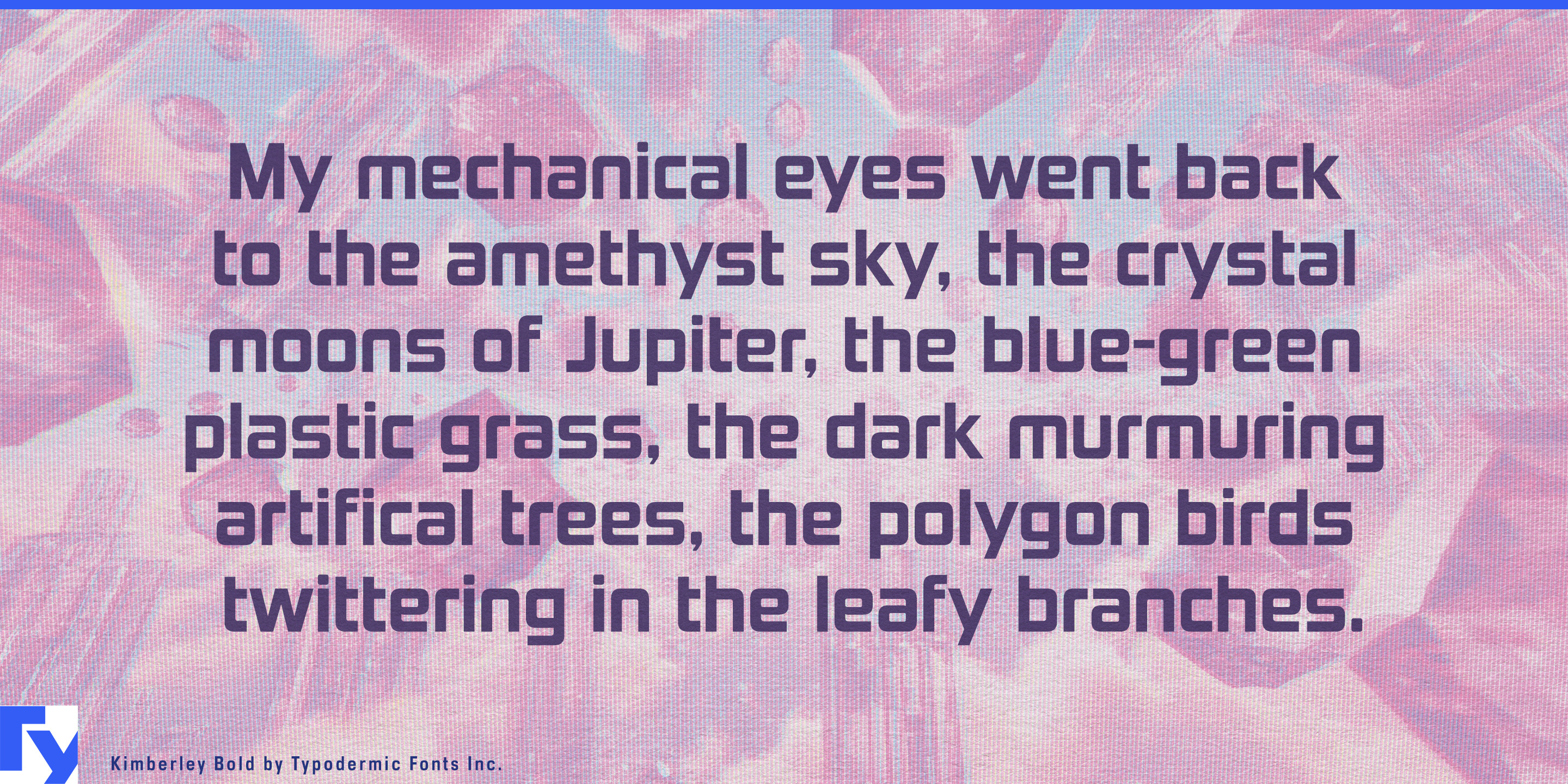
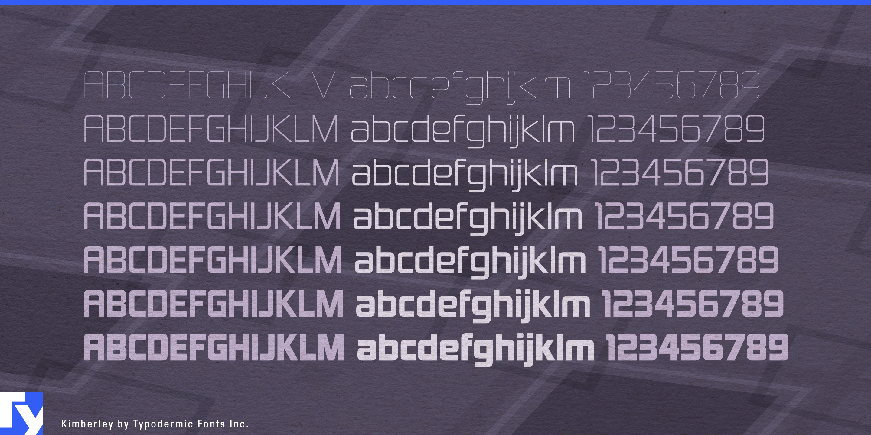
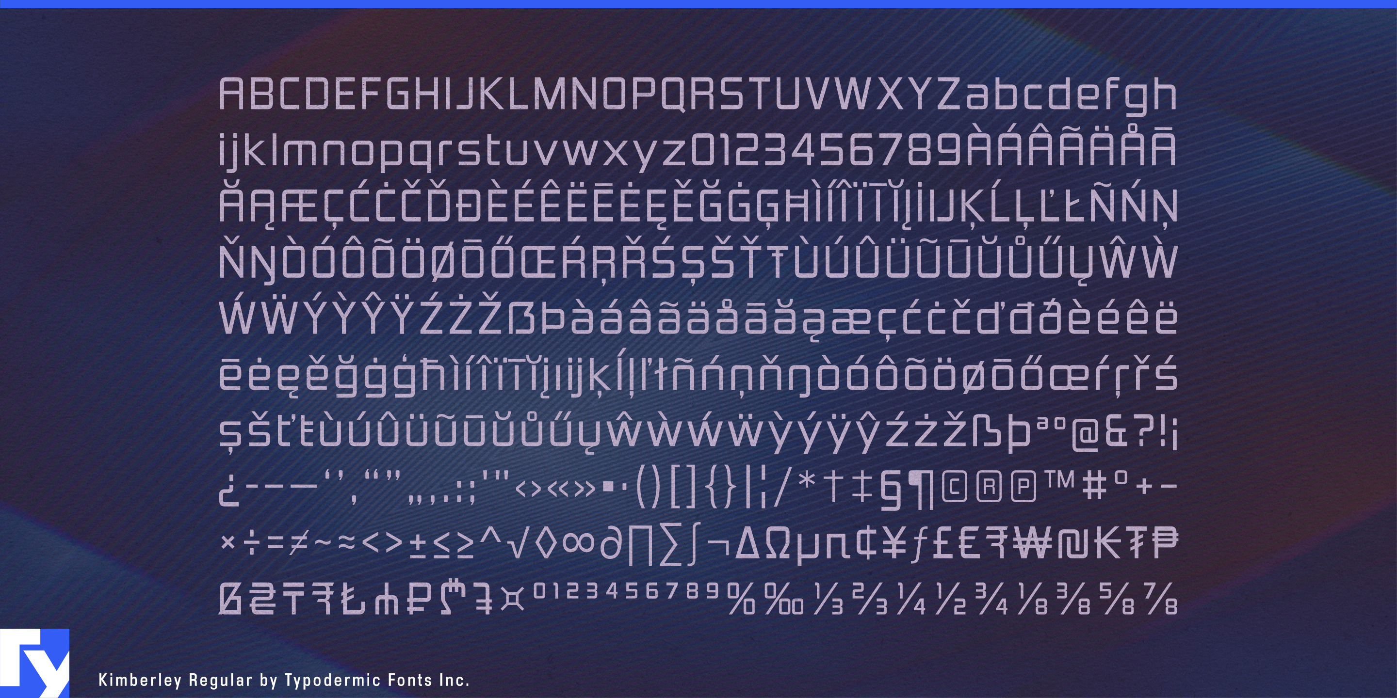


Future-facing engineering companies often face a typographic trap: technical lettering can quickly turn into gaming, cyberpunk, or generic software branding. Kimberley takes another route. Its squared construction draws on the visual language of 1970s corporate and industrial identity, with compact proportions and softened corners that give the geometry an engineered rather than theatrical character.
That makes Kimberley particularly useful for the industrial economy forming around electrification. Commercial charging systems, battery storage, power conversion, microgrids, heat pumps, fleet electrification, and grid-control equipment all need identities that can look advanced without appearing speculative. Kimberley has the weight for manufacturer names on charging cabinets and battery enclosures, while lighter styles can handle product families, model designations, technical brochure headings, trade-show graphics, and short supporting copy.
The same qualities suit robotics and industrial automation: machine-vision systems, autonomous warehouse equipment, CNC machinery, motion controls, sensors, inspection systems, and factory robotics. Heavy styles can establish a corporate mark or machine series; lighter cuts extend the same visual language into subsystem names, specifications, diagrams, exhibition graphics, and technical sales material.
Kimberley also fits advanced transportation and industrial electronics, including commercial EVs, rail technology, airport ground equipment, aerospace components, ruggedized computers, control panels, test instruments, communications hardware, and power supplies. Its compact forms work especially well on equipment badges, faceplates, enclosures, fleet graphics, catalogues, and product launches.
For established manufacturers moving into connected equipment, automation, and energy management, Kimberley offers another advantage. A company known for pumps, refrigeration systems, electrical hardware, building controls, or workshop machinery can modernize its identity without suddenly looking like a software startup. The design retains enough late-twentieth-century corporate-industrial character to suggest continuity while remaining at home on the machinery and infrastructure of the 2030s.
Kimberley can also serve as the outward-facing voice of industrial software such as digital-twin platforms, factory analytics, fleet-control systems, engineering applications, and infrastructure management. Paired with a quieter text face for dense data and controls, it supplies product names, dashboard headings, presentations, and campaign typography with the bearing of an equipment manufacturer rather than a game studio.
Get Kimberley
Desktop licenses cover print, logos, and static graphics. MyFonts also offers embedding licenses for websites, e-books, and applications.
Commercial font facts
Family details
- First released
- 2000
- Styles
- 14 styles
- Version
- 4.200
- Formats
- OTF
- Class
- Sans serif
- Form
- Geometric, Rounded
- Scripts
- Latin
- Role
- Display
Commercial style names (14)
- Hairline
- Hairline Italic
- Thin
- Thin Italic
- Extra-Light
- Extra-Light Italic
- Light
- Light Italic
- Regular
- Italic
- Bold
- Bold Italic
- Black
- Black Italic