
Kadeworth
Get the font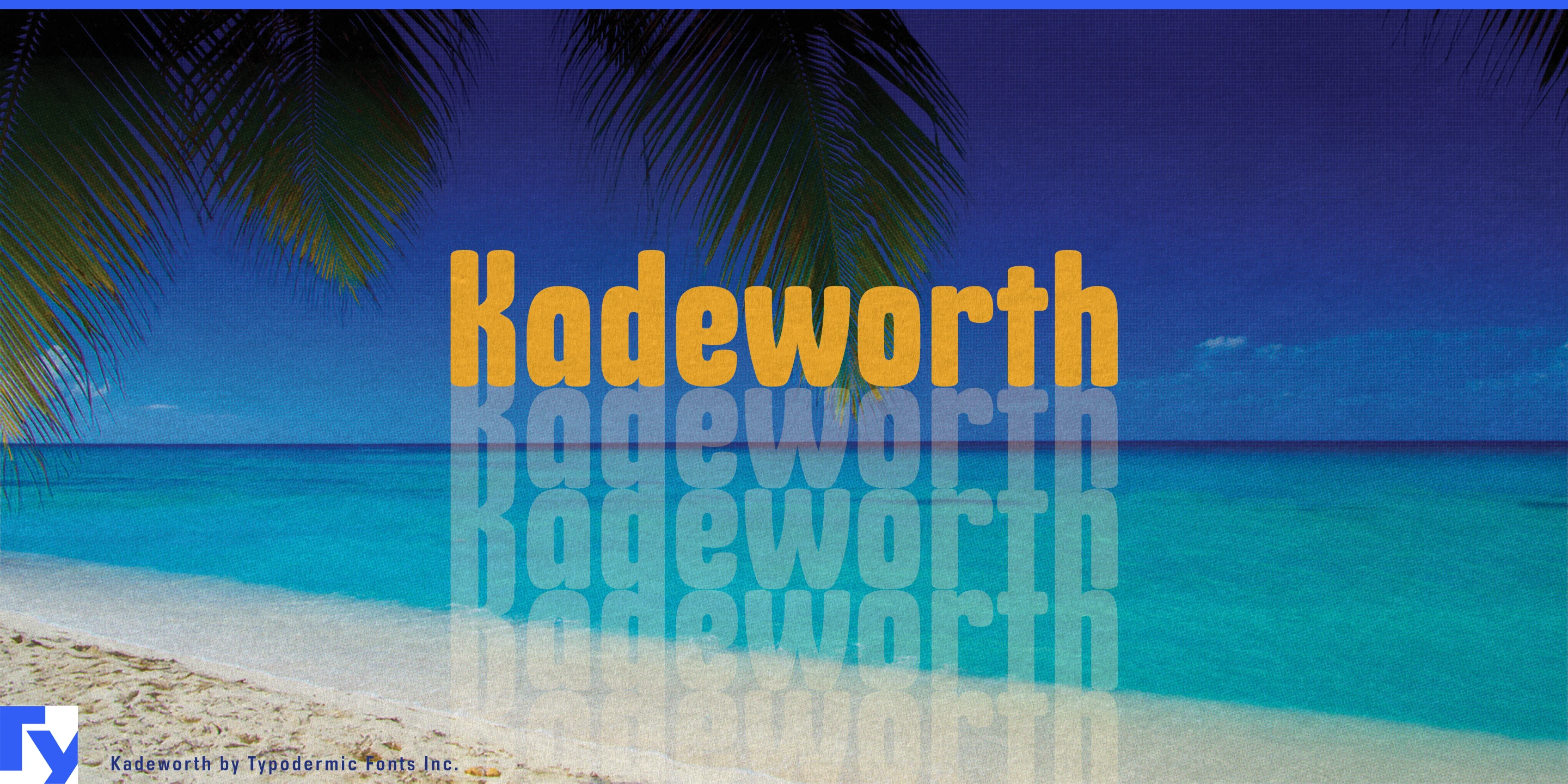
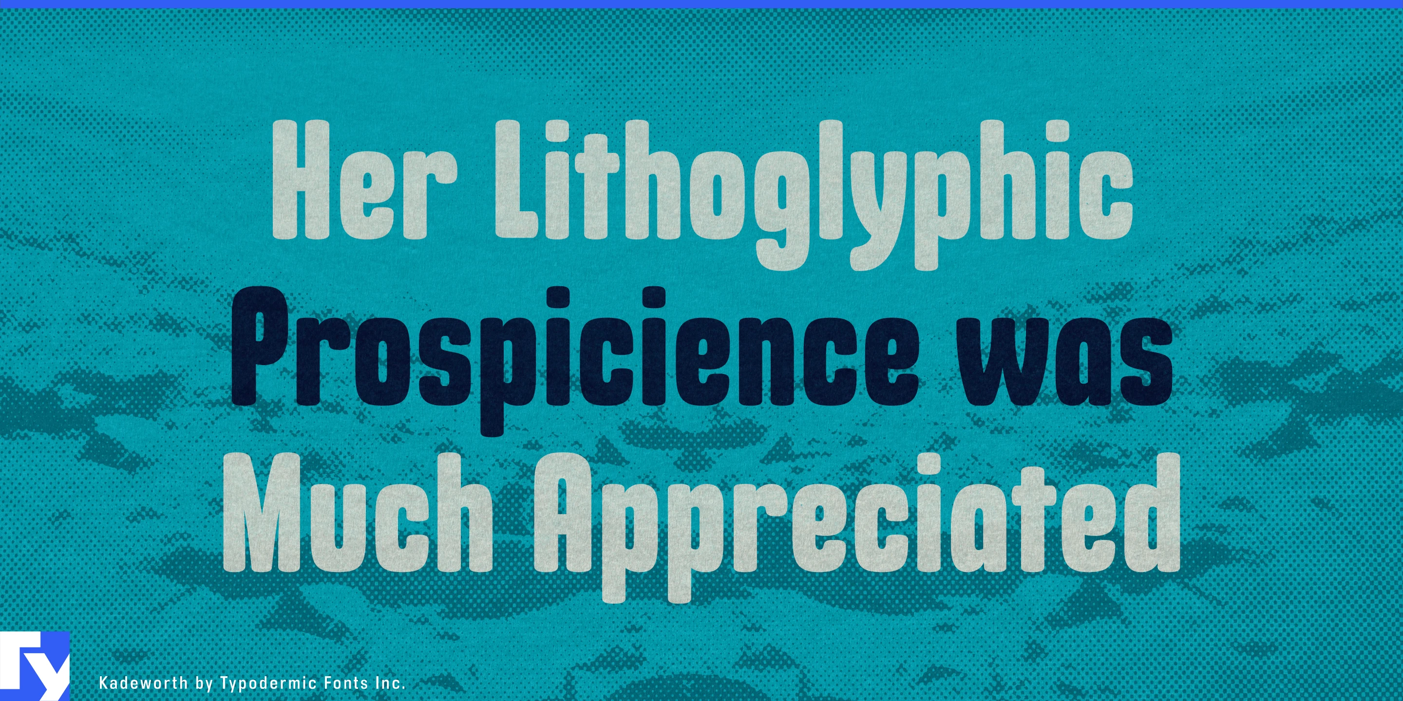
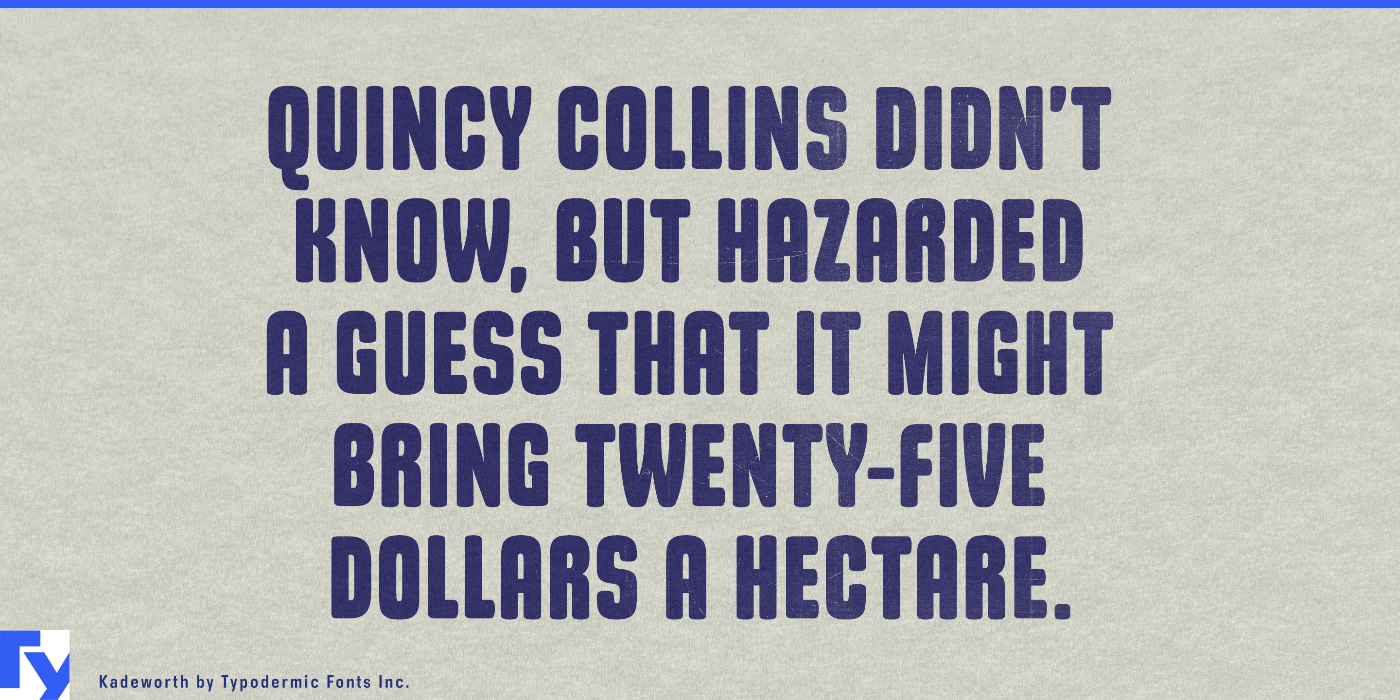
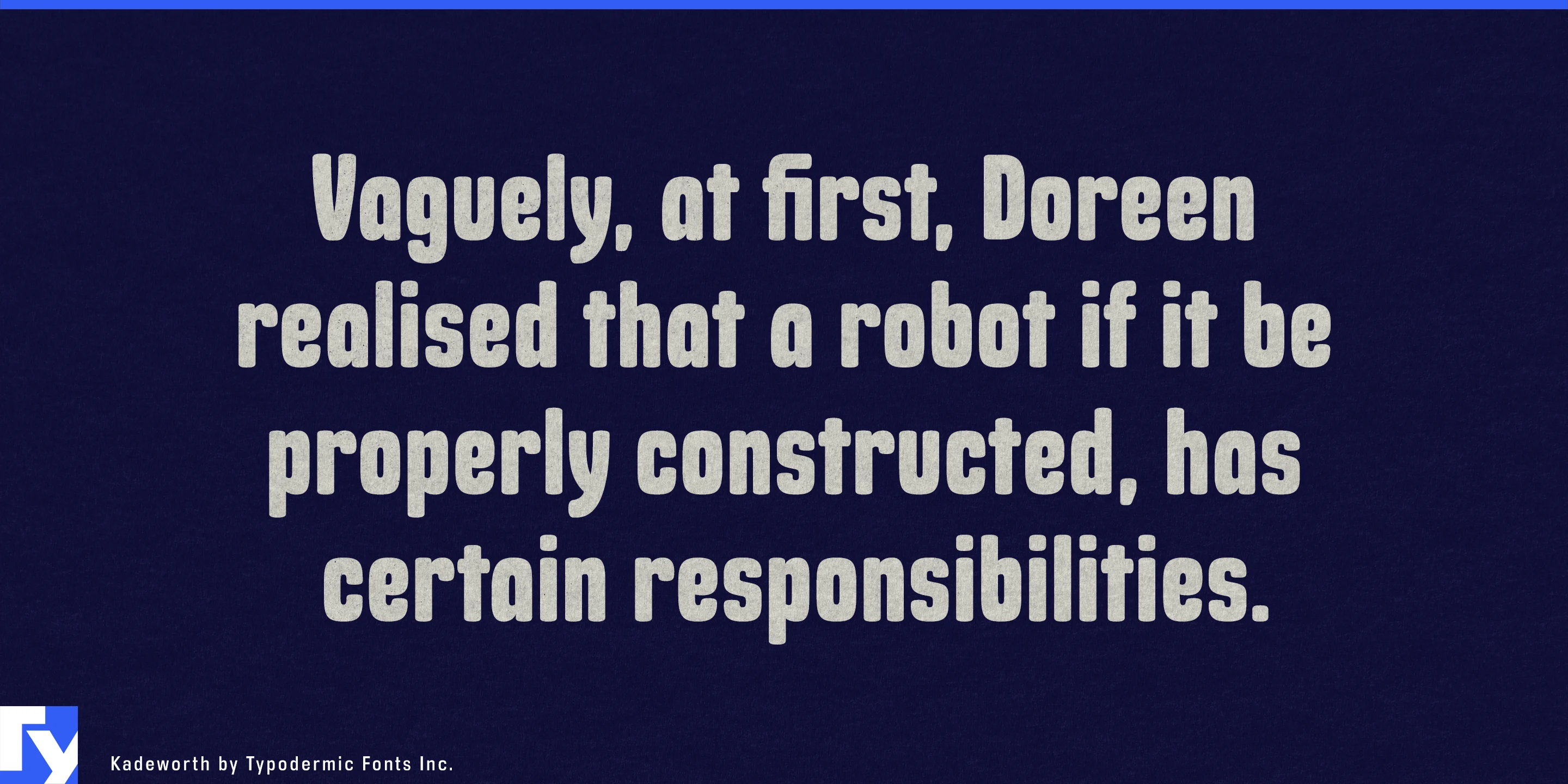
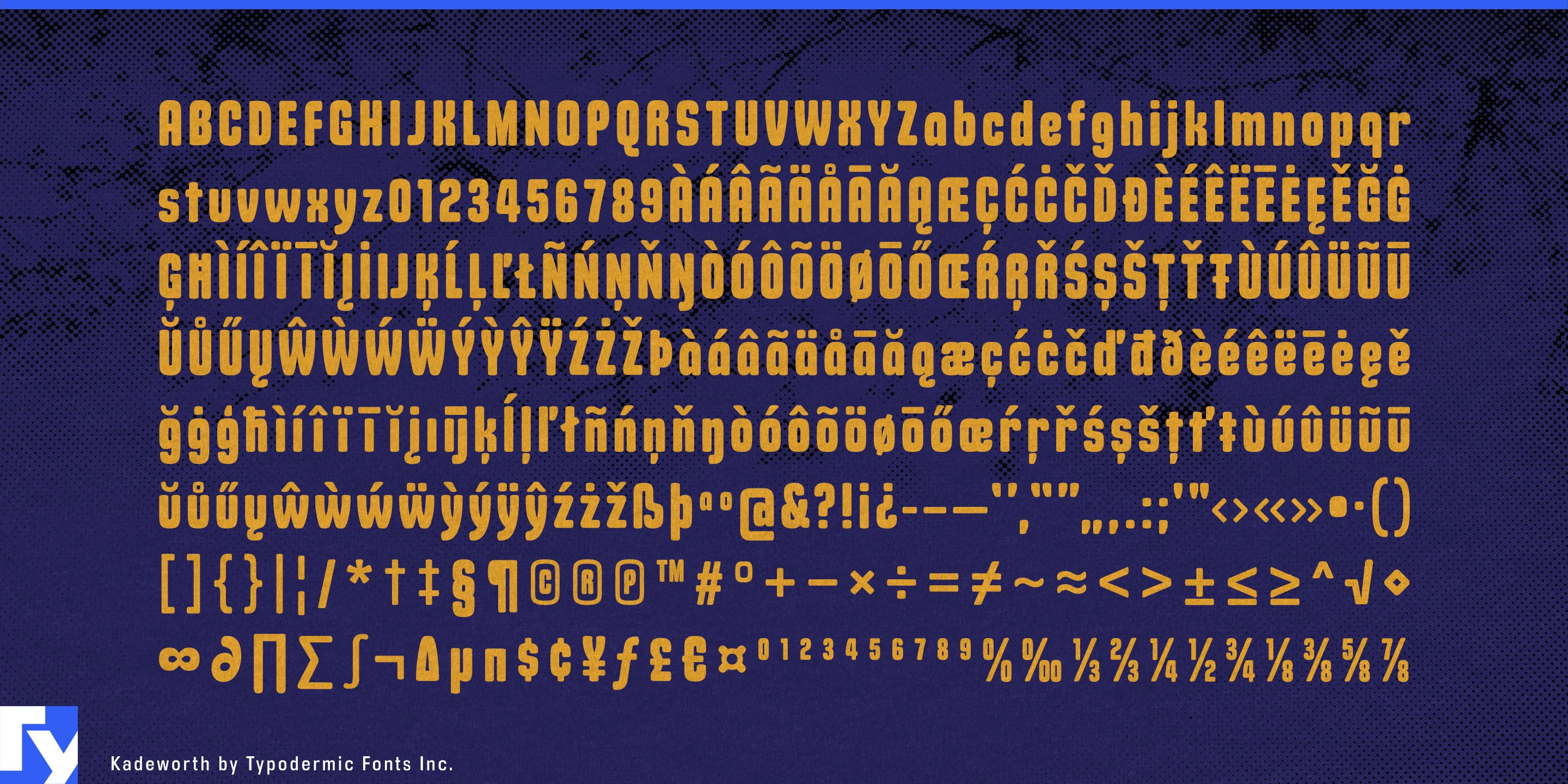


The box is fixed; the words are not. Kadeworth was designed for exactly that problem. Its narrow proportions, high x-height, short ascenders and descenders, and heavy strokes allow headlines to occupy compact rectangles without collapsing into a cramped texture. Open counters preserve separation inside the letters, while superelliptical stroke ends soften the severity usually associated with condensed display type.
Kadeworth began as a space-saving web headline design, intended to reduce awkward line breaks when available width was limited. That original problem has become even more relevant in template-driven graphics, where designers often know the dimensions of a field long before they know what text will eventually occupy it.
Sports broadcasting is a natural fit. Athlete names on arena screens, motorsport driver graphics, cycling-stage classifications, tournament brackets, fight cards, race results, and live-stream overlays all need to accept names and data of unpredictable length without constantly rebuilding the layout. Kadeworth can make substantial information large inside predetermined boxes, with enough weight to stay visible over photography and enough internal openness to remain distinct at a glance.
The same advantage carries into conference schedules, convention-centre displays, exhibition programmes, concourse screens, and ticketing graphics, where terse labels and unwieldy event names must coexist inside one reusable system. Digital menu boards and ordering kiosks present a similar challenge, fitting changing product names, seasonal specials, and promotional headlines into fixed screen regions without shrinking everything into insignificance.
On physical products, Kadeworth makes long names practical on narrow or crowded surfaces. Personal-care tubes, functional-beverage cans, sports-nutrition wrappers, equipment packaging, bicycle frames, helmets, skis, paddles, and portable power products can carry model or variant names at a useful display size without requiring artificially short wording.
Kadeworth is a specialized display face for systems whose dimensions cannot easily change. When names, titles, products, or results keep arriving faster than layouts can be rebuilt, it gives the words somewhere to go.
Get Kadeworth
Desktop licenses cover print, logos, and static graphics. MyFonts also offers embedding licenses for websites, e-books, and applications. Embedding licenses
Commercial font facts
Family details
- First released
- 2010
- Styles
- 1 style
- Version
- 1.000
- Formats
- OTF
- Class
- Sans serif
- Form
- Rounded, Superelliptical
- Case
- Mixed case
- Scripts
- Latin
- Role
- Display
- Features
- Open counters
Commercial style names (1)
- Regular