
Great Escape
Get the font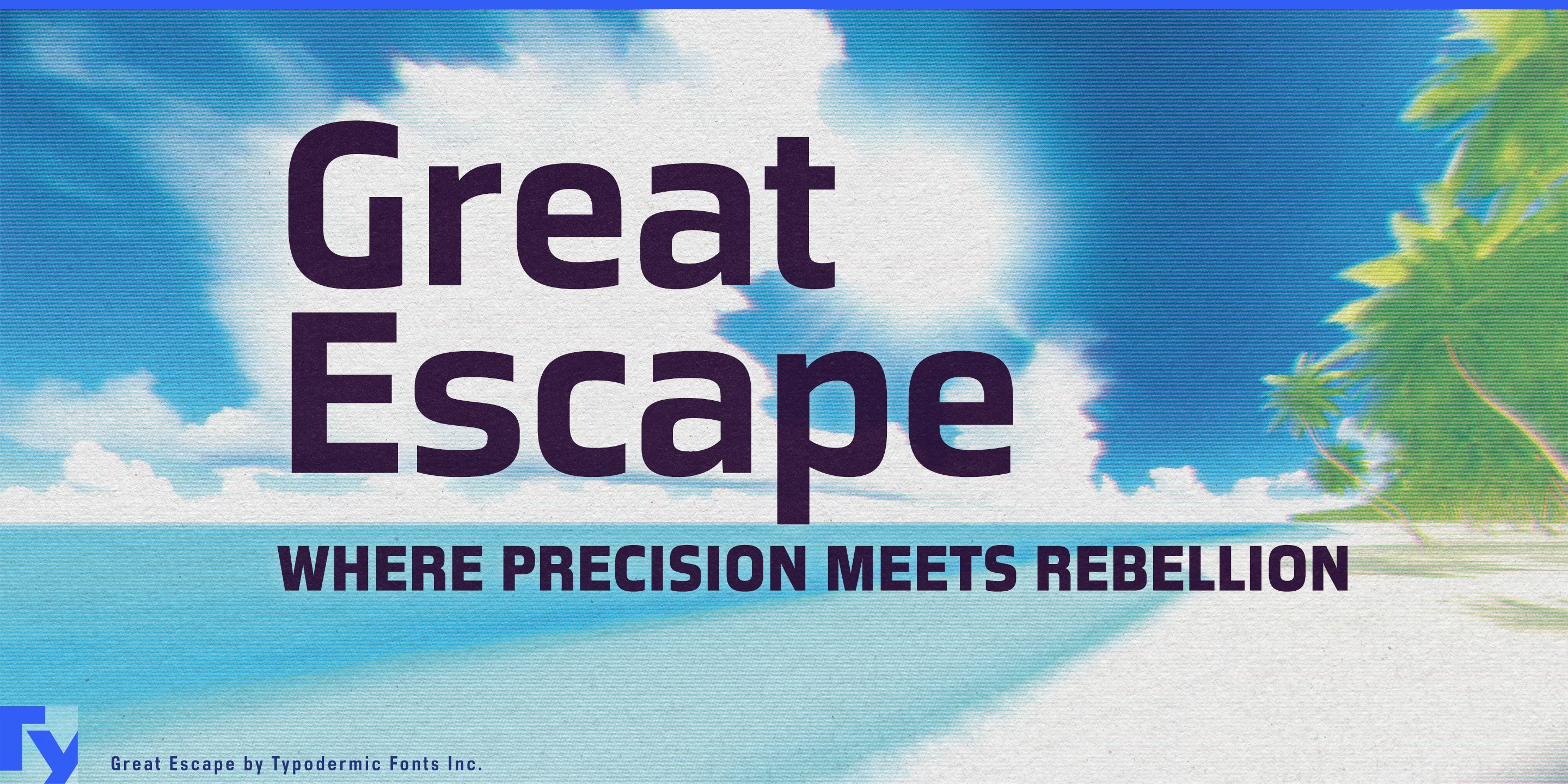
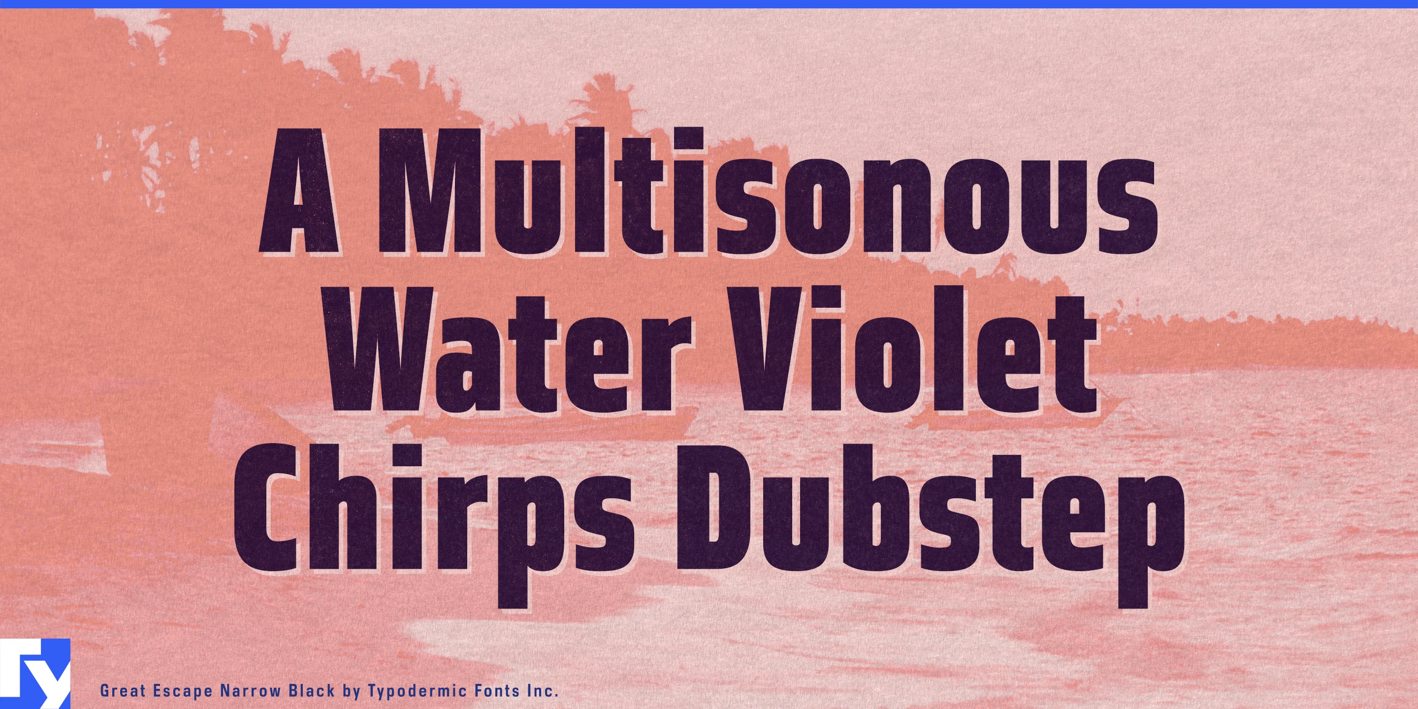
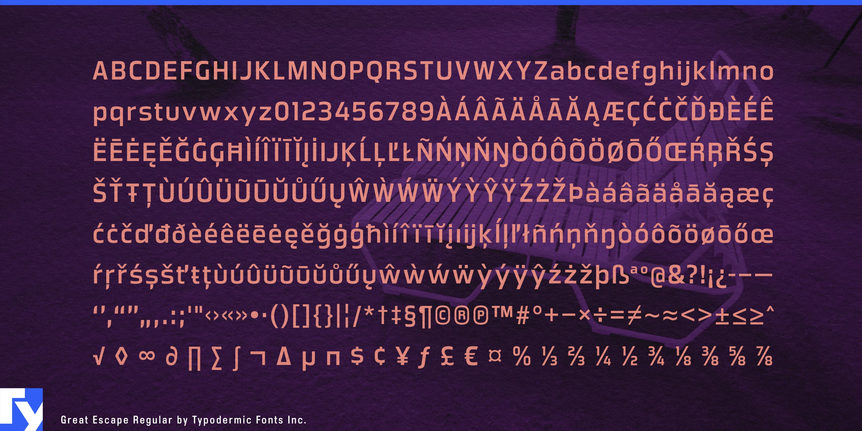
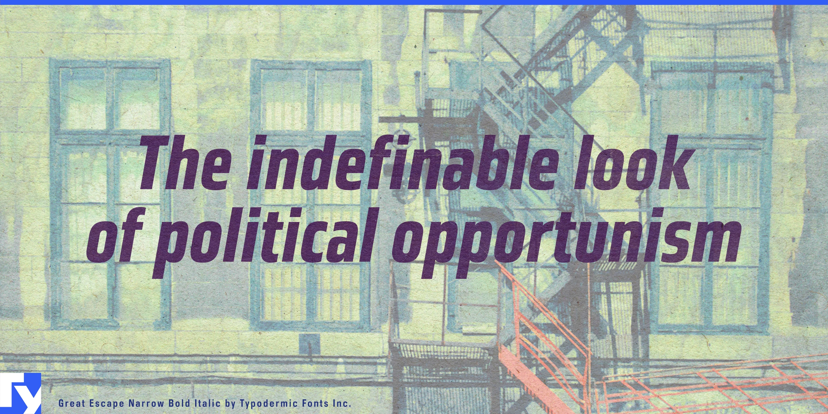
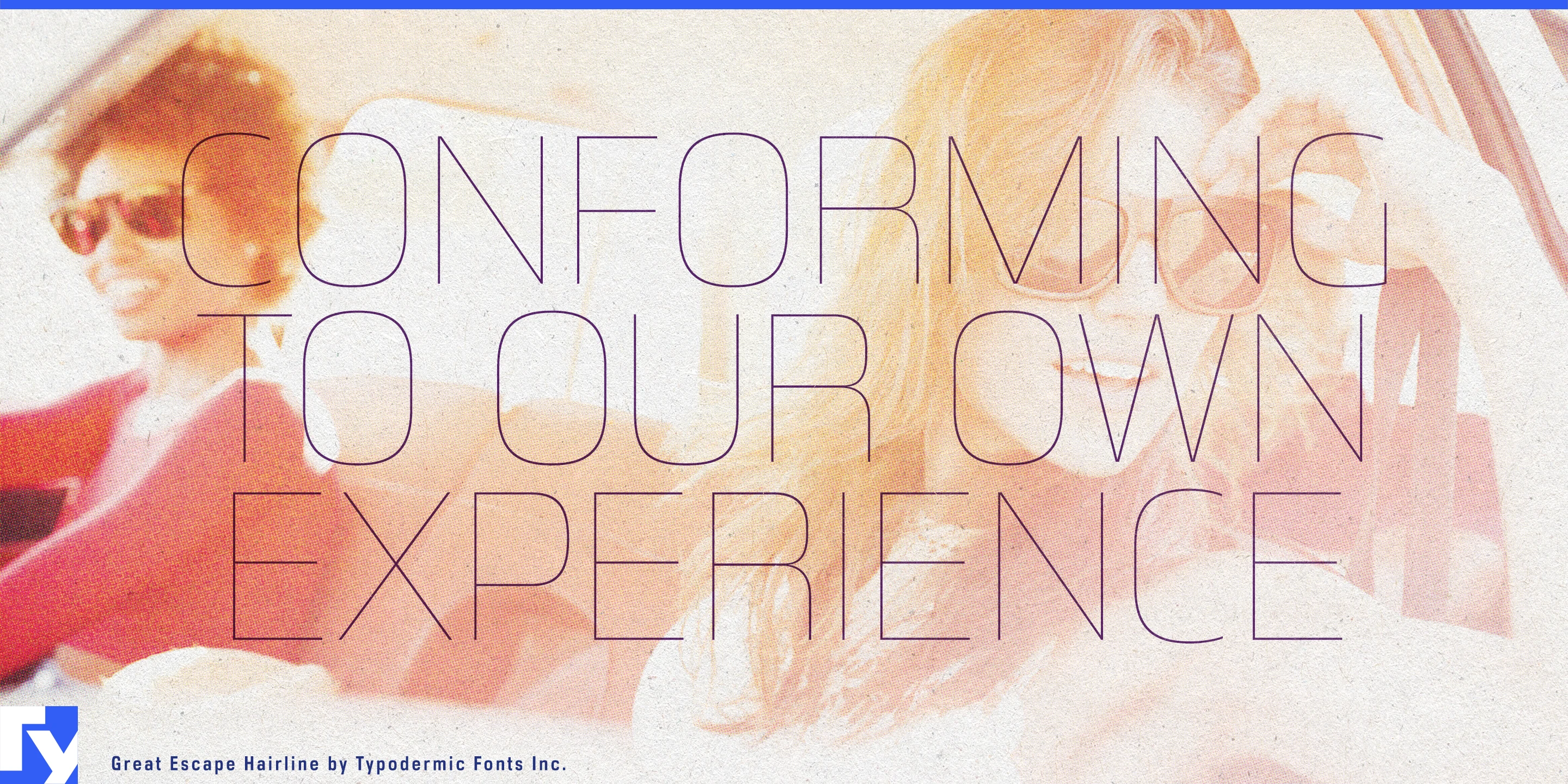
Great Escape gives information-heavy campaigns a recognizable square-sans voice. It is especially useful in hypermarkets and big-box retail, where typography must compete with product photography, prices, offer details, and irregular promotional panels. Weekly-special covers, hanging aisle banners, shelf-edge product messages, garden-centre category signs, electronics-department sale boards, and seasonal barbecue or back-to-school campaigns all benefit from its compact, emphatic presence.
The same visual language suits consumer equipment and performance products. Great Escape can carry model names printed on portable speakers, fitness machines, and coolers; it also fits e-bike accessory cartons, camping-stove feature panels, outdoor-product catalogues, comparison cards, and instruction-sheet headings. It suggests engineering without making consumer products look like laboratory equipment.
Cycling and running events offer another practical setting. Race titles must fit across start gantries, long team names squeeze onto jersey panels, and sponsor information competes for space along course barriers. Great Escape can organize number plates, route signs, sponsor walls, result-board headings, broadcast straps, schedules, and video recap titles within one coherent event identity.
Science and engineering exhibitions draw on its more analytical side. It works for entrance-wall titles, photographic displays, wall timelines, object-label headings, machine-diagram annotations, floor directories, directional panels, and touchscreen category names. Its structure connects naturally with subjects such as transport, energy, communications, industrial design, and consumer technology without making educational material feel bureaucratic.
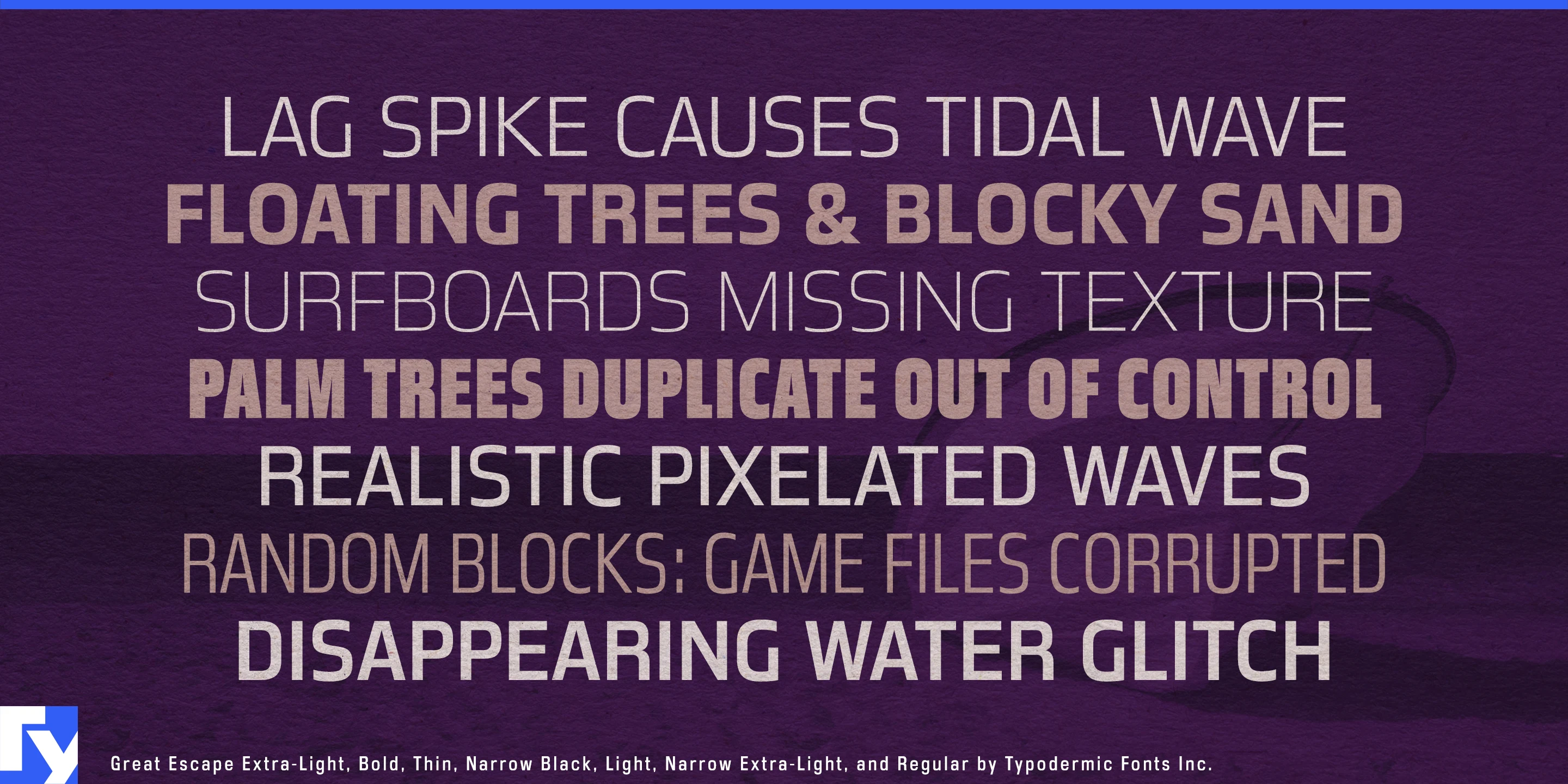
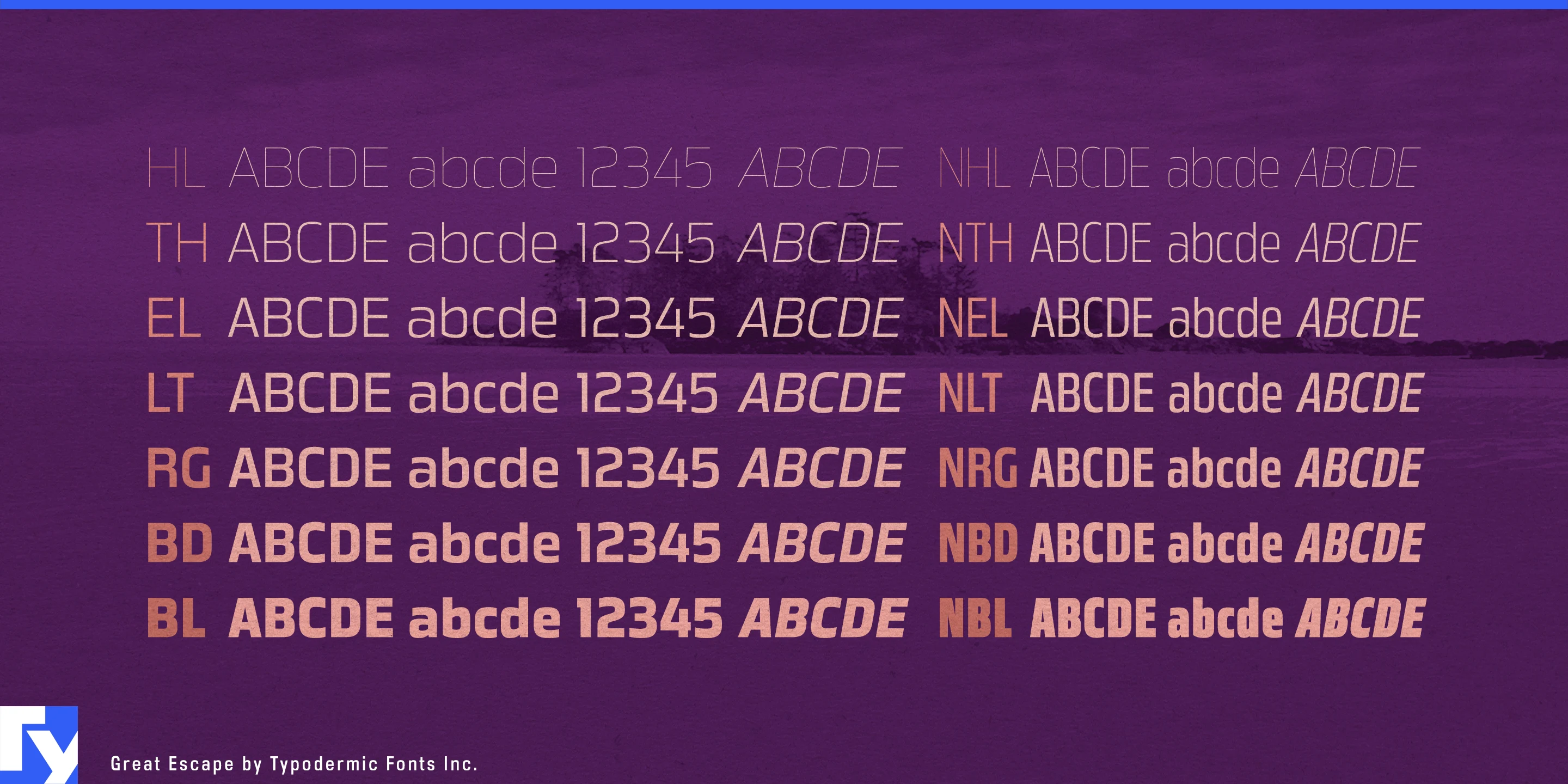
These uses are held together by Great Escape’s rounded-rectangular bowls, flat-sided curves, and compact proportions. Subtle stroke modulation and gently shaped joins soften the technical construction, while the direct single-storey a and g give the lowercase a distinctive, economical rhythm. Seven weights from Hairline to Black are available in regular and Narrow widths with matching italics, allowing the same recognizable forms to continue across promotional headlines, product information, event graphics, and exhibition text.
Get Great Escape
Desktop licenses cover print, logos, and static graphics. MyFonts also offers embedding licenses for websites, e-books, and applications. Embedding licenses
Commercial font facts
Family details
- First released
- 2010
- Styles
- 28 styles
- Version
- 1.300
- Formats
- OTF
- Class
- Sans serif
- Form
- Geometric, Humanist, Monoline
- Width
- Mixed
- Case
- Mixed case
- Scripts
- Latin
- Role
- Dual purpose
Commercial style names (28)
- Narrow Hairline
- Narrow Hairline Italic
- Narrow Thin
- Narrow Thin Italic
- Narrow Extra-Light
- Narrow Extra-Light Italic
- Narrow Light
- Narrow Light Italic
- Narrow
- Narrow Italic
- Narrow Bold
- Narrow Bold Italic
- Narrow Black
- Narrow Black Italic
- Hairline
- Hairline Italic
- Thin
- Thin Italic
- Extra-Light
- Extra-Light Italic
- Light
- Light Italic
- Regular
- Italic
- Bold
- Bold Italic
- Black
- Black Italic