
Dividente
Get the font


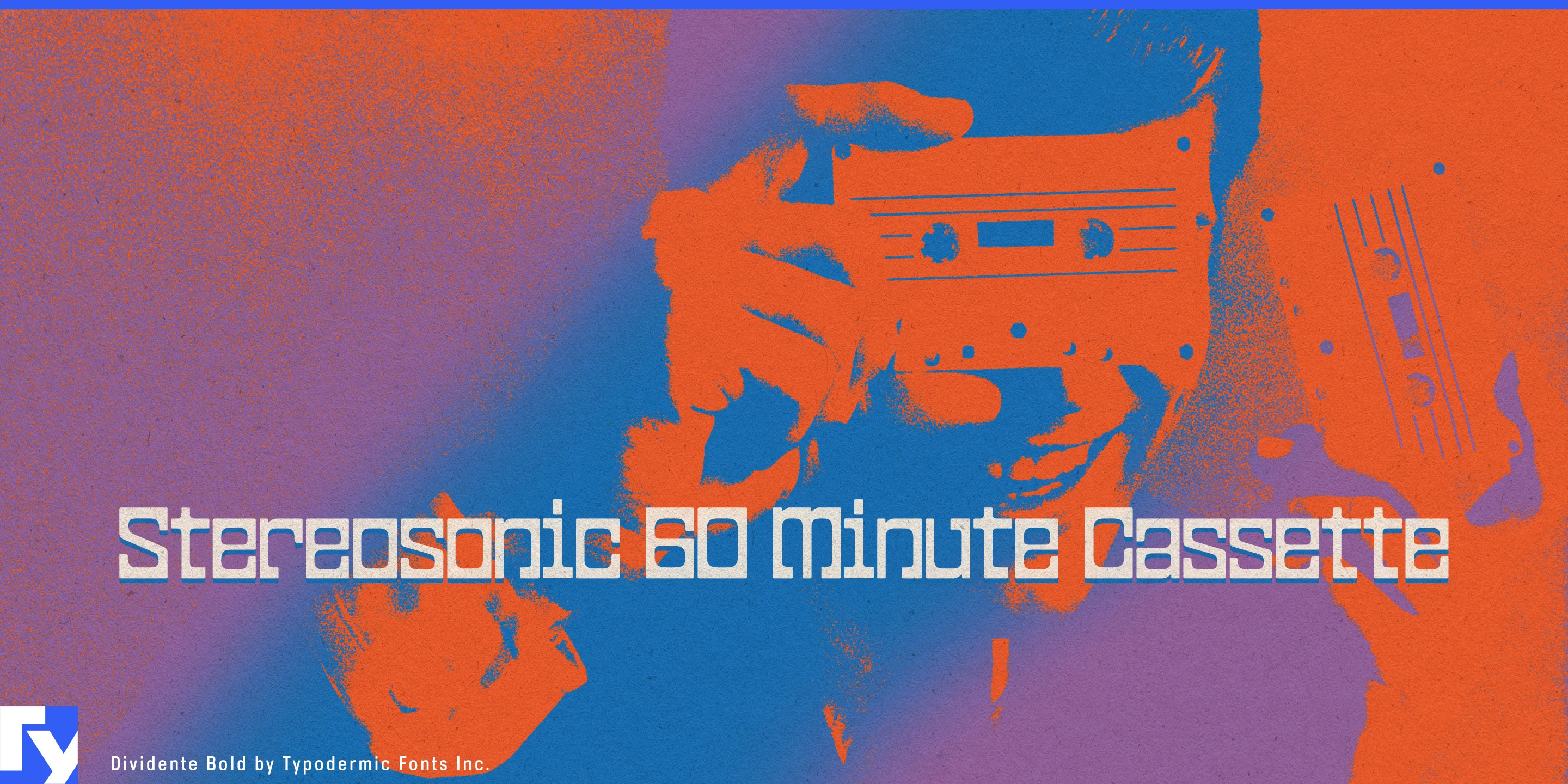
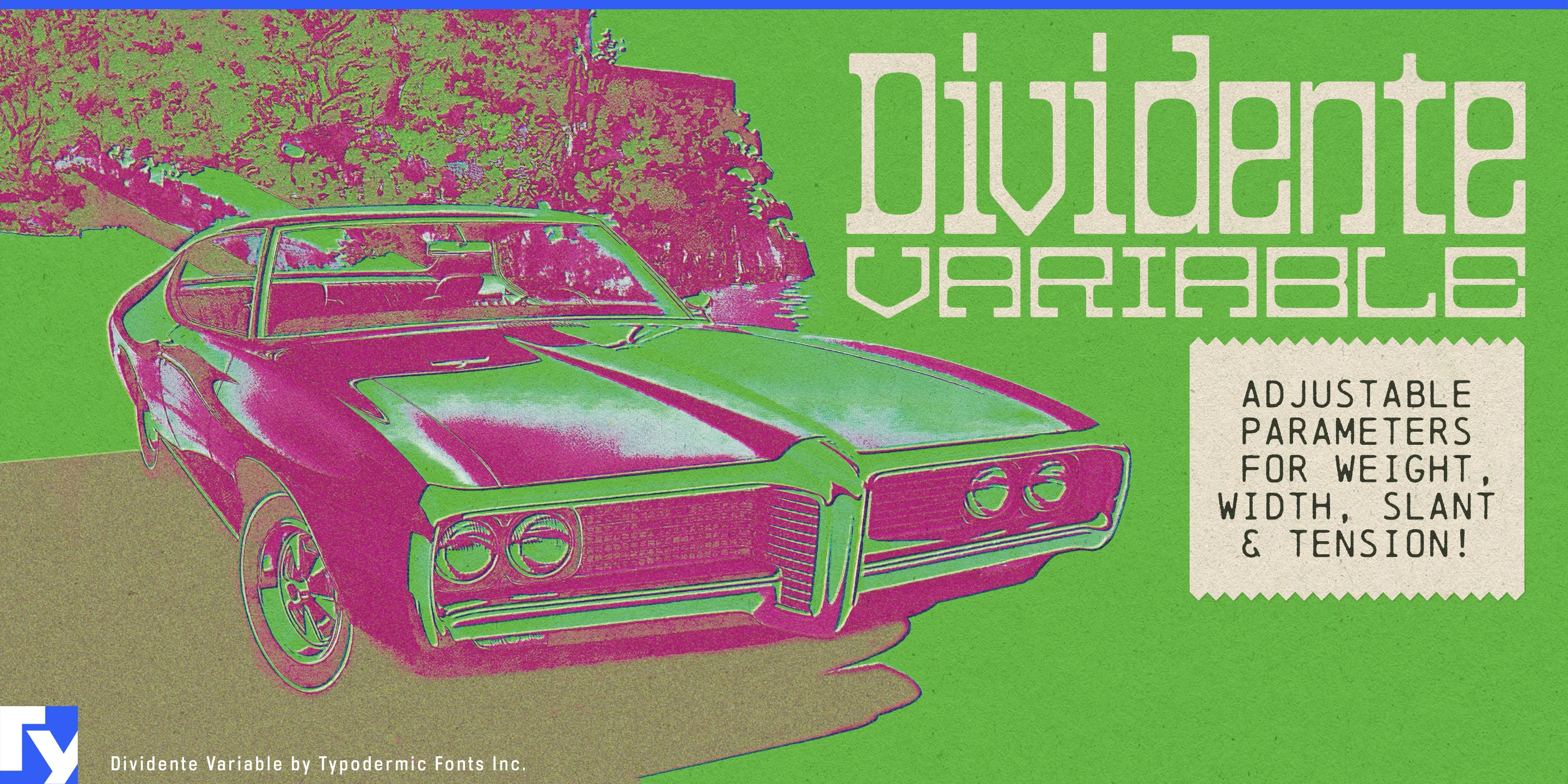
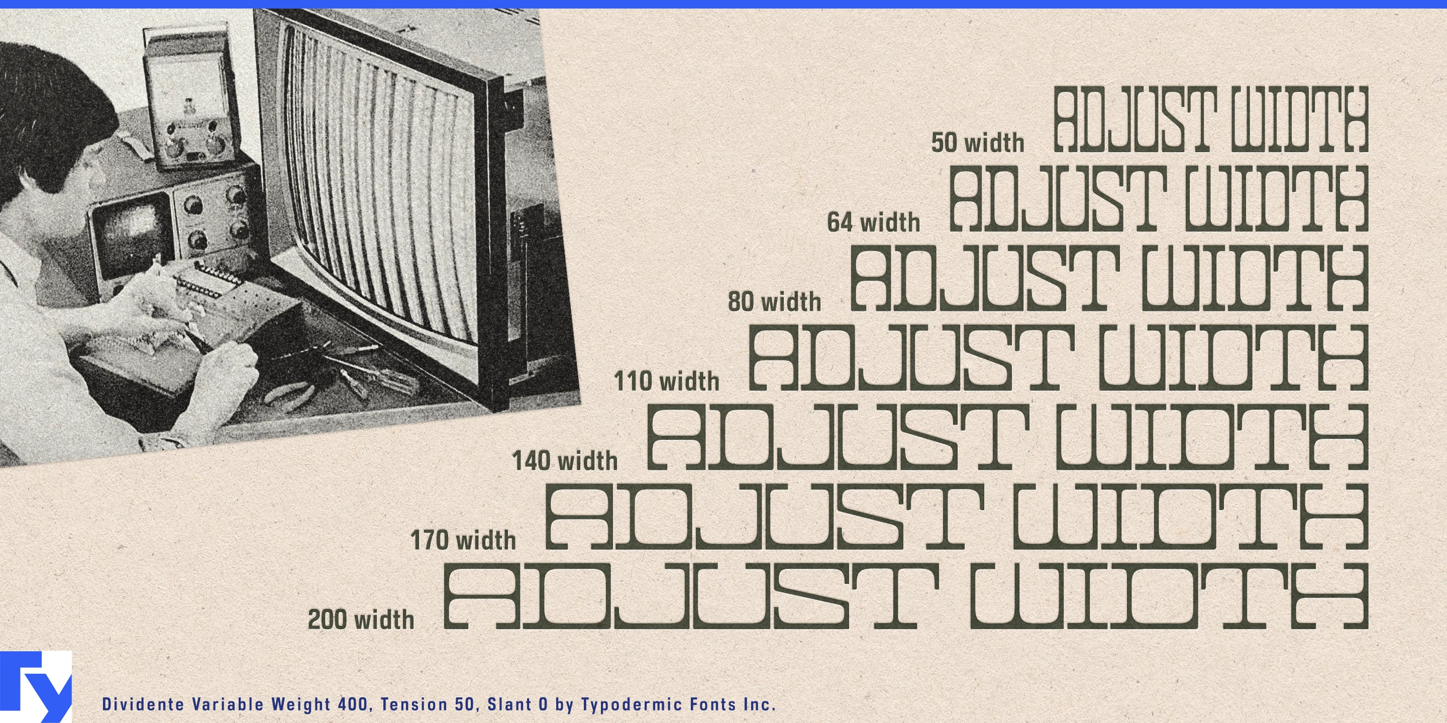
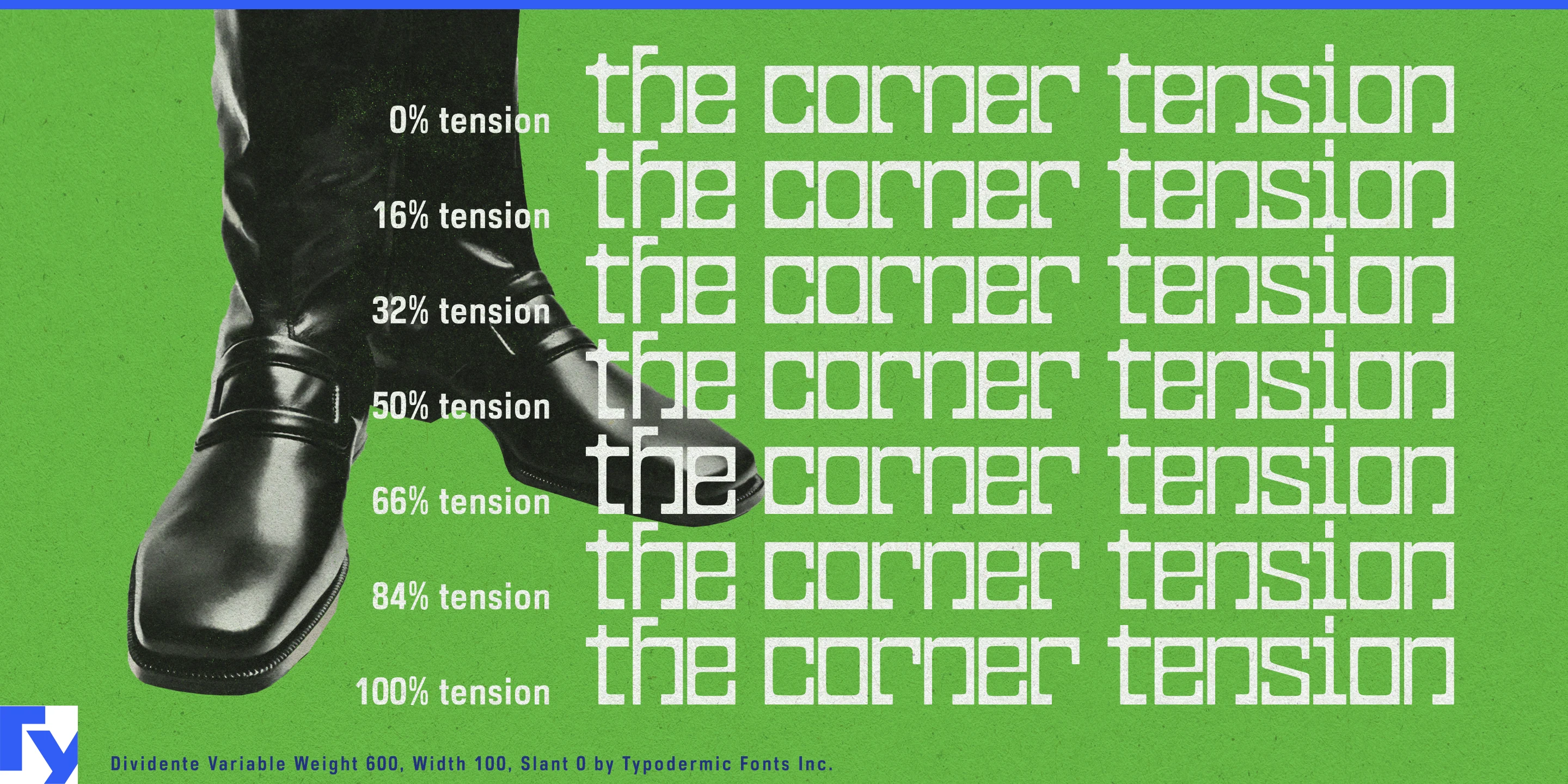
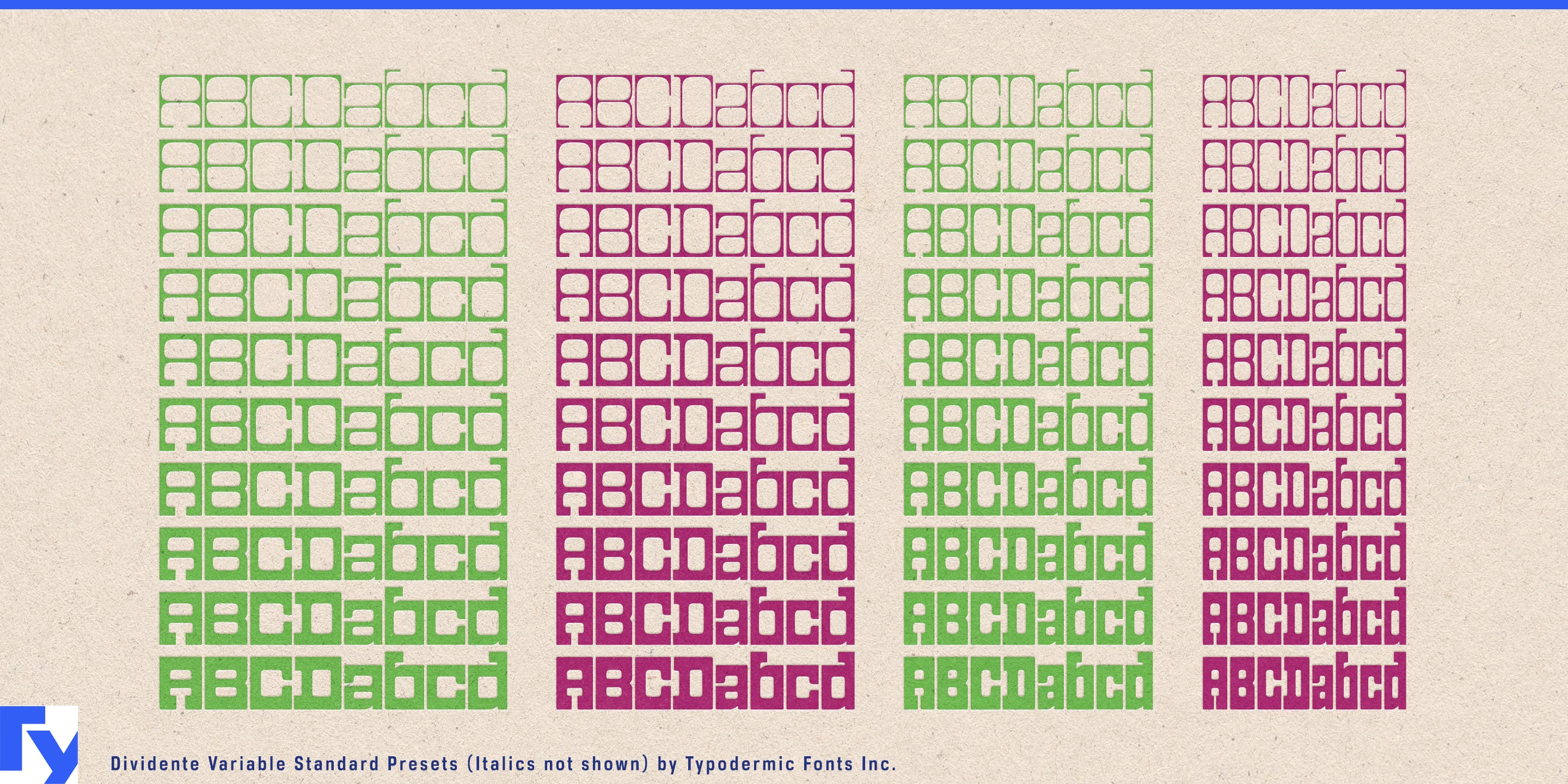
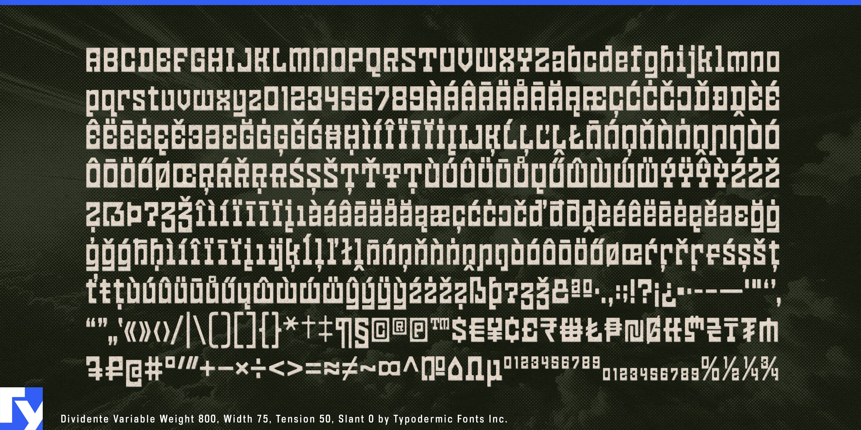

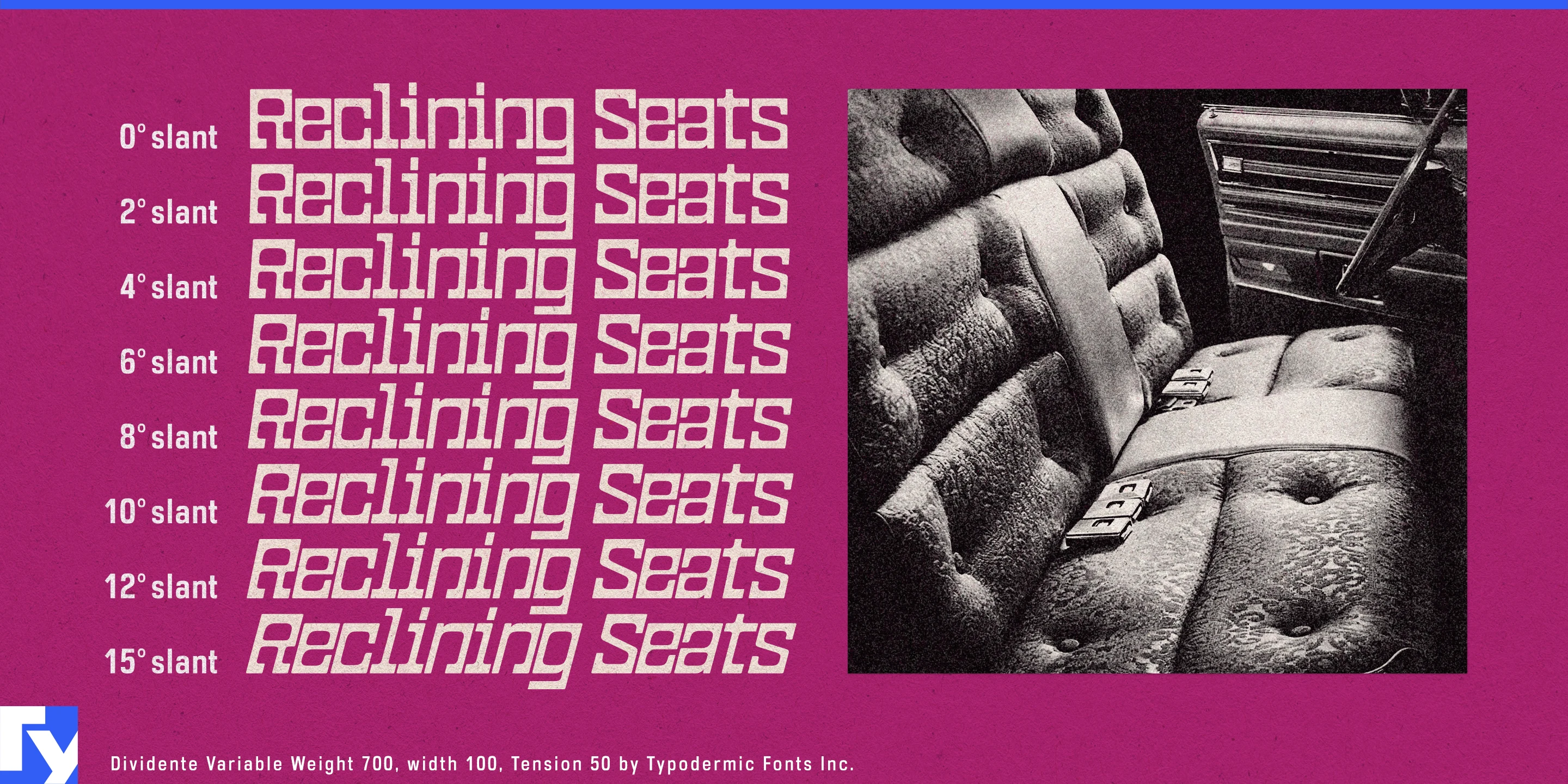
Retro character can be difficult to control. A dedicated 1960s or 1970s revival face may commit an entire identity to one period and one level of exuberance; a neutral geometric sans can remove the historical flavor altogether. Dividente gives designers somewhere in between. Its squared outer forms, soft interiors, tight rhythm, and broad range of weights and widths can shift from sleek retro-modernism to full psychedelic display without abandoning the same underlying vocabulary.
That makes Dividente particularly useful for retro-modern cafés, listening bars, and design-led hospitality. Espresso bars, coffee-and-record concepts, hotel cafés, modernist restaurants, and spaces built around chrome, smoked glass, saturated color, rounded upholstery, or postmodern furniture can dial the typography to match the room. Lighter styles can handle permanent identities, menu headings, window lettering, and architectural graphics; heavier and wider styles can take over for seasonal drinks, guest DJs, collaborations, merchandise, and promotional campaigns.
Hair salons and beauty studios offer another natural setting. Color studios, blow-dry bars, curl specialists, nail salons, and contemporary beauty collectives can use Dividente when minimalist luxury typography feels too restrained but cute or ornamental lettering would go too far. The family can move from airy salon names and wall lettering to dense campaign headlines, service promotions, product displays, and seasonal color launches.
Its heavier styles also suit bulky, sculptural footwear influenced by early-2000s design: thick skate-inspired sneakers, rounded platforms, exaggerated lifestyle trainers, clogs, and other shoes built around padded volume and molded geometry. Model names, shoeboxes, insoles, retail displays, launch campaigns, and seasonal capsules can shift from a technical fashion treatment to typography almost as substantial as the product itself.
Furniture and lighting occupy similar territory. Modular sofas, rounded lounge chairs, upholstered benches, sculptural lamps, low tables, and contemporary pieces influenced by late-1960s and 1970s interiors can use Dividente for collection names, catalogues, showroom graphics, design-fair booths, and product launches. Its combination of hard geometry and softened interiors echoes objects that are structured but padded, molded, or curved.
Dividente was designed with a psychedelic revival in mind, and that side remains available when a project wants to push further. Listening-bar events, summer café campaigns, experimental furniture launches, beauty collaborations, footwear drops, and cultural graphics can turn the heavier styles into dense, colorful display typography. Psychedelia is one setting rather than a requirement.
Dividente’s useful trick is its adjustable level of retro. It can whisper through a salon identity, settle into a modernist café, bulk up beside a sculptural sneaker or sofa, or turn the dial all the way toward psychedelic display.
Get Dividente
Desktop licenses cover print, logos, and static graphics. MyFonts also offers embedding licenses for websites, e-books, and applications. Embedding licenses
Commercial font facts
Family details
- First released
- 2025
- Styles
- 60 styles
- Version
- 1.000
- Formats
- OTF
- Class
- Sans serif
- Form
- Geometric, Superelliptical
- Width
- Mixed
- Case
- Mixed case
- Scripts
- Latin
- Role
- Display
Commercial style names (60)
- Thin Condensed
- Thin Condensed Italic
- Extra-Light Condensed
- Extra-Light Condensed Italic
- Light Condensed
- Light Condensed Italic
- Condensed
- Condensed Italic
- Medium Condensed
- Medium Condensed Italic
- Semi-Bold Condensed
- Semi-Bold Condensed Italic
- Bold Condensed
- Bold Condensed Italic
- Extra-Bold Condensed
- Extra-Bold Condensed Italic
- Heavy Condensed
- Heavy Condensed Italic
- Black Condensed
- Thin
- Thin Italic
- Extra-Light
- Extra-Light Italic
- Light
- Light Italic
- Regular
- Italic
- Medium
- Medium Italic
- Semi-Bold
- Semi-Bold Italic
- Bold
- Bold Italic
- Extra-Bold
- Extra-Bold Italic
- Heavy
- Heavy Italic
- Black
- Black Condensed Italic
- Black Italic
- Thin Expanded
- Thin Expanded Italic
- Extra-Light Expanded
- Extra-Light Expanded Italic
- Light Expanded
- Light Expanded Italic
- Expanded
- Expanded Italic
- Medium Expanded
- Medium Expanded Italic
- Semi-Bold Expanded
- Semi-Bold Expanded Italic
- Bold Expanded
- Bold Expanded Italic
- Extra-Bold Expanded
- Extra-Bold Expanded Italic
- Heavy Expanded
- Heavy Expanded Italic
- Black Expanded
- Black Expanded Italic