
Burnaby Stencil
Get the font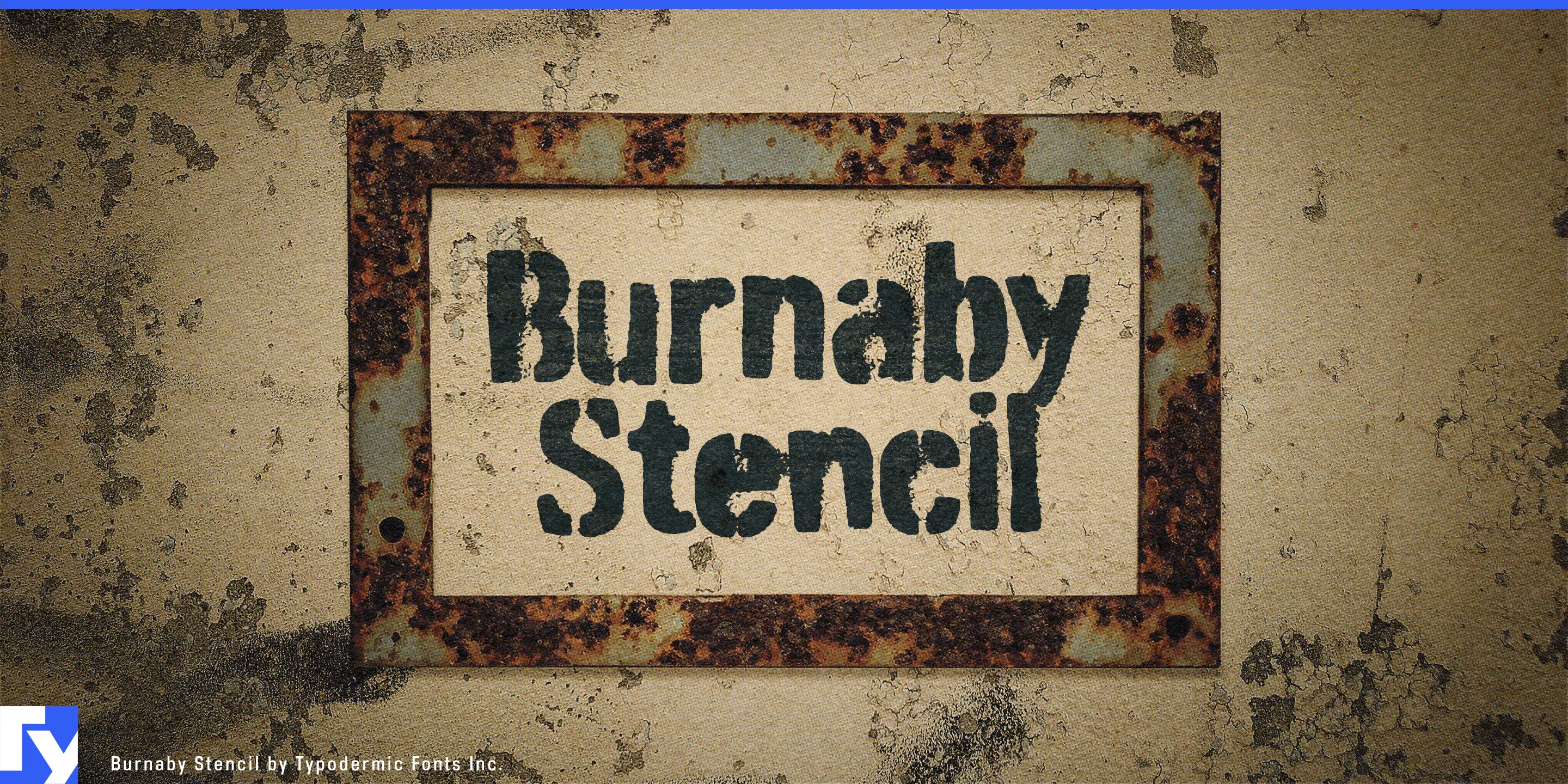
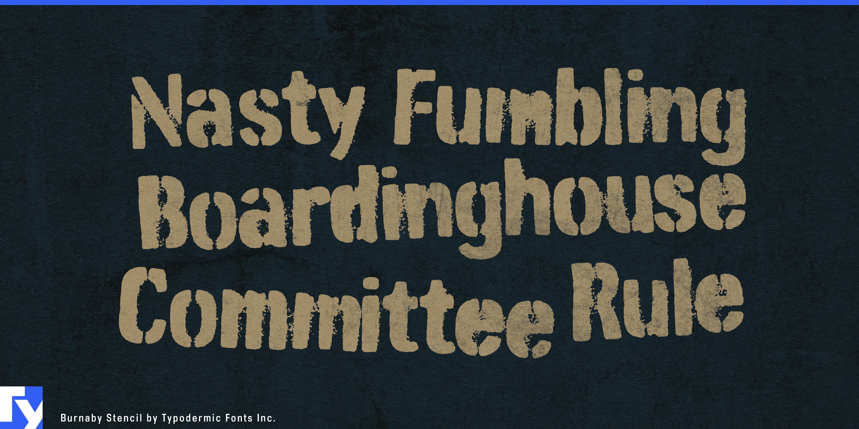
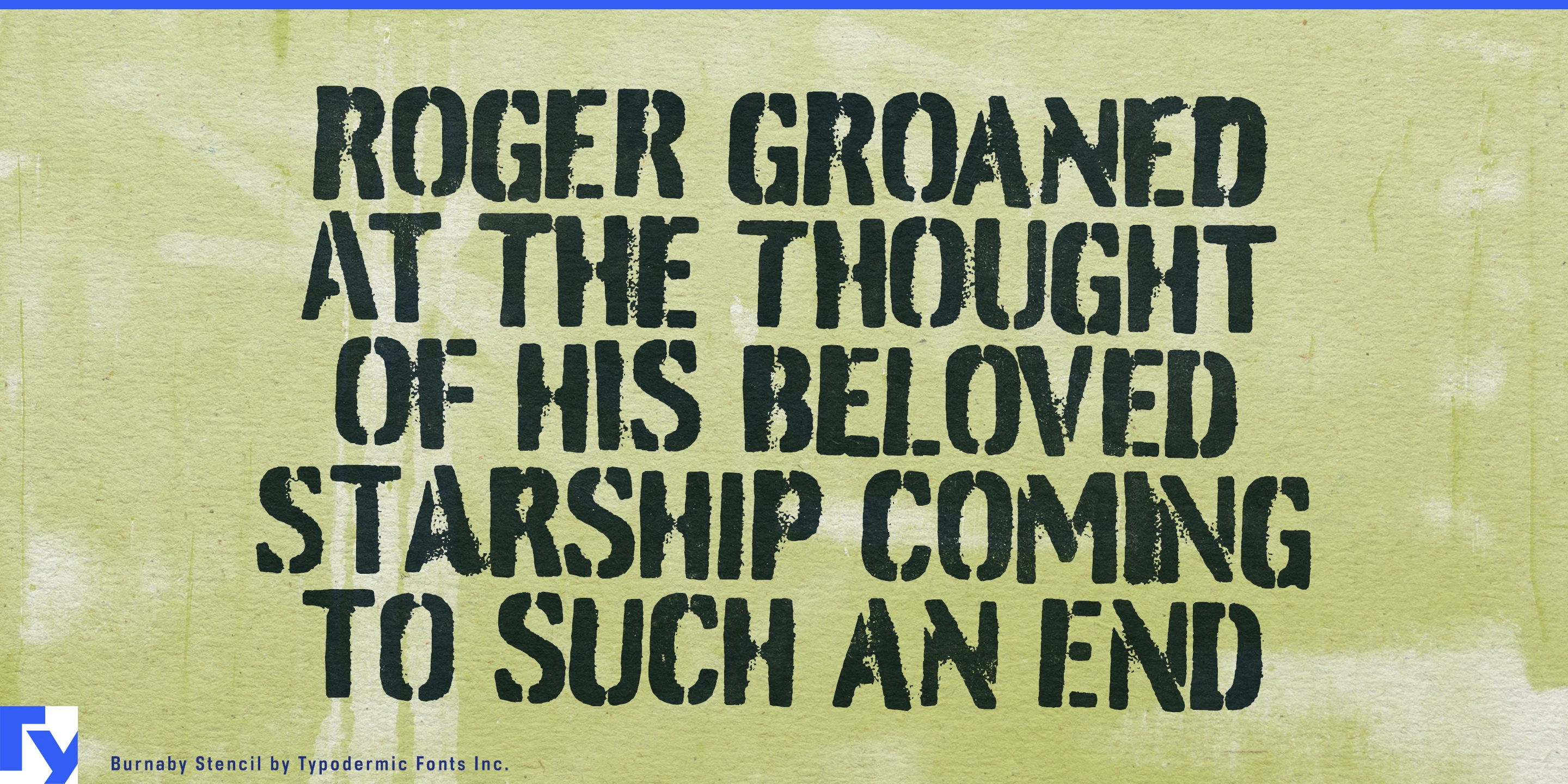
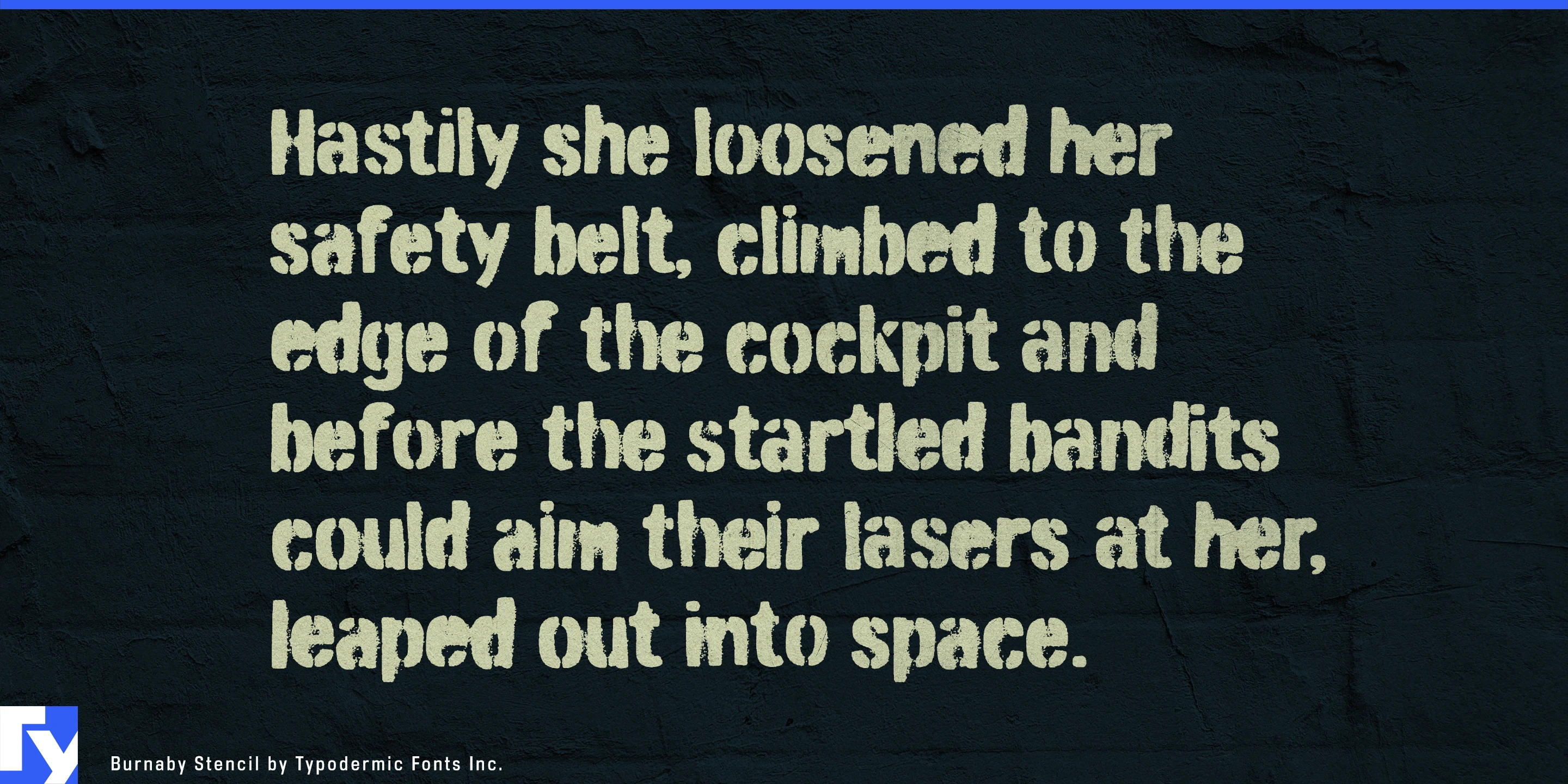
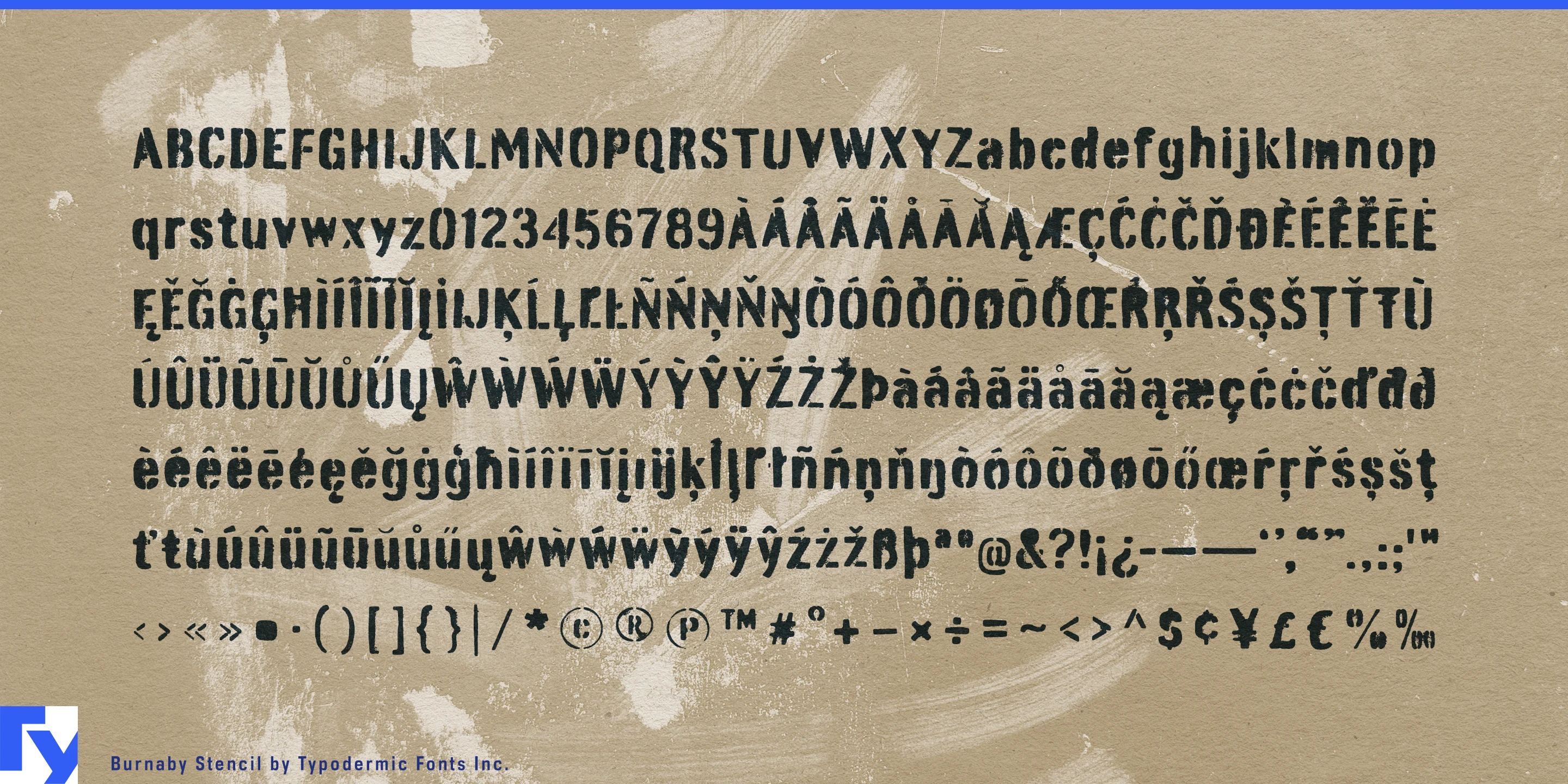
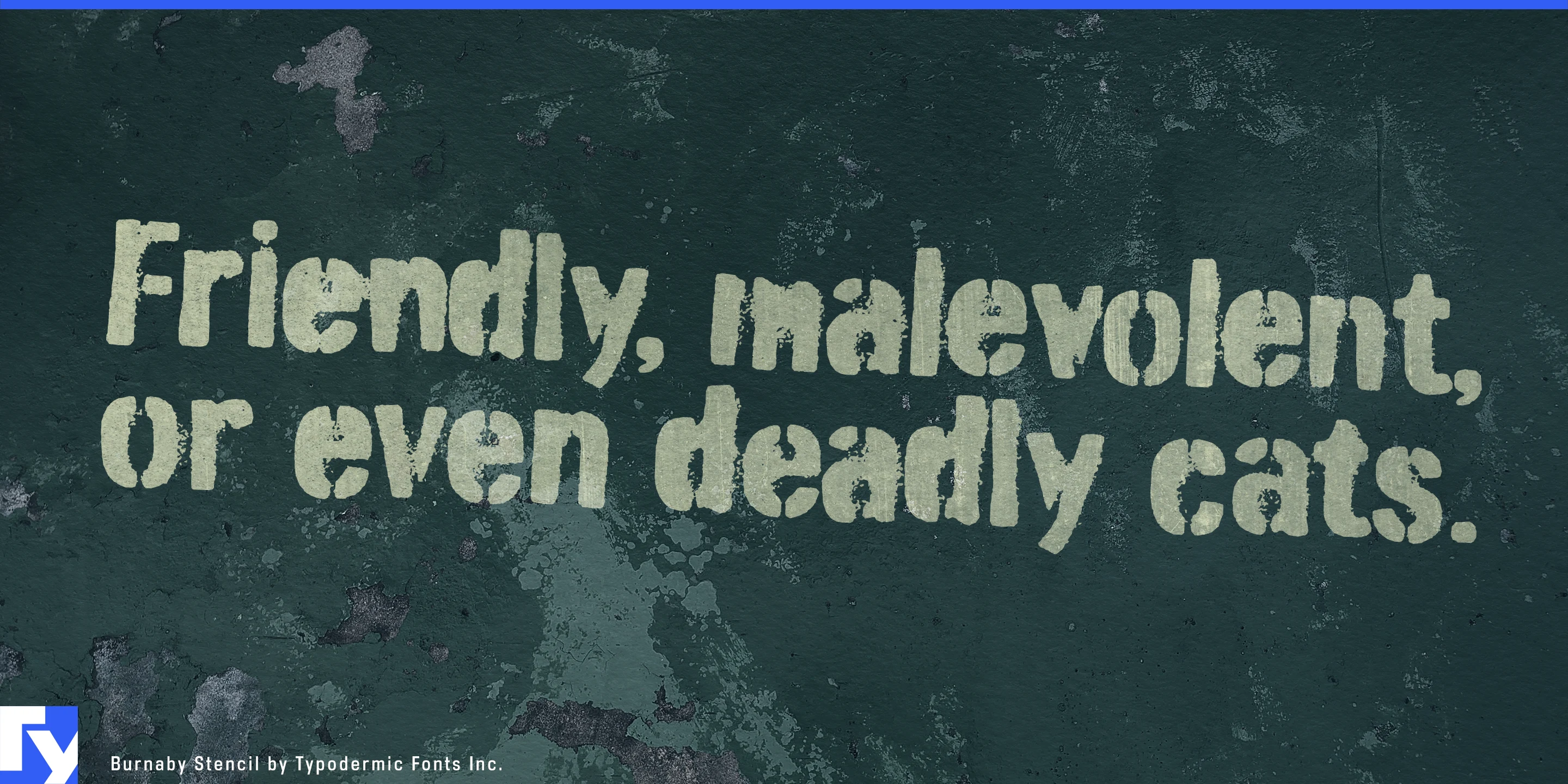
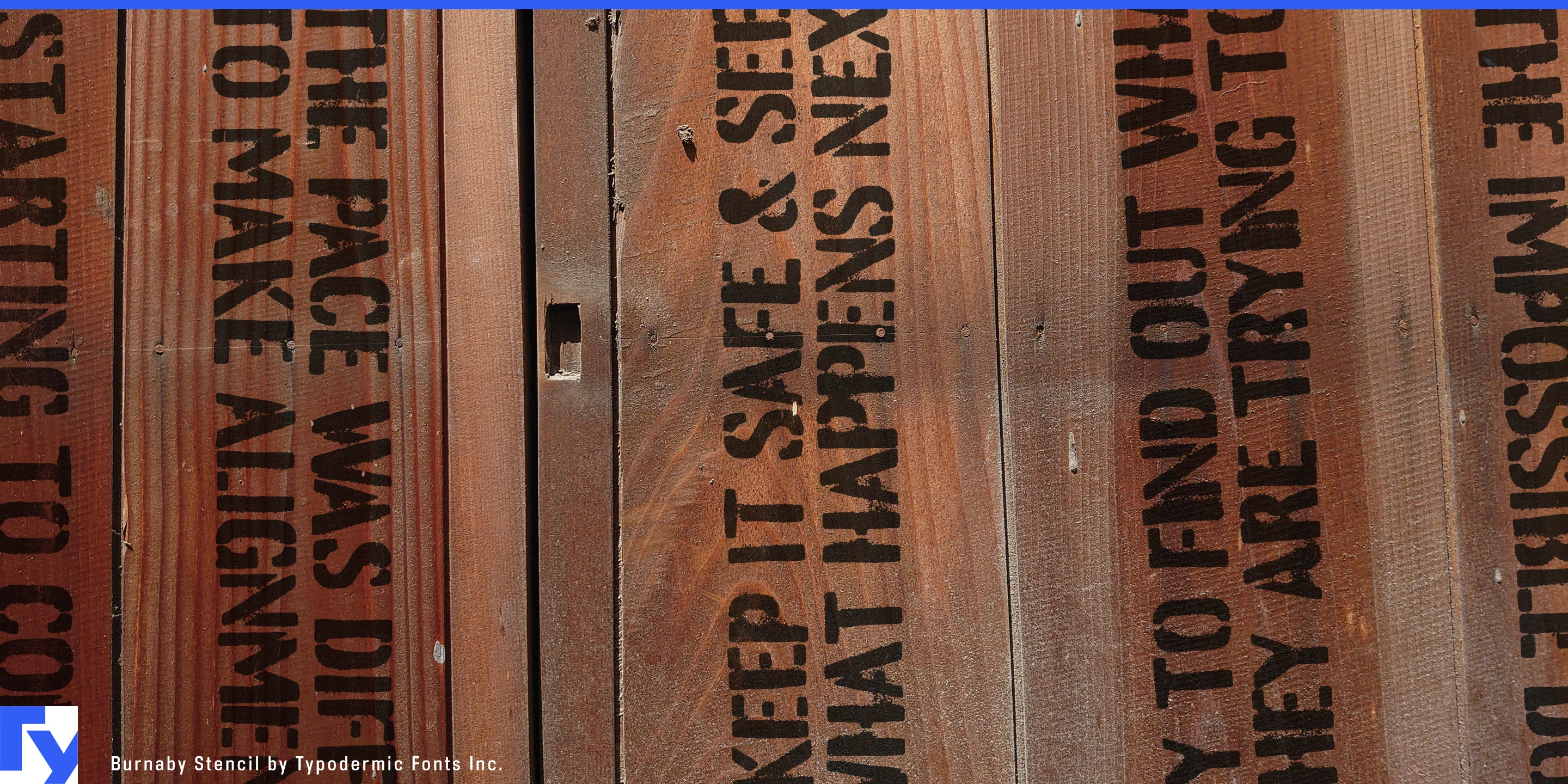
A finished identity sometimes has to communicate in an unfinished place. A redevelopment project may have polished renderings and carefully planned branding while the actual site is still plywood, concrete, temporary partitions and freight doors. Pristine corporate typography can feel pasted on; generic grunge can look like an effect. Burnaby Stencil gives a professional design system a convincing on-site voice.
Its compact, superelliptical forms were designed as stencil lettering from the outset. Uneven edges, incomplete coverage, soft bleed and overspray suggest paint applied quickly through a physical stencil, while alternate letter combinations help repeated textures feel less mechanical.
Construction and redevelopment are natural settings for Burnaby Stencil. It can carry project names and campaign headlines across hoarding, renovation partitions, opening-soon graphics, sales-centre installations and exhibitions documenting spaces in transition. Adaptive-reuse projects gain a similar advantage: warehouses, factories and utility buildings converted into offices, hospitality, housing or cultural spaces can use lettering that acknowledges patched surfaces and previous use without pretending to reproduce historic signage.
The same visual language extends to architectural salvage, material-reuse programs, reclaimed building products, protective equipment cases and workshop storage systems. Burnaby Stencil can handle program names, product families and campaign graphics while more utilitarian type takes care of safety information, specifications and detailed wayfinding.
Production design offers another strong role. Film, streaming productions, games and immersive attractions often need convincing typography for temporary compounds, abandoned facilities, storage zones, workshops, freight doors and improvised interiors. Burnaby Stencil can generate changing location names, instructions and environmental text while retaining the irregularity of sprayed lettering. Its mixed-case alphabet is especially useful when the setting calls for something less formal than rows of military capitals.
Burnaby Stencil is less about destruction than incompletion. It suits typography that appears to have been made while a place was being built, converted, dismantled or temporarily occupied; controlled enough to remain part of the design system, rough enough to look as though somebody actually brought the stencil and paint to the site.
Get Burnaby Stencil
Desktop licenses cover print, logos, and static graphics. MyFonts also offers embedding licenses for websites, e-books, and applications. Embedding licenses
Commercial font facts
Family details
- First released
- 2007
- Styles
- 1 style
- Version
- 1.106
- Formats
- OTF
- Class
- Sans serif
- Form
- Superelliptical
- Case
- Mixed case
- Scripts
- Latin
- Role
- Display
- Features
- Stencil, Distressed, Alternates
Commercial style names (1)
- Stencil