
Bodoni Z37
Get the font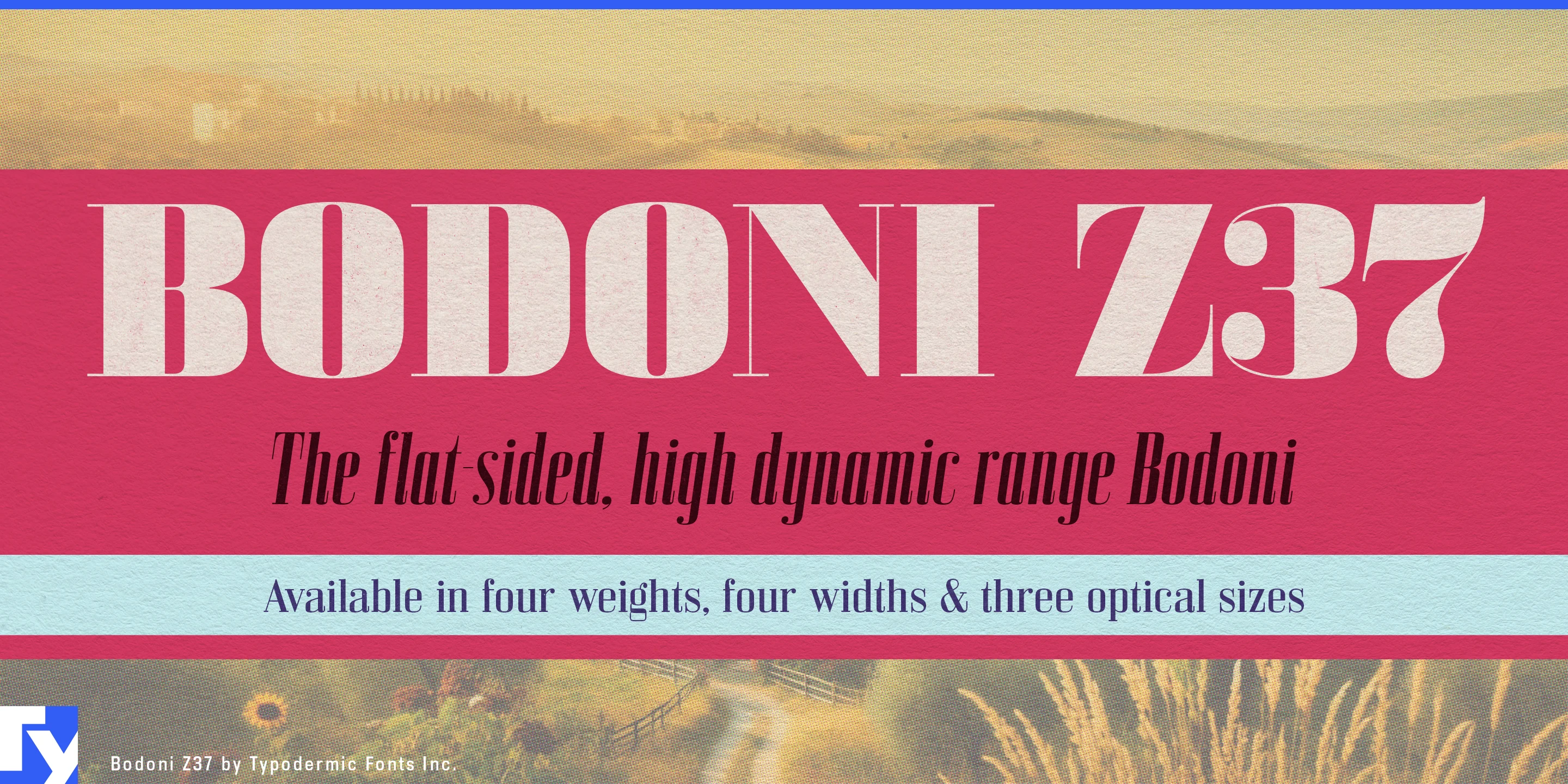
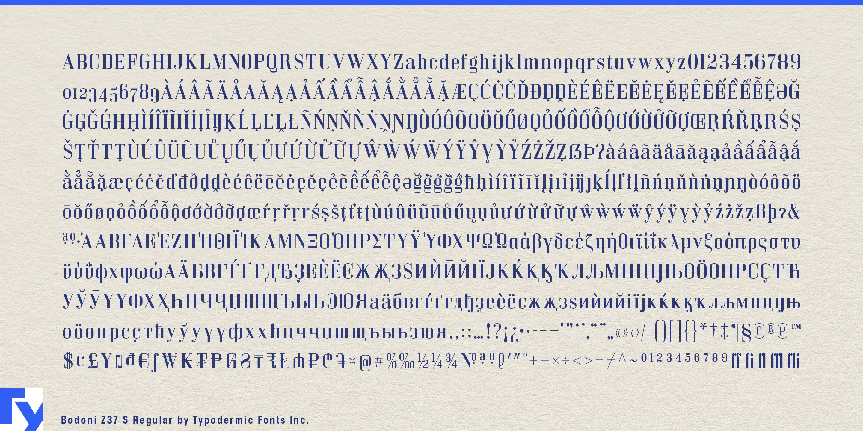
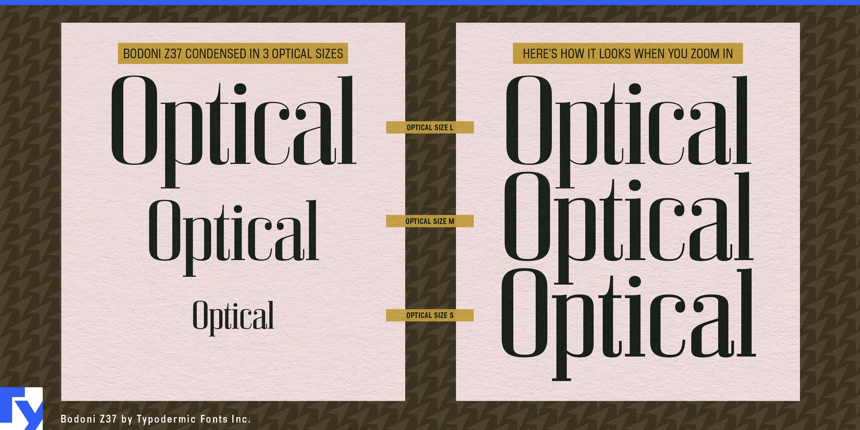

A Bodoni can look spectacular in one perfectly chosen headline and become troublesome the moment the layout changes. Hairlines that sparkle across a magazine cover may become fragile at smaller sizes; a graceful wordmark may refuse to fit a narrow package; a condensed substitute may look squeezed rather than designed. Bodoni Z37 was built for the harder job of carrying high-contrast Didone typography across an entire display system.
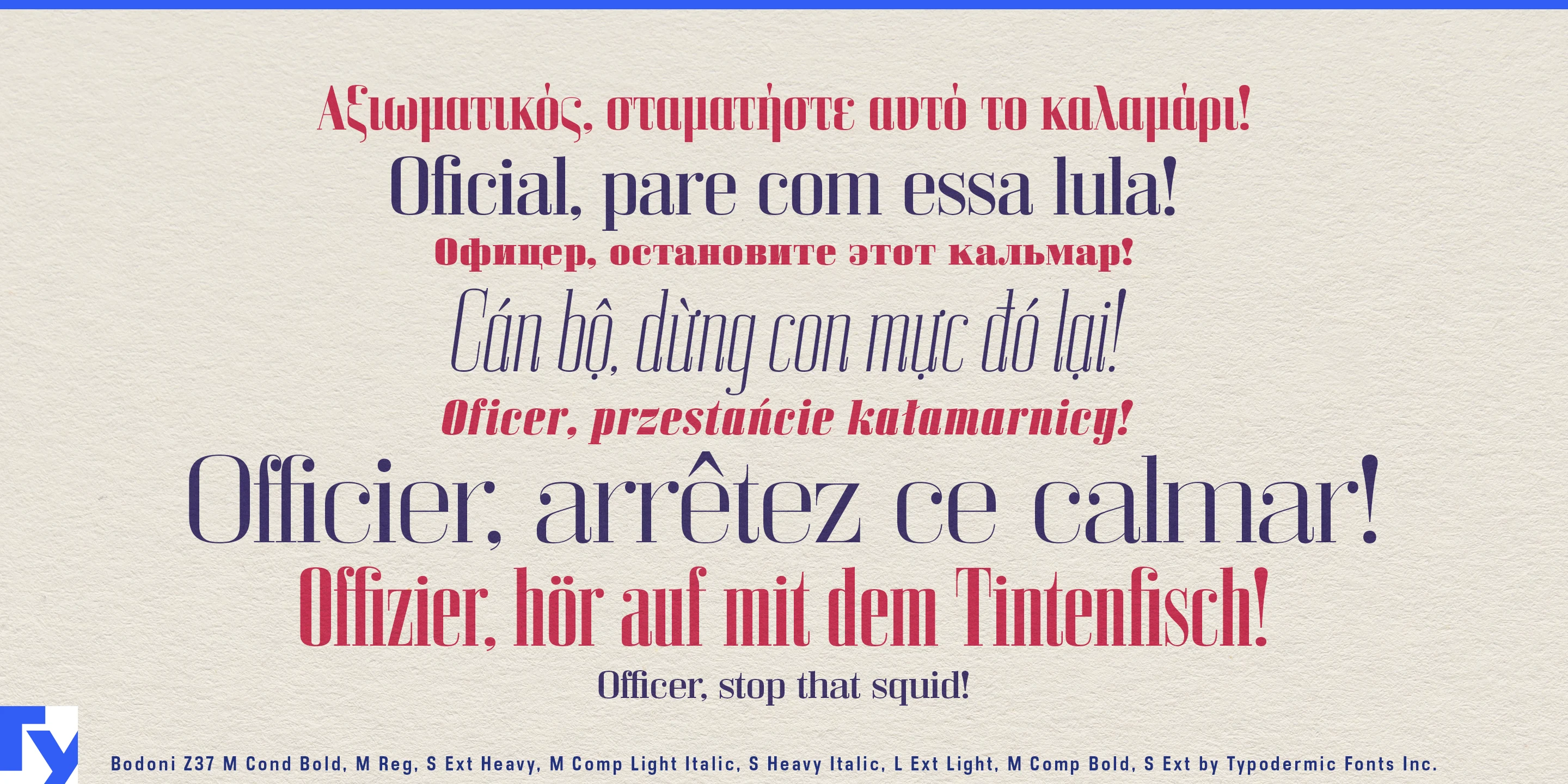
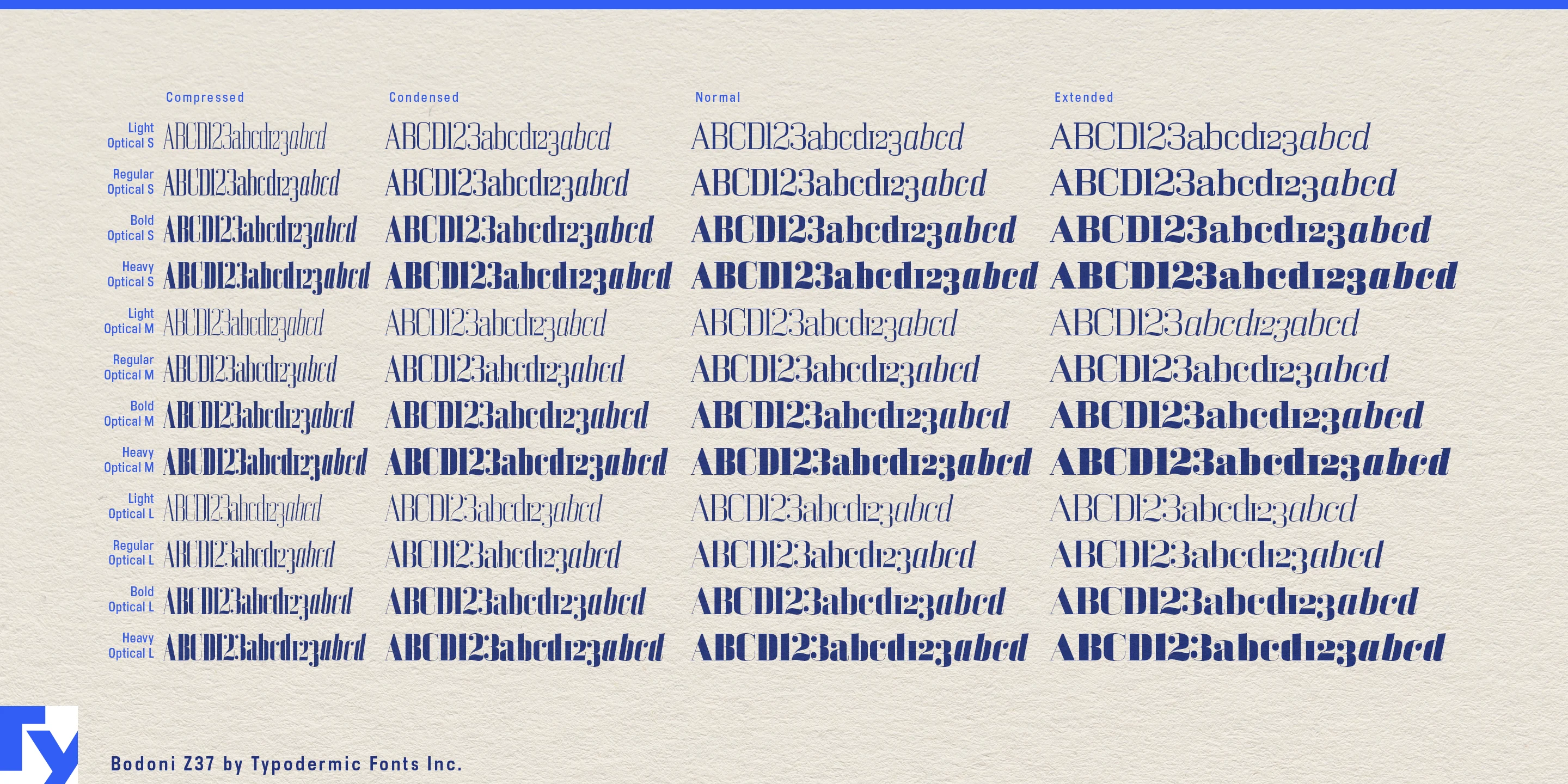
The family combines four weights, four widths from Compressed through Extended, three optical sizes and matching italics, producing 96 coordinated styles. Contrast changes with optical size so smaller settings remain sturdier while the largest cuts can push the fine strokes much further. Width is treated as a design problem too: the narrower styles become progressively flatter-sided rather than simply compressing an oval construction into less space.
Fashion editorial makes particularly good use of that range. A single issue may need a broad masthead, a tall compressed cover line, a huge collection name across a photograph, narrow designer credits, pull quotes and smaller section headings. Bodoni Z37 can change proportion and contrast as those spaces demand while keeping the same underlying voice.
Art publishing and exhibition design create a similar range of scales. Museum identities, photography monographs, gallery catalogs, retrospective books and art-fair programs may move from enormous wall titles and cover typography to section headings, captions and narrow informational lines. Bodoni Z37 can provide the expressive display layer throughout that system while a quieter companion face handles sustained reading.
Packaging puts the width range under even more pressure. Perfume cartons, skincare bottles, wine labels, spirits boxes and specialty-food packages frequently offer typography an awkward collection of tall strips, broad panels and small secondary areas. A long product name can move into Compressed without looking artificially squeezed; a broad carton front can take advantage of Extended; smaller headings can use a sturdier optical cut while a large name gets the finer, more dramatic treatment.
Beauty and fragrance campaigns can push the family toward its most extreme contrast. Large optical styles let hairlines become part of the spectacle on campaign posters, window graphics and full-screen advertising, while narrower cuts fit naturally onto bottles and vertical packaging.
The increasingly flat-sided construction of the narrower widths gives Bodoni Z37 another distinction from softer, more conventional Didones. At wider settings it can remain relatively classical; as it compresses, the shapes become sharper and more architectural.
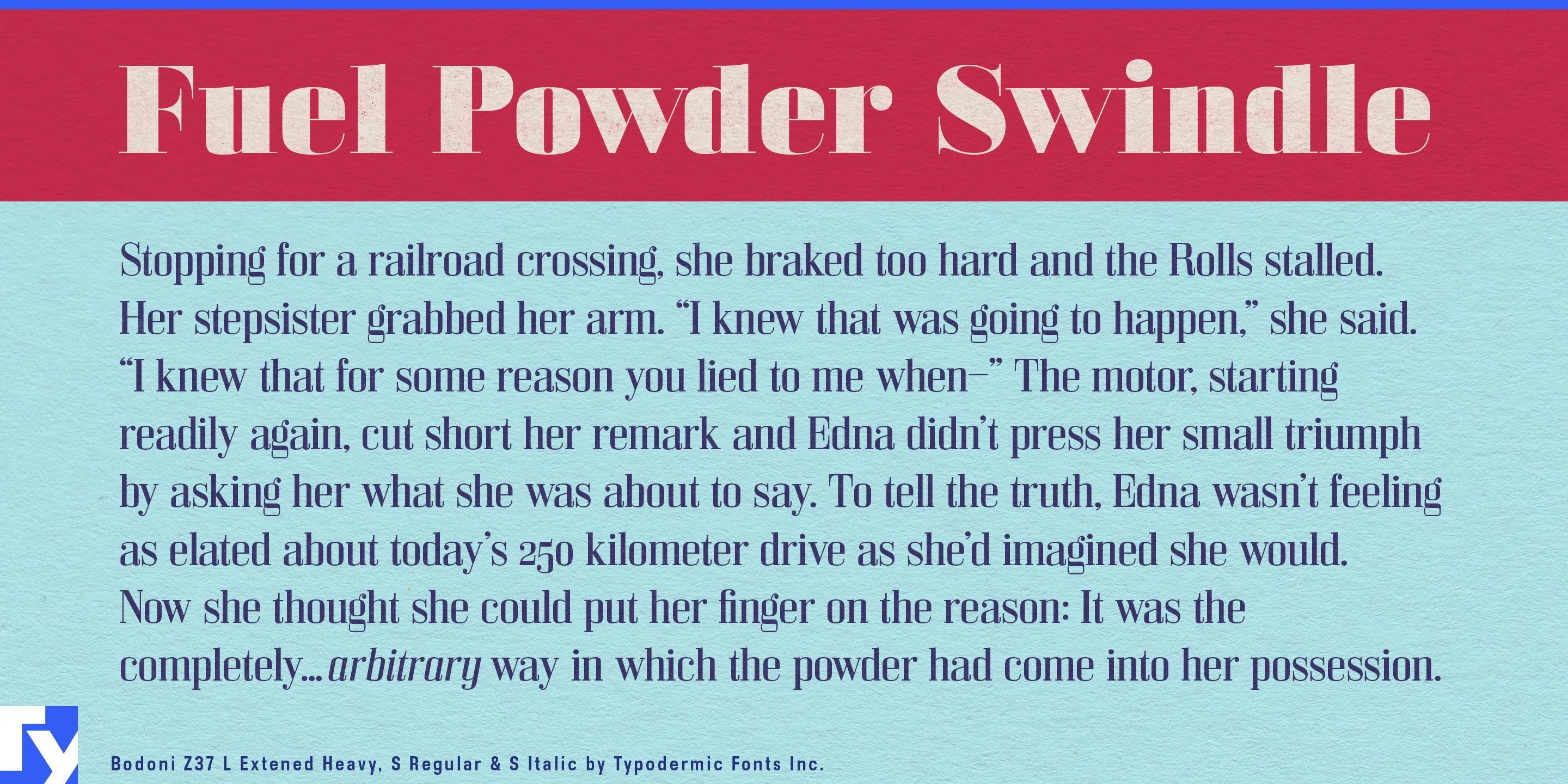
Bodoni Z37 is not intended to replace a comfortable long-reading text face. Its strength is the expressive layer around the text: covers, mastheads, feature openers, package names, exhibition titles, pull quotes and other prominent typography that must survive dramatic changes in size and proportion.
Get Bodoni Z37
Desktop licenses cover print, logos, and static graphics. MyFonts also offers embedding licenses for websites, e-books, and applications. Embedding licenses
Commercial font facts
Family details
- First released
- 2020
- Styles
- 96 styles
- Version
- 1.000
- Formats
- OTF
- Class
- Serif
- Form
- Geometric, Rectangular, Calligraphic, High contrast
- Width
- Mixed
- Scripts
- Latin, Greek, Cyrillic
- Role
- Display
Commercial style names (96)
- L Compressed Light
- M Compressed Light
- S Compressed Light
- L Compressed Light Italic
- M Compressed Light Italic
- S Compressed Light Italic
- L Compressed
- M Compressed
- S Compressed
- L Compressed Italic
- M Compressed Italic
- S Compressed Italic
- L Compressed Bold
- M Compressed Bold
- S Compressed Bold
- L Compressed Bold Italic
- M Compressed Bold Italic
- S Compressed Bold Italic
- L Compressed Heavy
- M Compressed Heavy
- S Compressed Heavy
- L Compressed Heavy Italic
- M Compressed Heavy Italic
- S Compressed Heavy Italic
- L Condensed Light
- M Condensed Light
- S Condensed Light
- L Condensed Light Italic
- M Condensed Light Italic
- S Condensed Light Italic
- L Condensed
- M Condensed
- S Condensed
- L Condensed Italic
- M Condensed Italic
- S Condensed Italic
- L Condensed Bold
- M Condensed Bold
- S Condensed Bold
- L Condensed Bold Italic
- M Condensed Bold Italic
- S Condensed Bold Italic
- L Condensed Heavy
- M Condensed Heavy
- S Condensed Heavy
- L Condensed Heavy Italic
- M Condensed Heavy Italic
- S Condensed Heavy Italic
- L Light
- M Light
- S Light
- L Light Italic
- M Light Italic
- S Light Italic
- L
- M
- S
- L Italic
- M Italic
- S Italic
- L Bold
- M Bold
- S Bold
- L Bold Italic
- M Bold Italic
- S Bold Italic
- L Heavy
- M Heavy
- S Heavy
- L Heavy Italic
- M Heavy Italic
- S Heavy Italic
- L Extended Light
- M Extended Light
- S Extended Light
- L Extended Light Italic
- M Extended Light Italic
- S Extended Light Italic
- L Extended
- M Extended
- S Extended
- L Extended Italic
- M Extended Italic
- S Extended Italic
- L Extended Bold
- M Extended Bold
- S Extended Bold
- L Extended Bold Italic
- M Extended Bold Italic
- S Extended Bold Italic
- L Extended Heavy
- M Extended Heavy
- S Extended Heavy
- L Extended Heavy Italic
- M Extended Heavy Italic
- S Extended Heavy Italic