
Barrista
Get the font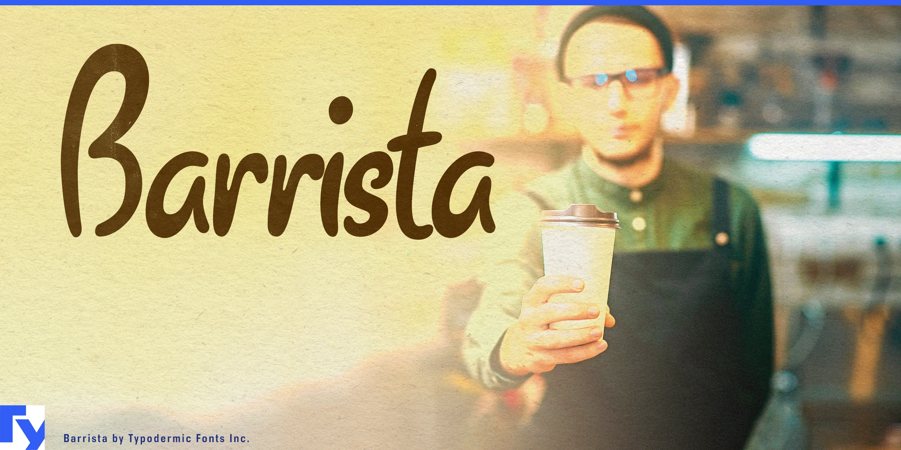


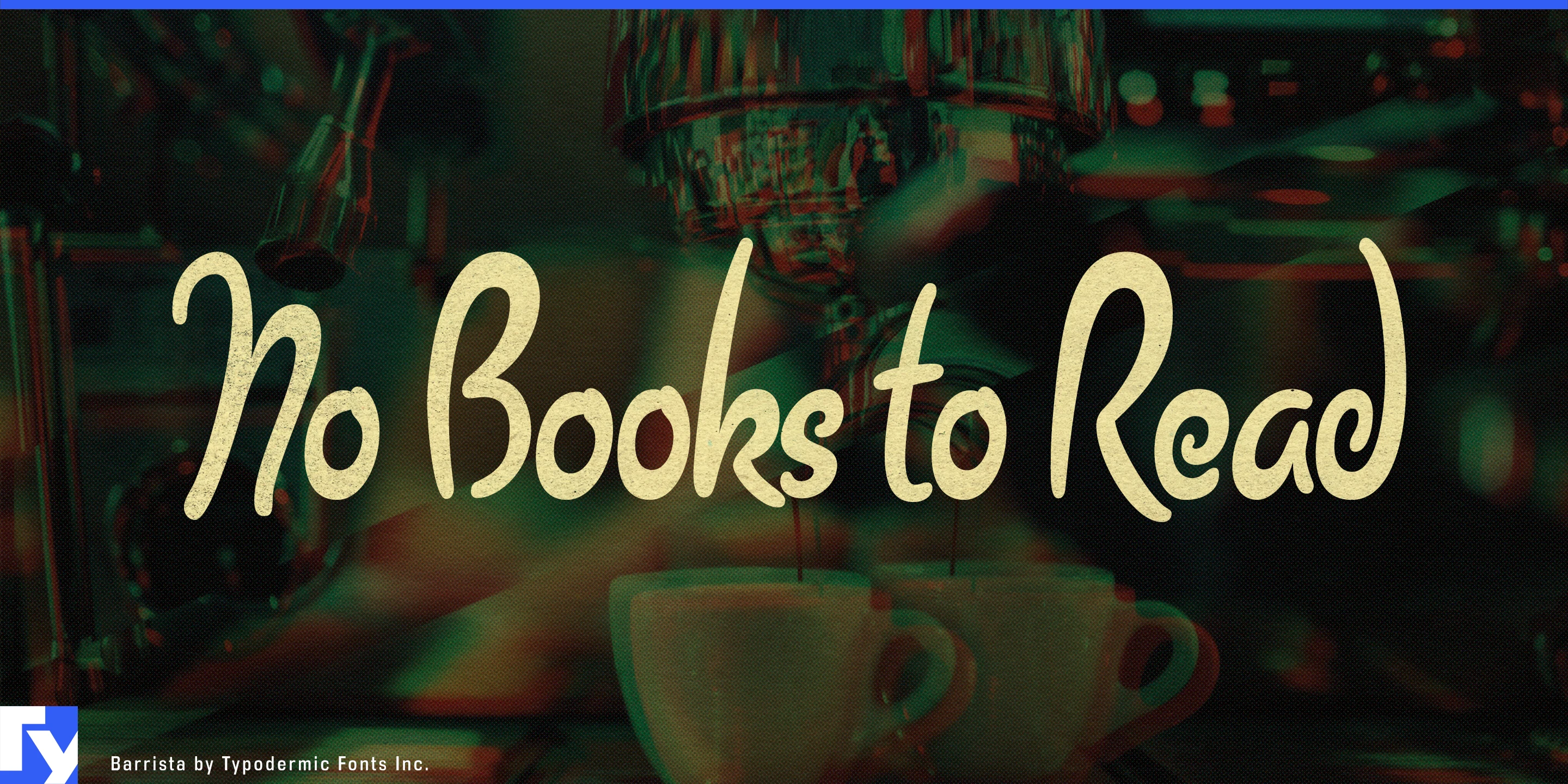
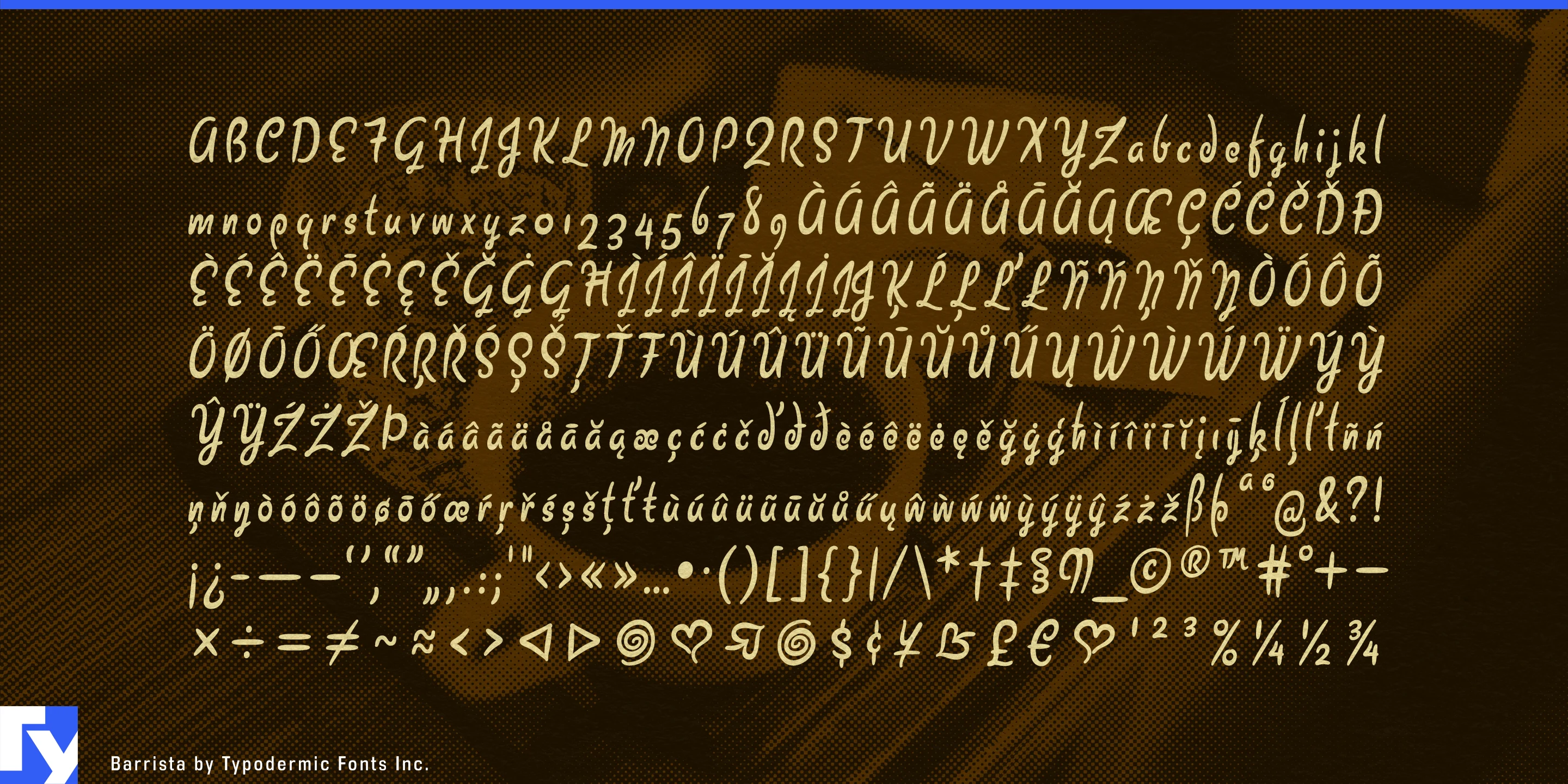
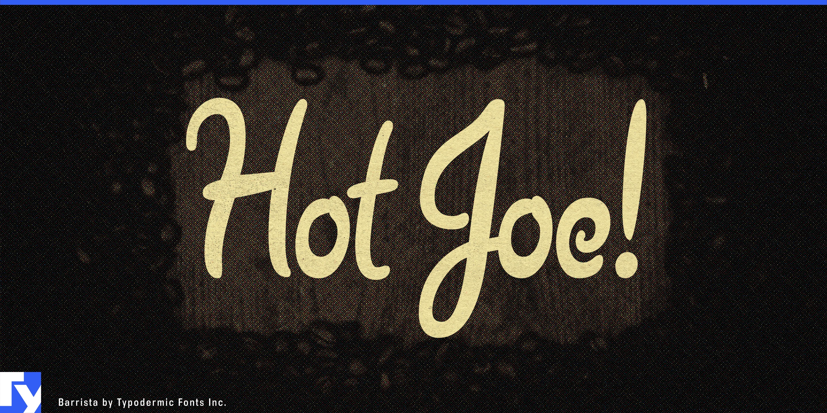
Designers sometimes need handwriting that looks human without looking like calligraphy. Polished brush scripts can feel too accomplished for a quick note, while deliberately messy handwriting can become childish or comic. Barrista occupies a less formal middle ground: narrow, loopy, unconnected lettering with enough awkwardness to suggest an ordinary adult hand rather than a practiced lettering artist.
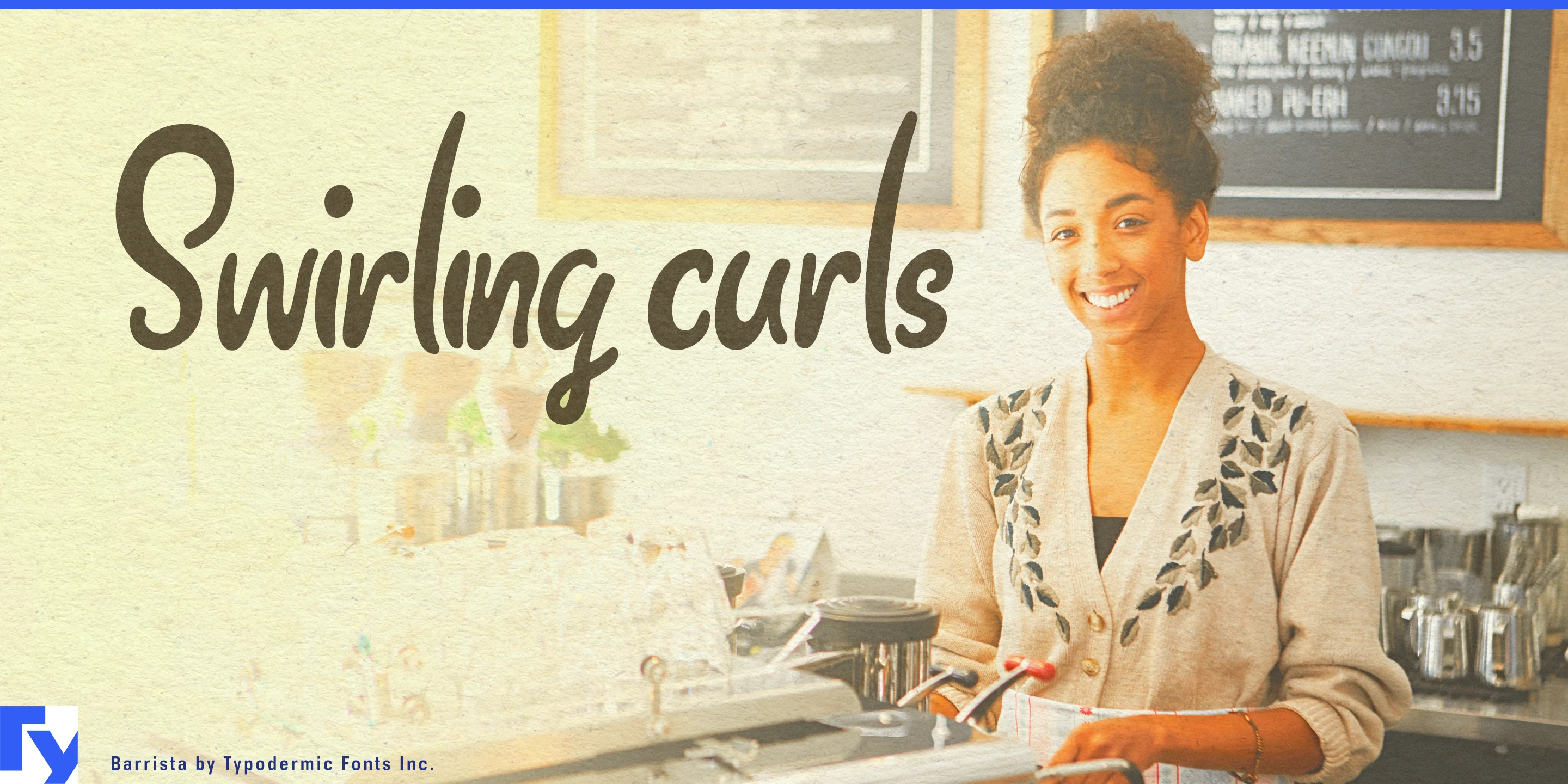
Barrista grew from the atmosphere of casual coffee-shop lettering, with curls suggesting steam and caramel swirls, but its useful territory extends well beyond coffee. The modulated strokes are consistent enough to function as type while retaining a slightly clumsy rhythm, and common letter combinations vary so repeated forms do not always fall into an obviously mechanical pattern.
Its natural role is the temporary handwritten layer inside an otherwise designed environment. Today’s Soup, Blueberry Muffin, Sold Out, Fresh This Morning; flavor names, care notes, staff recommendations, price cards, and marginal comments can all feel more believable when they look as though someone actually wrote them. That makes Barrista useful in food and retail settings, recipe and editorial work, plant shops, markets, exhibitions, and other places where a polished identity still needs an informal human voice.
Barrista is strongest in short phrases, notes, labels, recommendations, and asides; the kinds of messages that benefit from looking personal without becoming decorative calligraphy.
Get Barrista
Desktop licenses cover print, logos, and static graphics. MyFonts also offers embedding licenses for websites, e-books, and applications. Embedding licenses
Commercial font facts
Family details
- First released
- 2005
- Styles
- 1 style
- Version
- 3.003
- Formats
- OTF
- Class
- Script
- Form
- Handwritten
- Case
- Mixed case
- Scripts
- Latin
- Role
- Display
- Features
- Ligatures
Commercial style names (1)
- Regular