
Folder
Get the font


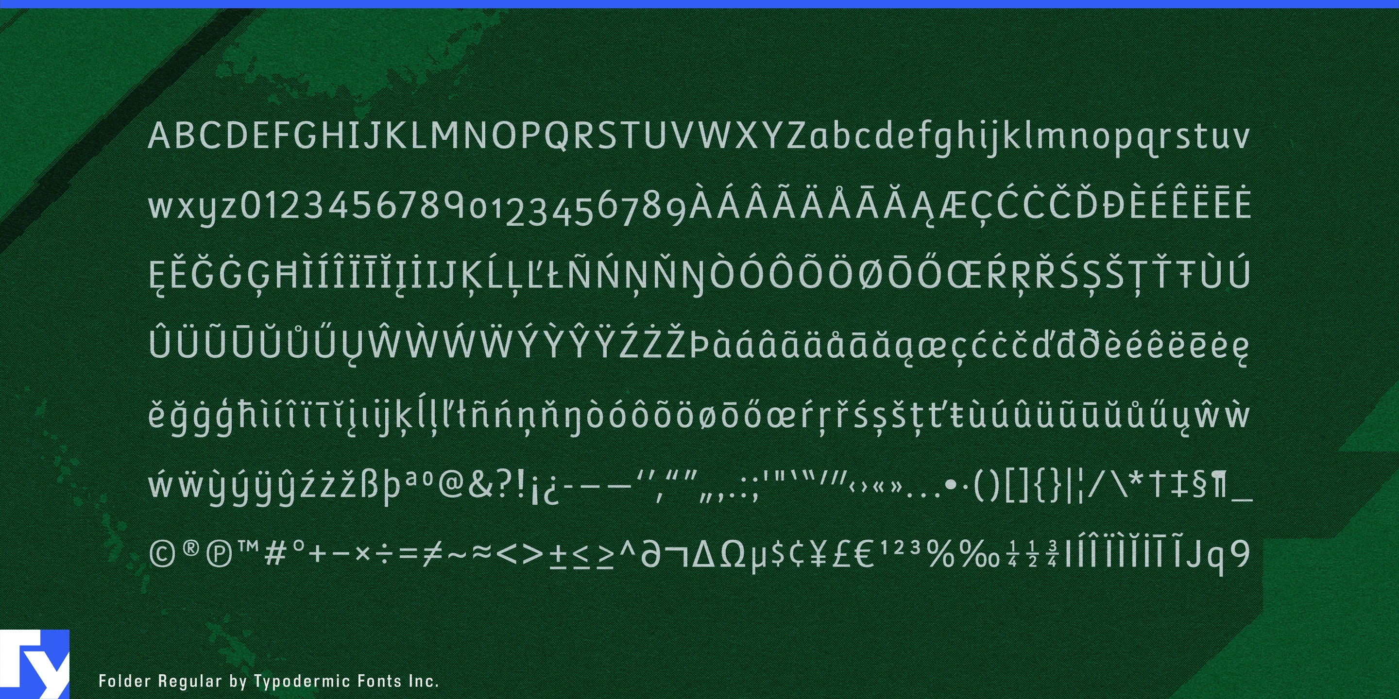
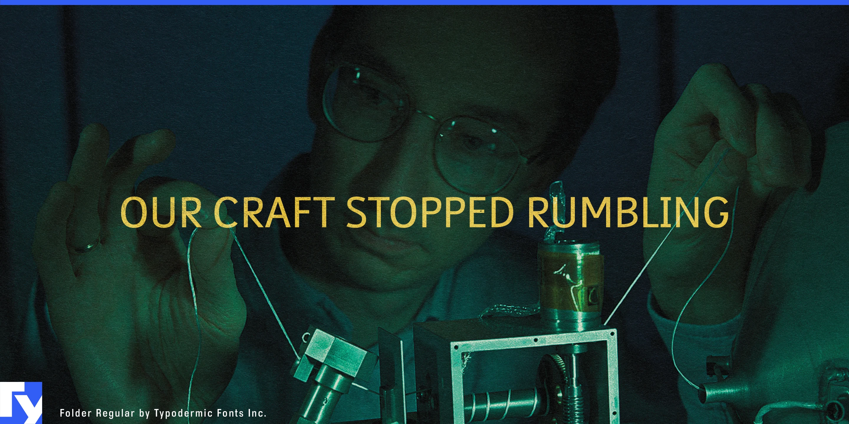
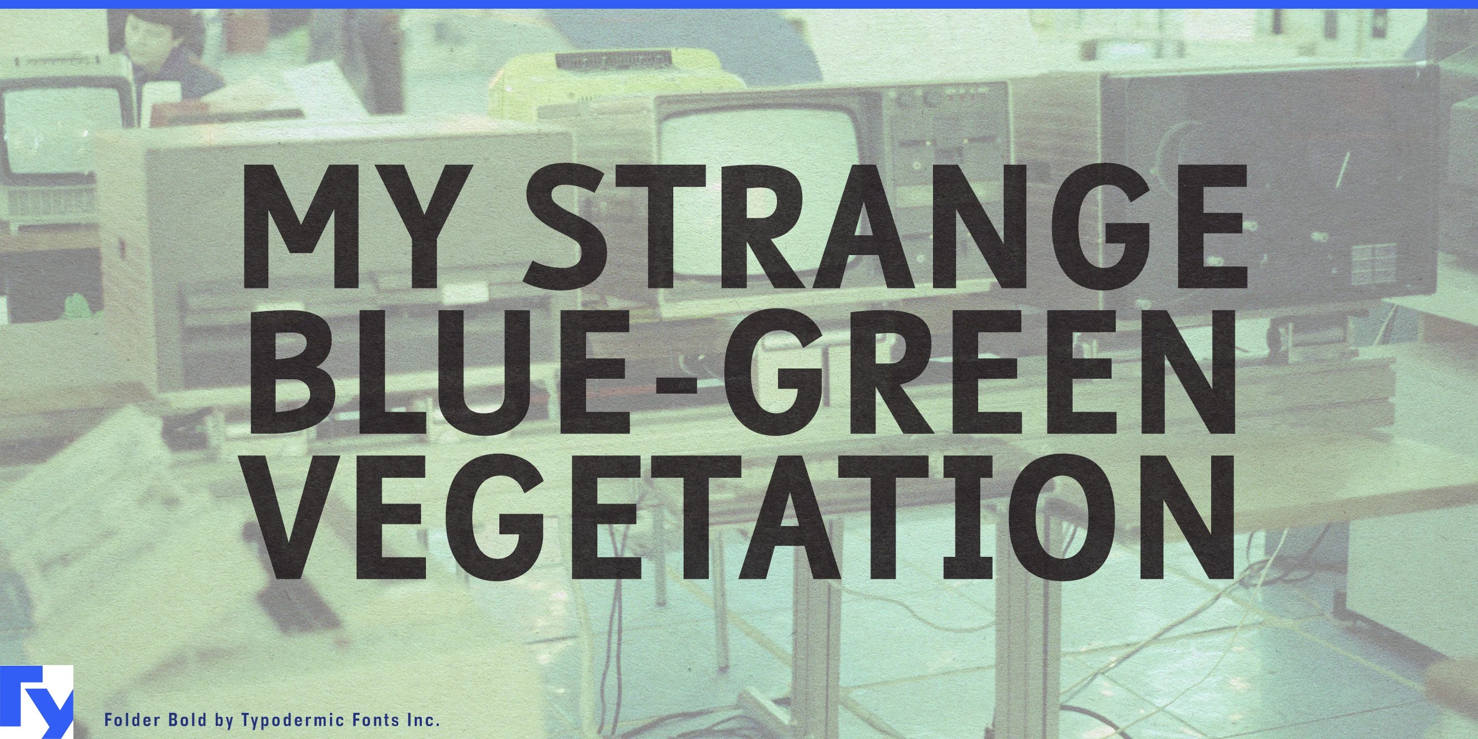
Folder was designed for information that needs to feel instructional without looking elementary. Its clear, compact forms combine the straightforward character of educational printing with a restrained technical quality, giving serious subjects a learner-oriented voice without pushing them toward either playful classroom lettering or anonymous interface typography.
That makes Folder especially useful for educational video and streaming. Science explainers, curriculum video libraries, documentary learning segments, instructional animation, language-learning programmes, and classroom media can use it for titles, definitions, questions, diagram labels, captions, and short explanatory overlays.
STEM subjects are a particularly natural fit. Space science, engineering, robotics, electronics, computing, biology, earth science, energy, and climate education often struggle between overly juvenile classroom graphics and hard-edged technological branding. Folder occupies the middle ground. It can label a rover diagram, explain the parts of a battery cell, introduce a coding exercise, identify a laboratory process, or organize an animated engineering lesson without making the subject feel childish or forbidding.
Science museums and interactive exhibits can use the same quality for family audiences. Planetariums, technology museums, natural-history museums, transport collections, science centers, and visitor attractions can apply Folder to exhibit headings, interactive-screen prompts, experiment instructions, diagram labels, timeline captions, family activity stations, and short object descriptions.
Educational software extends Folder naturally into virtual laboratories, robotics-learning platforms, coding courses, astronomy apps, language exercises, science simulations, and AI-assisted learning systems. Folder can become the instructional voice for tutorial overlays, questions, simulation labels, worked explanations, quizzes, and information panels while the surrounding application retains its normal interface typography.
Technical training offers another useful setting. Equipment onboarding, apprenticeship courses, manufacturing education, laboratory instruction, maintenance training, and technician certification material can use Folder for process steps, callouts, diagrams, captions, and explanatory sequences.
Folder works best when serious information needs to remain visibly educational. Its combination of school-derived forms and restrained technical construction makes it especially effective for video, STEM learning, interactive exhibits, simulations, and training systems designed to help people understand unfamiliar subjects.
Get Folder
Desktop licenses cover print, logos, and static graphics. MyFonts also offers embedding licenses for websites, e-books, and applications. Embedding licenses
Commercial font facts
Family details
- First released
- 2005
- Styles
- 4 styles
- Version
- 2.008
- Formats
- OTF
- Class
- Sans serif
- Form
- Geometric, Pixel
- Scripts
- Latin
- Role
- Dual purpose
- Features
- Alternates, Open counters
Commercial style names (4)
- Regular
- Italic
- Bold
- Bold Italic