
Bullpen
Get the font
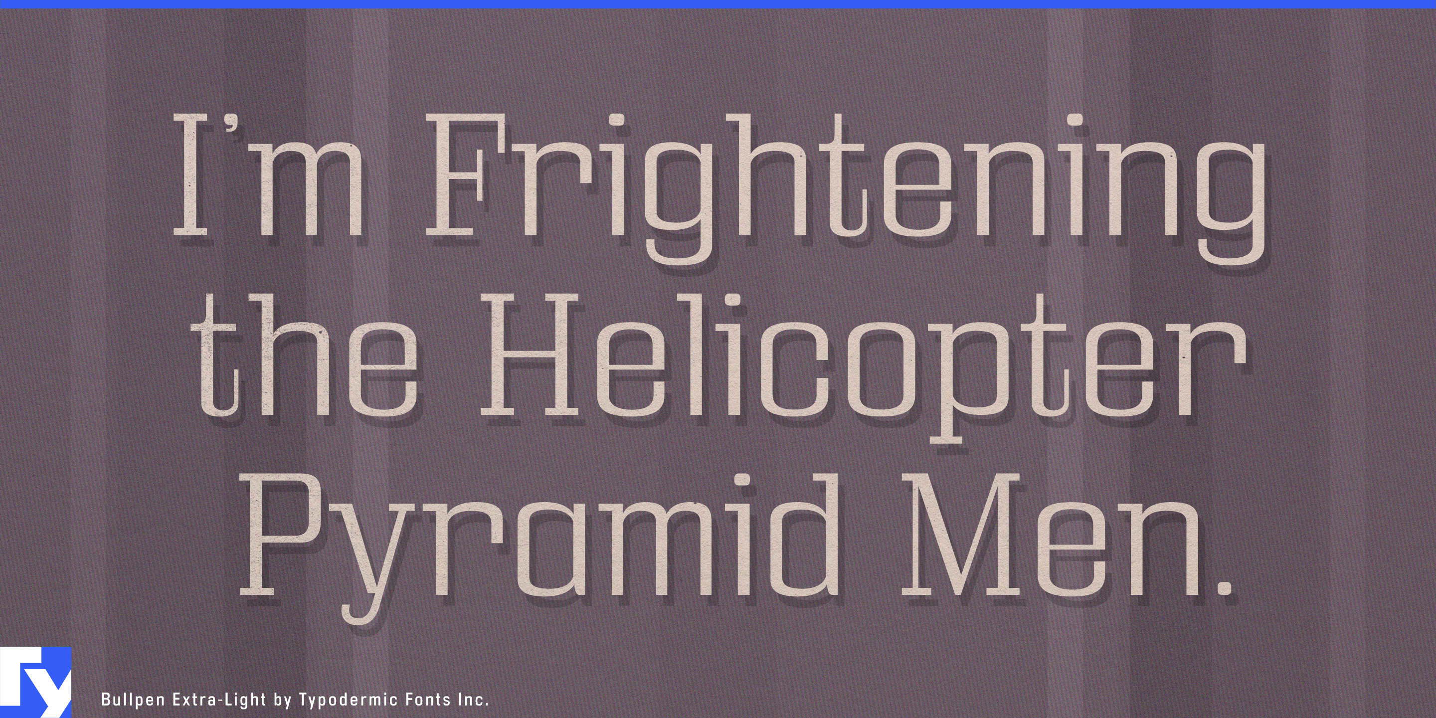

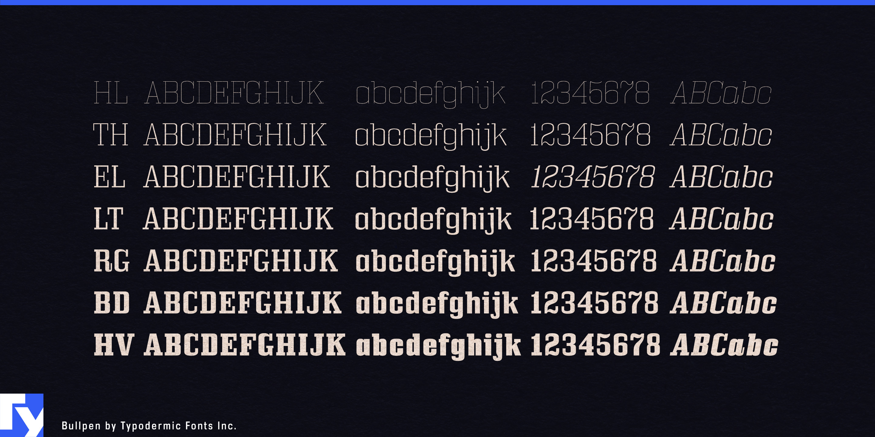
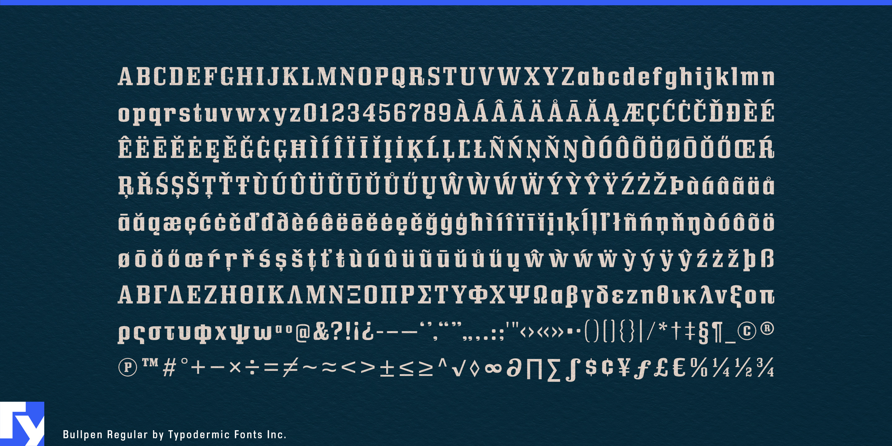
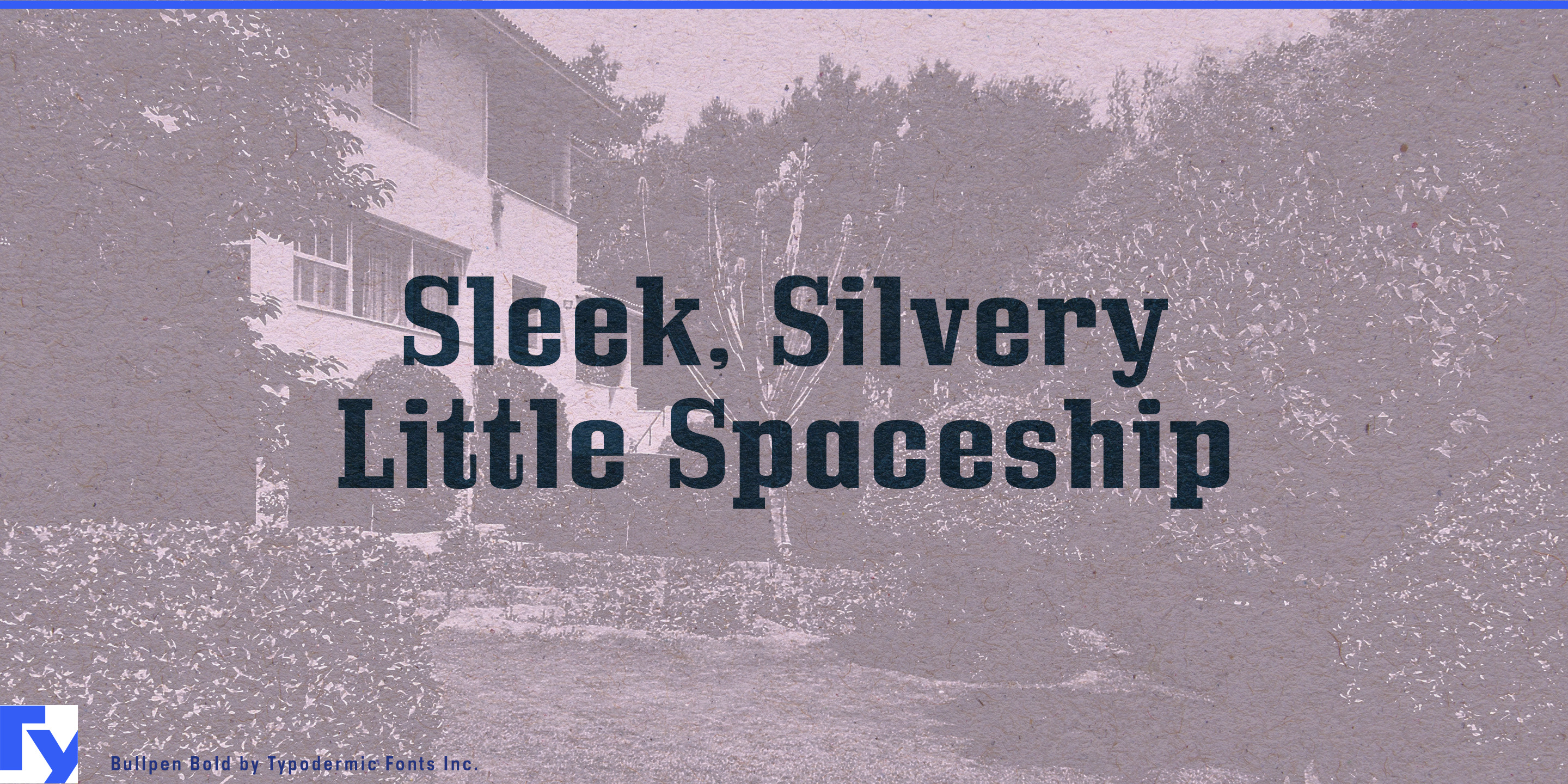
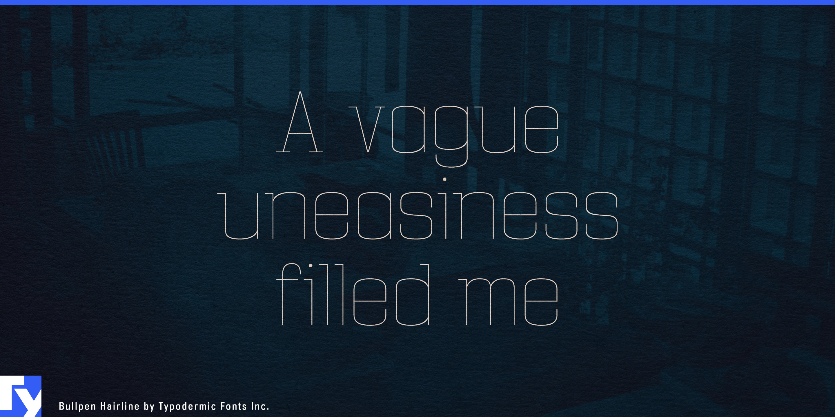
A strong slab serif can establish a team or equipment brand quickly. The trouble begins when that identity has to do quieter work. Player introductions become hospitality signage; a machine badge becomes a technical presentation; game-day graphics have to coexist with museums, lounges, training facilities and sponsor events. Switching to a neutral sans solves the volume problem but often removes the character that made the identity recognizable. Bullpen keeps its square, mechanical voice from Hairline through Heavy, letting designers reduce the volume without changing personalities.
That range makes Bullpen especially useful for professional sports organizations whose identities extend beyond the field. Heavy and Bold can handle season campaigns, rivalry graphics, player introductions, concourse headers and team-store walls. Regular and Light can move into schedule categories, museum displays, suite names, sponsor-hospitality graphics and secondary headings. Hairline can carry the same underlying structure into premium club areas and architectural graphics where conventional athletic lettering would feel unnecessarily loud.
Modern stadium districts create an even broader hierarchy problem. Teams increasingly operate restaurants, retail, museums, plazas, lounges and entertainment spaces around the venue. Bullpen’s lighter weights can retain the organization’s squared slab character in venue names, heritage displays, district programming and hospitality graphics without making every space feel like game-day merchandise.
Connected training equipment gives the same range a product role. Commercial strength machines, rowing and ski trainers, batting simulators and performance-testing systems combine substantial physical hardware with screens, software and data. Bullpen’s mechanical slabs make sense beside steel frames, equipment housings and molded components, while lighter weights keep model families, training programs and launch graphics from becoming overpowering.
The family is equally useful as heavy machinery moves toward electric power and automation. Compact loaders, excavators, utility equipment and commercial landscaping machines still need to look like serious equipment even when the powertrain changes. Heavy retains the solidity expected around machinery, while Hairline, Thin and Light expose the same square construction in a cleaner, more technical form. Product-series names, dealer launches, trade-show environments, equipment decals and specification headings can evolve without making the manufacturer suddenly look like a software startup.
Bullpen’s italics add another level of hierarchy for player names, statistics, matchups, performance data and directional copy, while the original 3D style remains available for the largest graphic moments. Its real strength is the distance between Hairline and Heavy: Bullpen can still shout when the scoreboard demands it, but it no longer has to shout everywhere else.
Get Bullpen
Desktop licenses cover print, logos, and static graphics. MyFonts also offers embedding licenses for websites, e-books, and applications.
Commercial font facts
Family details
- First released
- 2001
- Styles
- 15 styles
- Version
- 5.002–5.100 (varies by style)
- Formats
- OTF
- Class
- Slab serif
- Scripts
- Latin, Greek
- Role
- Display
Commercial style names (15)
- Hairline
- Hairline Italic
- Thin
- Thin Italic
- Extra-Light
- Extra-Light Italic
- Light
- Light Italic
- Regular
- Italic
- Bold
- Bold Italic
- Heavy
- Heavy Italic
- 3D