
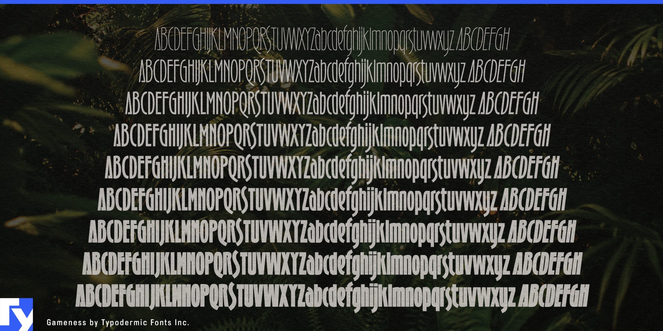
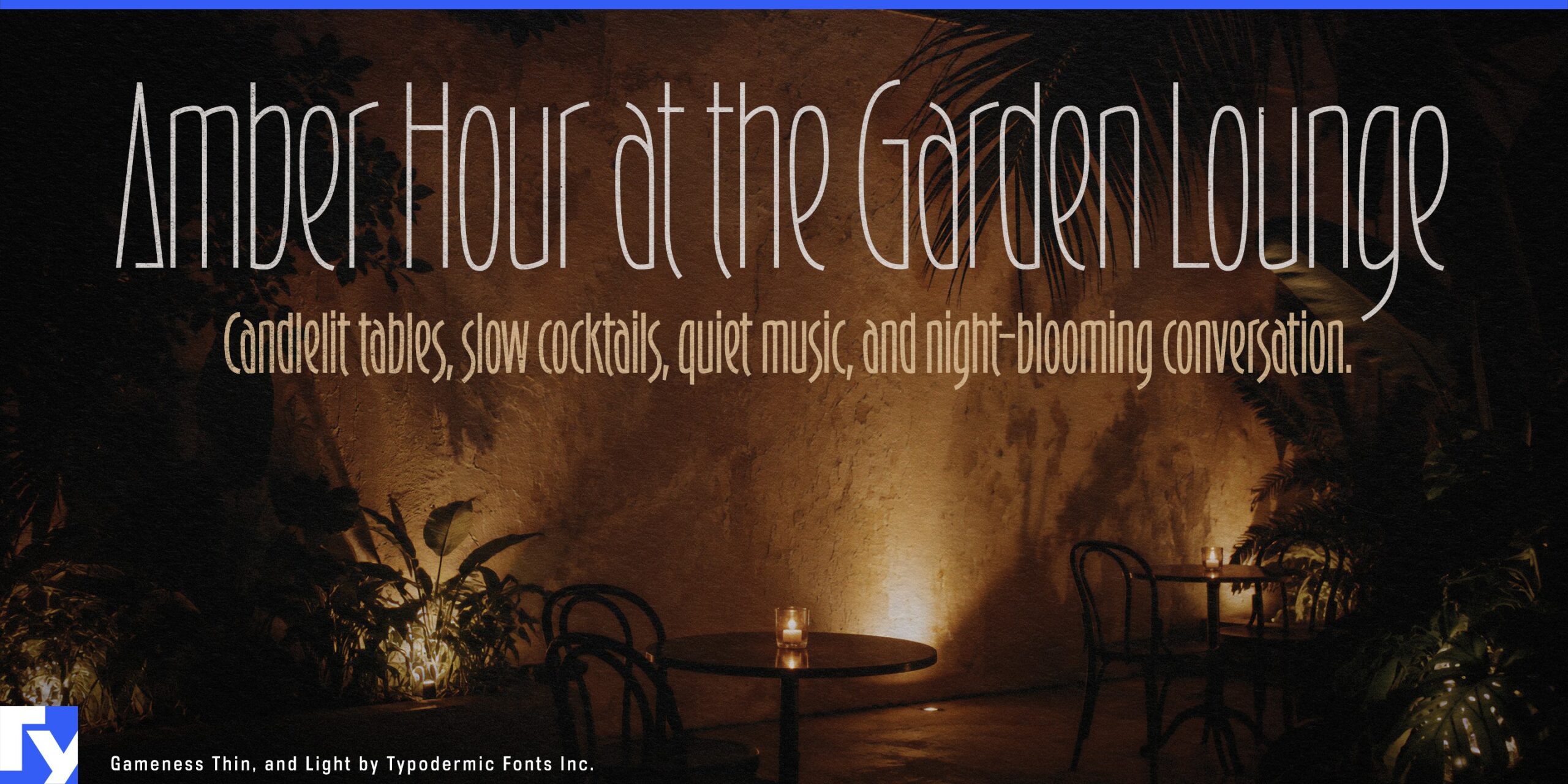
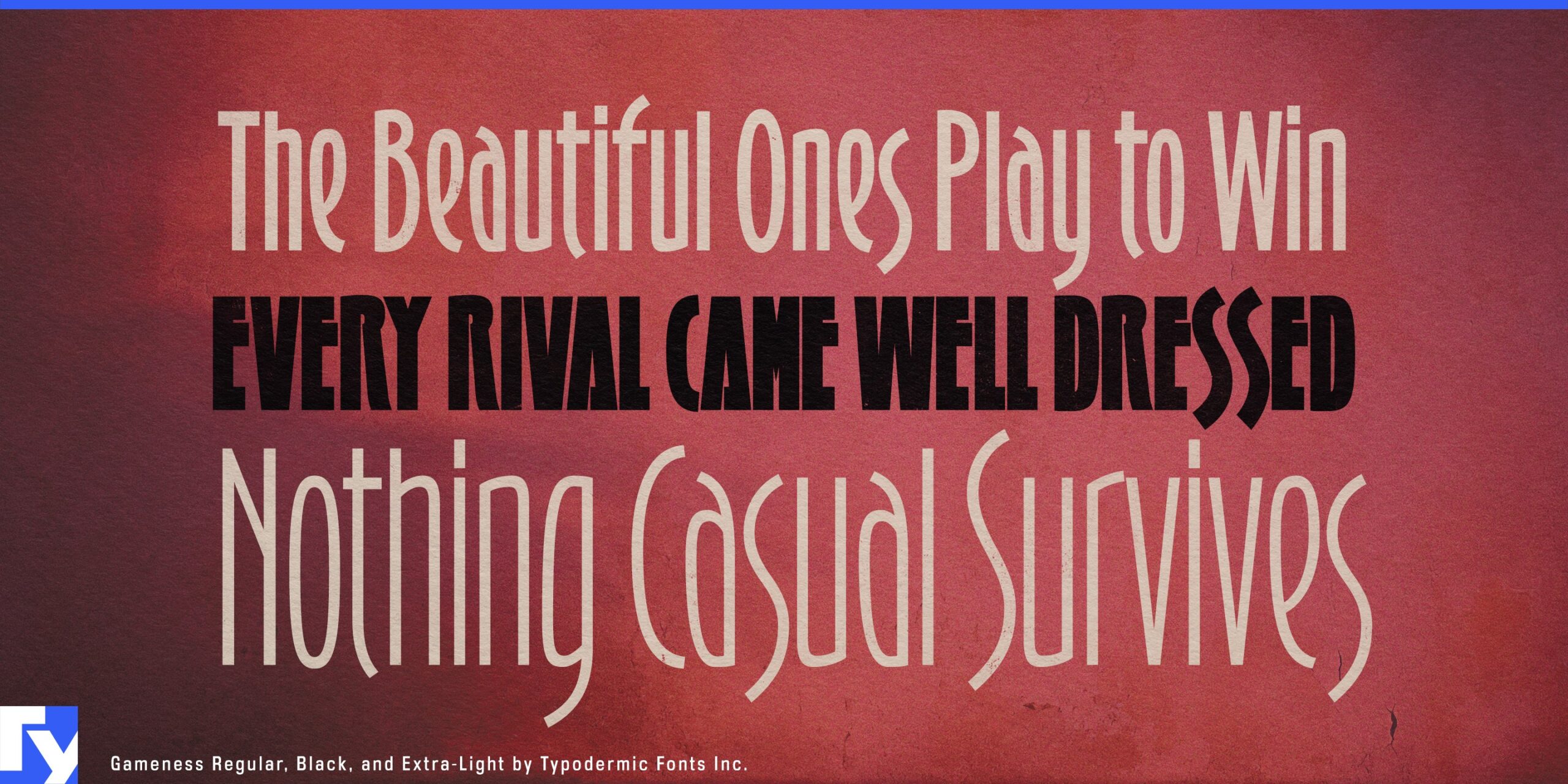
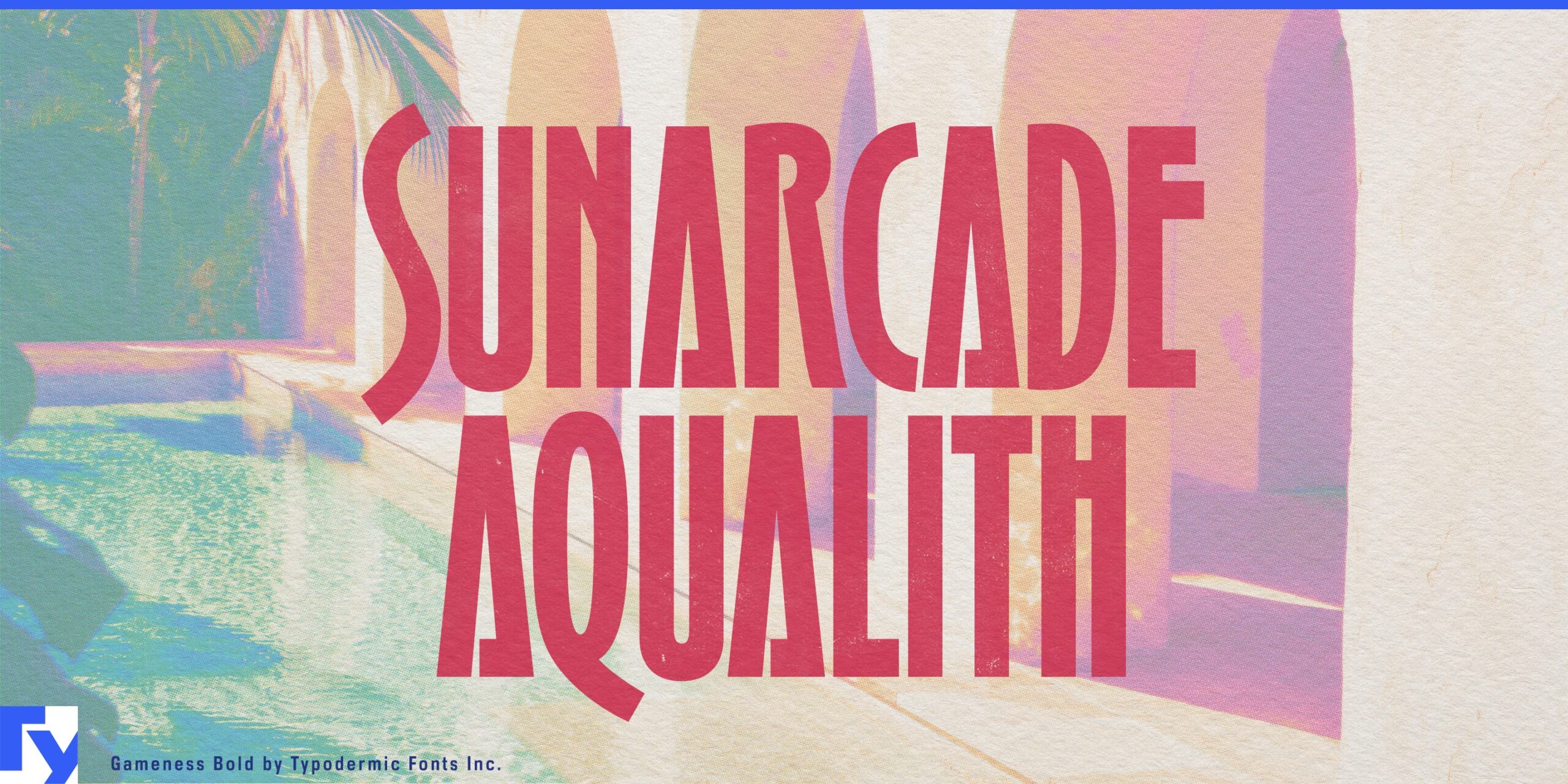
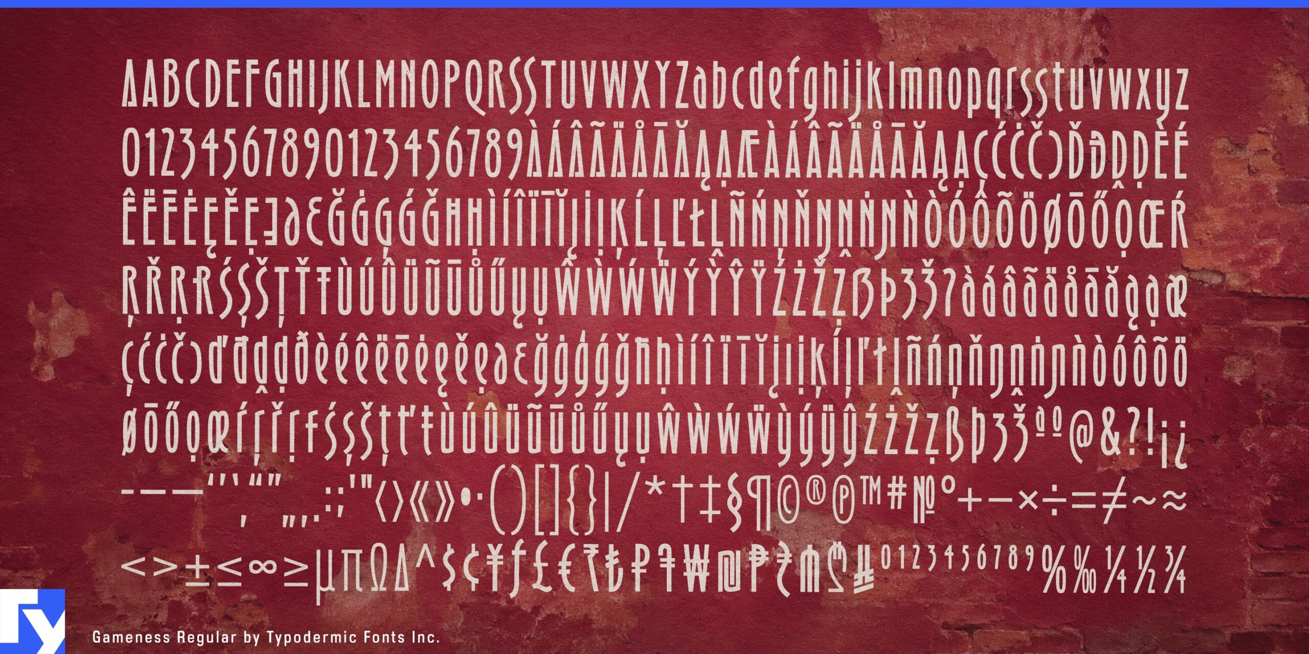
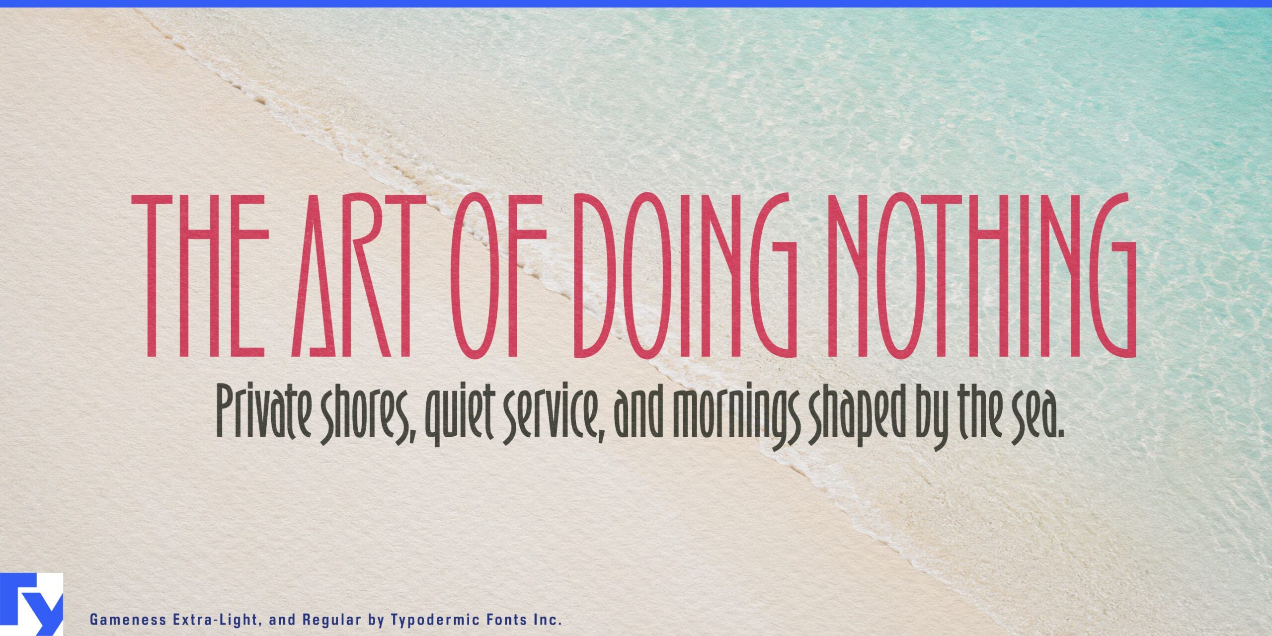
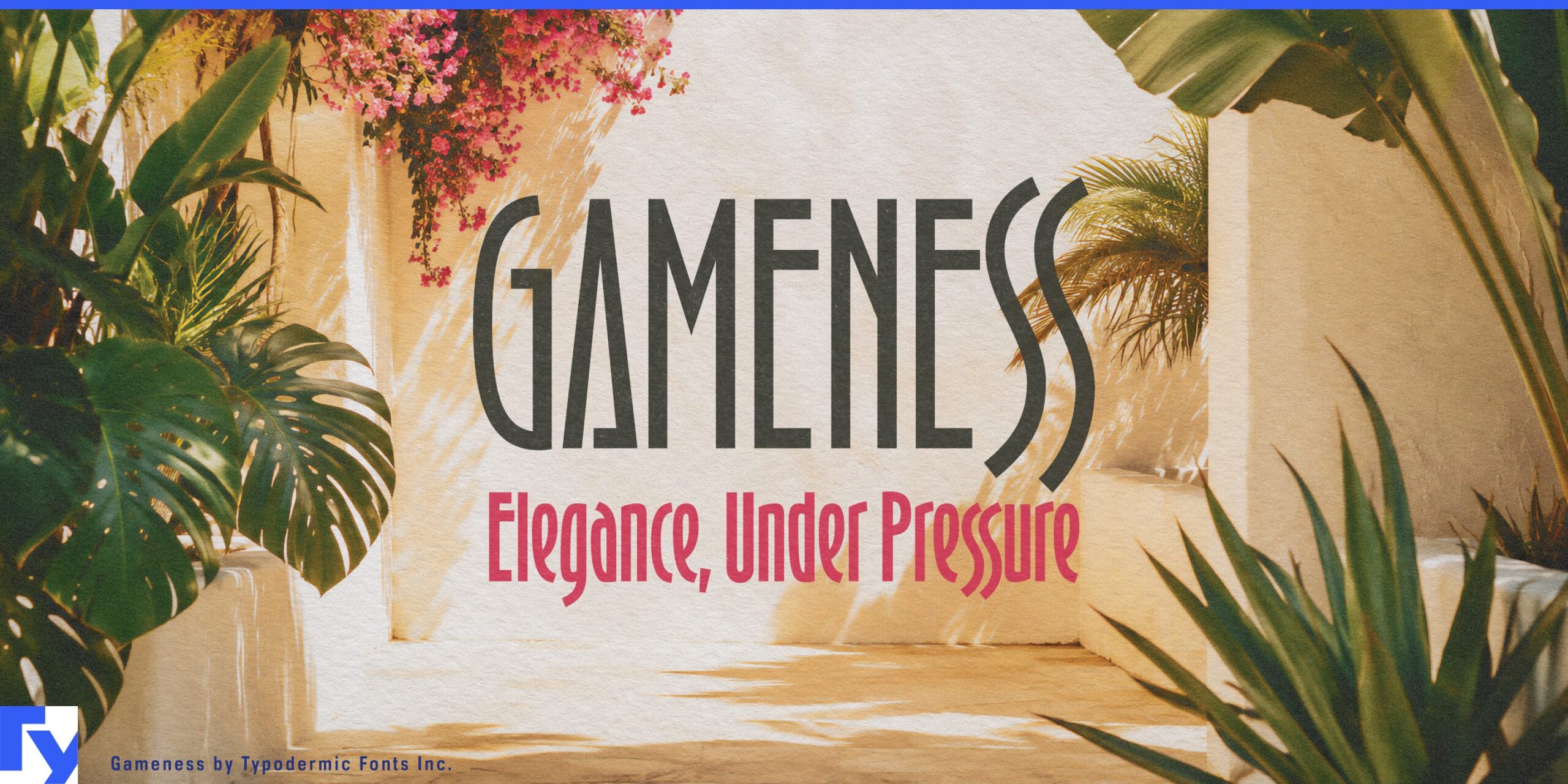
Gameness is a tall, condensed display family with fashion-house poise and competitive tension. Its slender vertical forms rise with Art Deco confidence, creating a sharp architectural rhythm that feels elegant, focused, and controlled. In logos, labels, and headline settings, Gameness brings height and polish without wasting horizontal space.
The family moves from delicate Thin and Extra-Light styles suited to perfume labels, skincare packaging, couture invitations, and jewelry branding, through stronger weights for boutique hotel signage, cocktail menus, fashion lookbooks, and luxury event graphics. Heavy and Black add a more commanding voice for championship titles, tennis tournament posters, motorsport graphics, fight-night bills, and premium sports branding that calls for restraint as well as impact.
Lowercase letters and matching italics give Gameness room to handle product lines, menu headings, packaging flavor names, runway show programs, gallery posters, and high-end promotional materials. Subtle alternates, including a barred capital A and nesting S pairs, let designers adjust the texture of words and logos while preserving the family’s clean vertical rhythm. Gameness is poised, narrow, dramatic, and built to stand tall.
Download these and hundreds of other fonts for free with a commercial-use desktop license. Check the links above if you require more styles, website embedding, app integration, or anything else that the free license doesn’t provide.